

A university brief exploring the verbal battle between two giants of the international
graphic design profession, the Dutch graphic designers Wim Crouwel and Jan van Toorn.
I wanted to play on the battle between two styles, keeping the typography neutral and balanced


The aim was to engage you with a more advanced level of typography that can be described as ‘macro-typography’ and ‘micro-typography' exploring the treatment of this text as a medium to represent either the separation of the two styles or the interplay between the two.

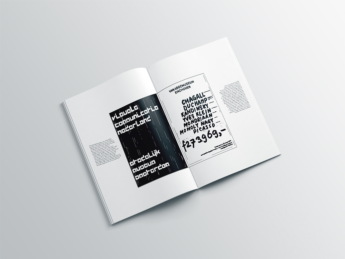
Taking either work or highlights from Van Toorn and Wim Crouwel and treating it,
re-working it, or dissecting the information presented in the debate as to present an interesting collection of good typographic skills.


