


LIGFE 立格扉
家飾品牌 / CIS / 網頁 / 攝影
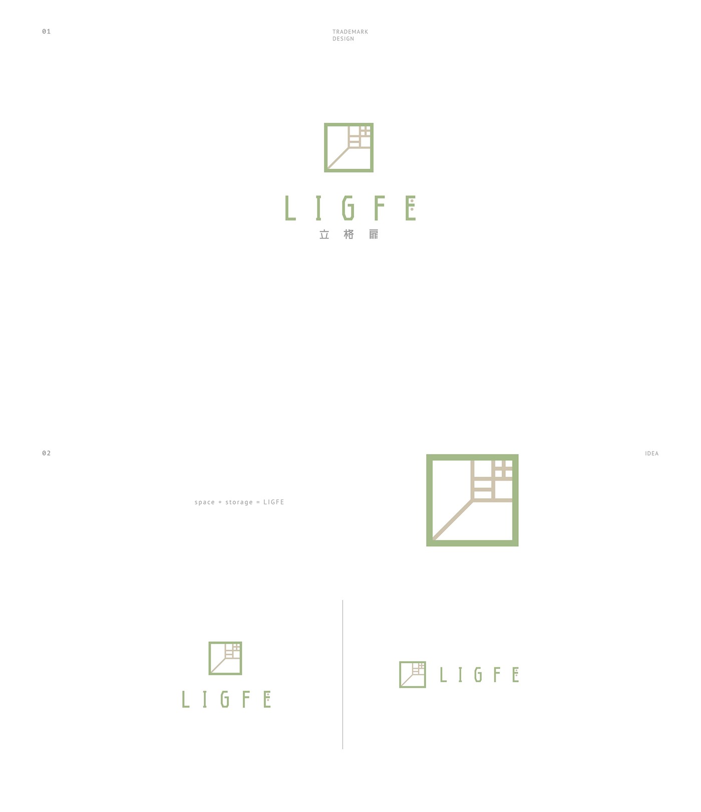
以LIGFE中「L」作為LOGO透視架構,硬挺垂直的線條不只展現品牌創新結構和運用材質上的專業精神,同時亦建立空間與收納的意象,產生從門外觀看空間的視角,進而將立格扉的概念融入其中,立——立方 ; 格——收納 ; 扉——窗戶與透光,交織成一個生活的器皿、一種生活的態度。
Using LIGFE's "L" as the logo’s visual structure, the rigid vertical lines not only demonstrate the brand’s innovation and professionalism in architectural design, but also create the concept of space and storage. The design brings a different perspective to how we view space, combining all the elements of the Chinese letters of the LIGFE brand (立格扉): 立 expressing symmetry, 格 representing compartments, and 扉 meaning window. Interwoven, these elements become a new gateway to a new attitude to life.
中英文標準字體設計,與LOGO融合出一致的視覺風格,簡練純粹的線條,傳遞品牌嚴謹打造堅實品質的意念,並在字間隱藏收納的含義,使整體視覺統合並走出嶄新獨特的風格。
Designed with standard Chinese and English fonts and fused with the logo to bring a consistent visual style, with concise and pure lines, reflecting the brand’s rigorous commitment to quality. And within the words are hidden the implication of storage, merging the overall design into a new unique style.
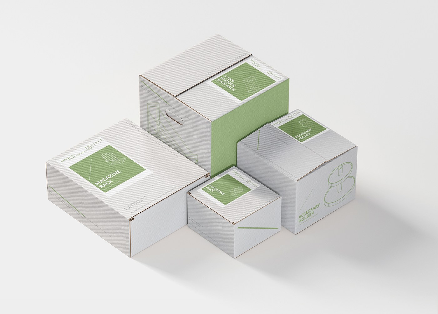
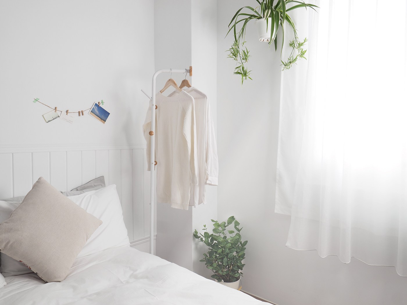
在色彩應用上,深灰色的標準字體呼應「立格扉」以鐵件做為產品架構的製研根基。樸質的木褐色傳達產品結合木質溫潤的觸感,更貼近居家生活的溫暖舒適。清新自然的主色調—青綠色,如同綠意和陽光入室般,象徵產品為居家收納創造最舒服的生活風景,在收納取捨之間帶來感官的清流、心靈的愉悅。
In terms of the color schemes, the dark gray color and the standardized fonts echo the LIGFE brand’s use of steel frames as the structural framework for all its products. The simple wood color conveys the product's warmth and comfort, bringing us ever closer to feeling of being home. The fresh natural main colors of greenish blue, resemble the nature and sunlight, symbolizing how the brand brings a sense of comfort into daily life, gives births out a feeling of purity and deep pleasure.


