Overview
Monark was originally inspired by newspaper types with low contrast letterforms, large x-height, small ascenders & descenders, heavy serifs, as well as large internal spaces. It is designed to be very legible when set in small sizes.
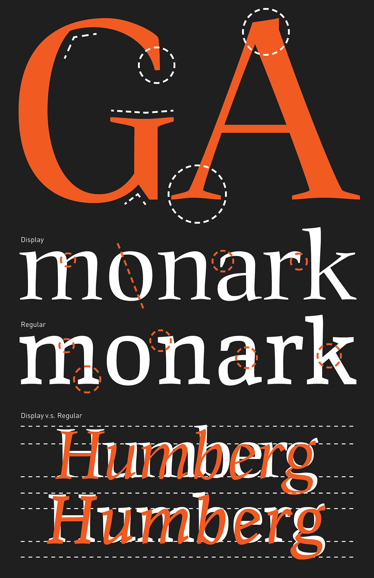
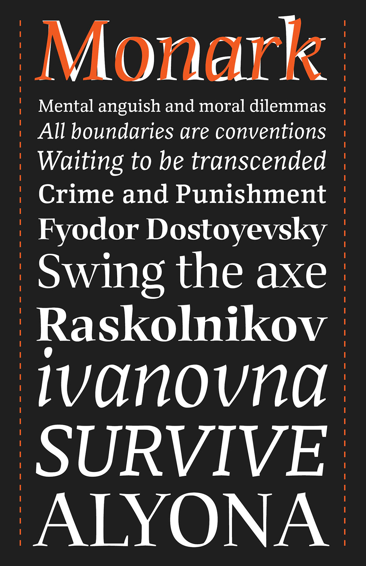
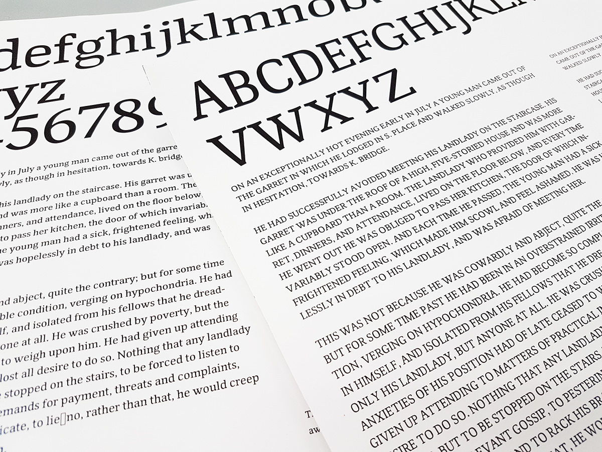
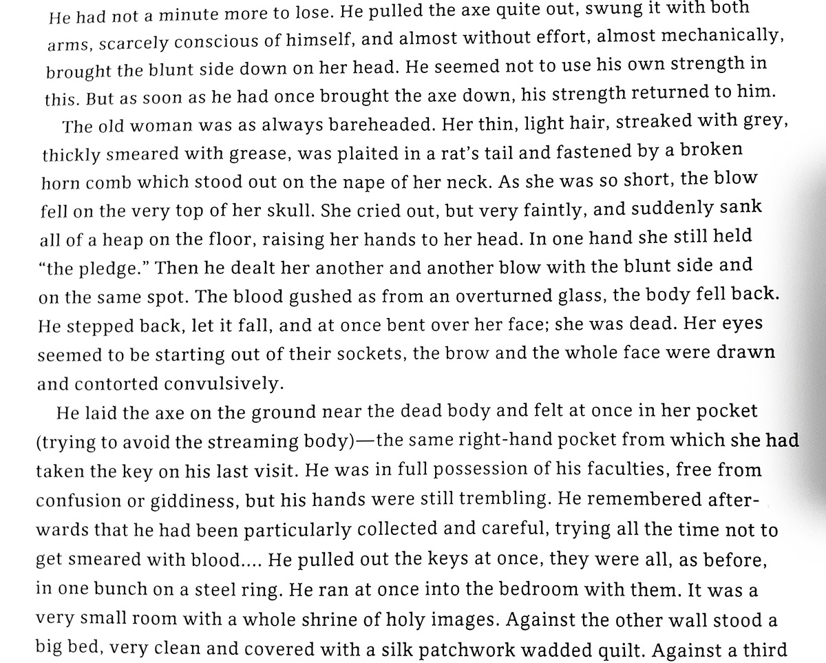
Monark aims to capture the theme from Crime and Punishment by Fyodor Dostoyevsky. Internal conflicts are presented by counterforms of glyphs.
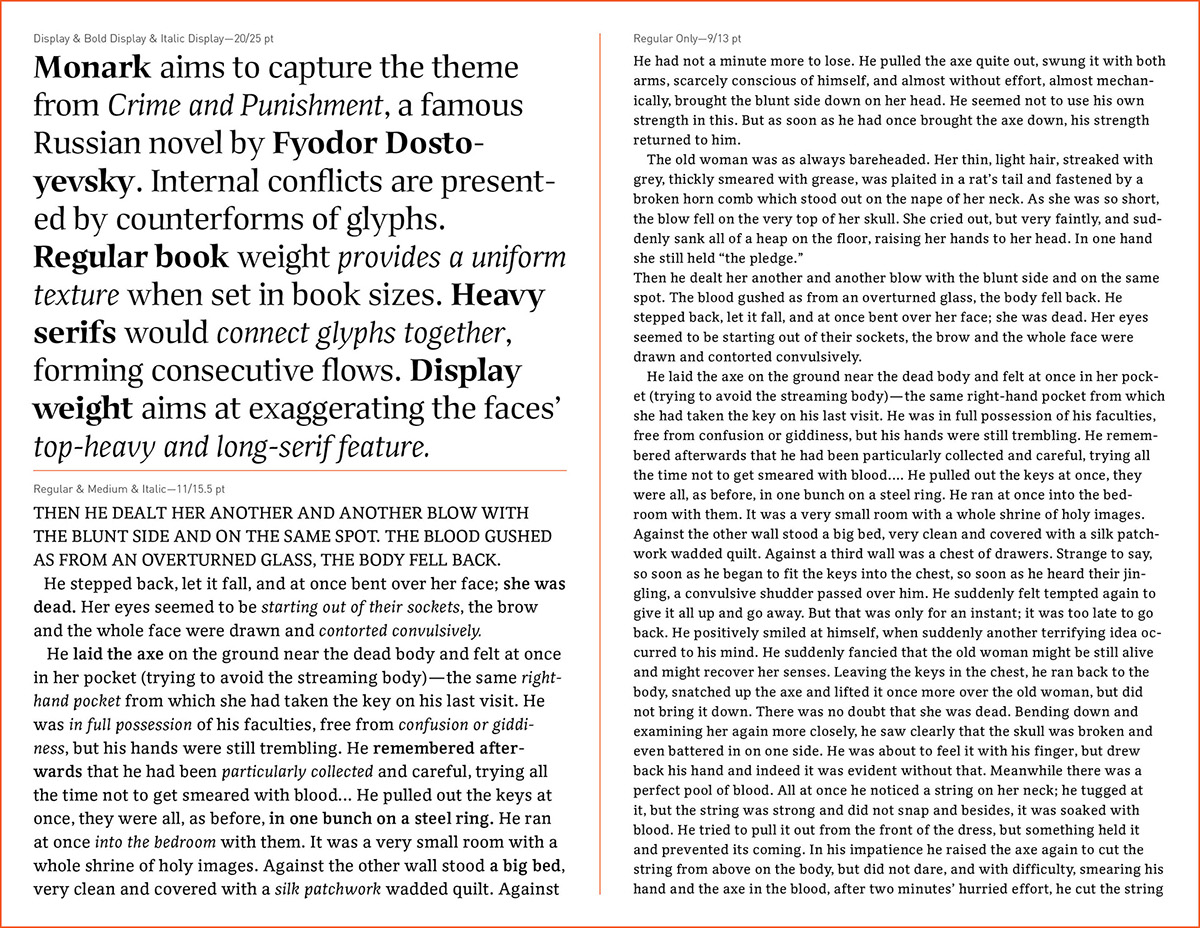
The regular book weight provides a uniform texture when set in book sizes. Heavy serifs would connect glyphs together, forming consecutive flows throughout the entire page.
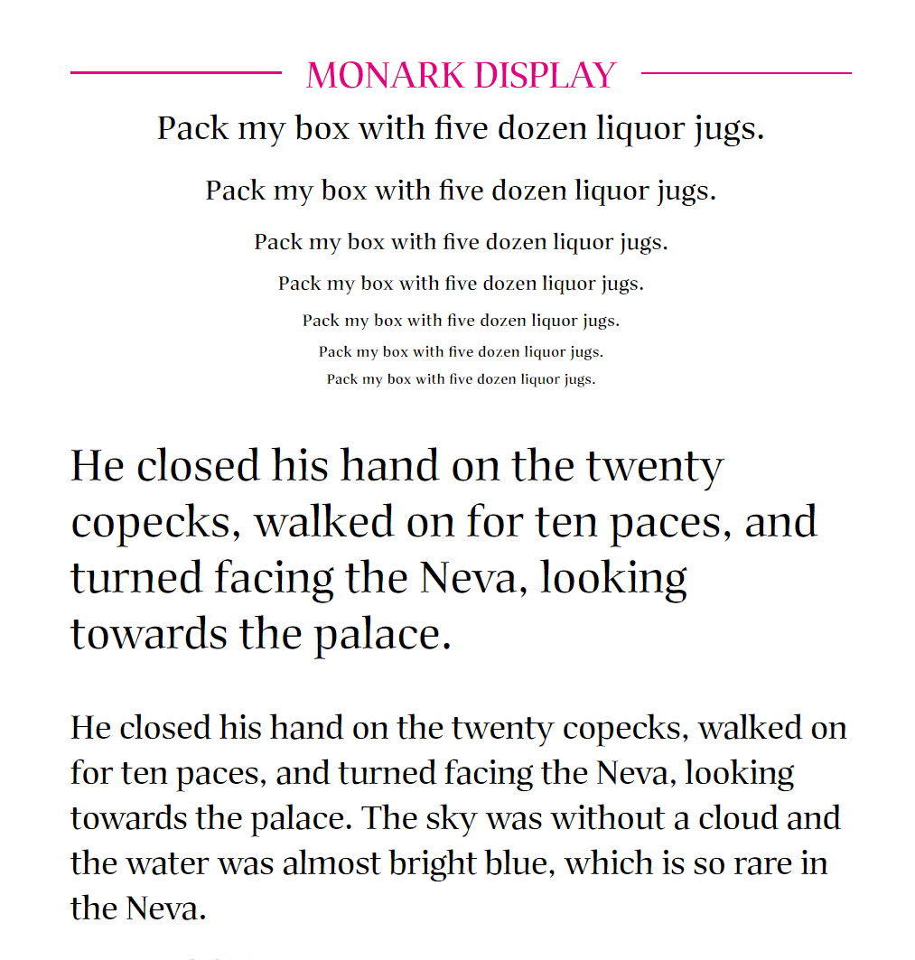
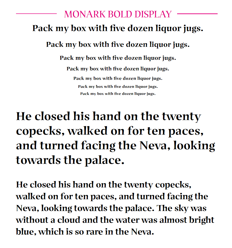
Gradually, the Monark book font has became a type family including two Display weights, two Book weights and their italic versions. The Display weights aim at fully expressing all the small details which feature thin and long serifs, top-heavy letterforms, (little) condensed nature, and abnormal curve-linear relationships. The Italics aim at combining internal conflicts of the Monark family and calligraphic features together, resulting in angled letter-forms that feel coherent to each other.
Weights
BOOK: regular, italic, medium
DISPLAY: display, bold display, italic display
Opentype Typeface
Monark was originally inspired by newspaper types with low contrast letterforms, large x-height, small ascenders & descenders, heavy serifs, as well as large internal spaces. It is designed to be very legible when set in small sizes.
Monark aims to capture the theme from Crime and Punishment by Fyodor Dostoyevsky. Internal conflicts are presented by counterforms of glyphs.
The regular book weight provides a uniform texture when set in book sizes. Heavy serifs would connect glyphs together, forming consecutive flows throughout the entire page.
Gradually, the Monark book font has became a type family including two Display weights, two Book weights and their italic versions. The Display weights aim at fully expressing all the small details which feature thin and long serifs, top-heavy letterforms, (little) condensed nature, and abnormal curve-linear relationships. The Italics aim at combining internal conflicts of the Monark family and calligraphic features together, resulting in angled letter-forms that feel coherent to each other.
Weights
BOOK: regular, italic, medium
DISPLAY: display, bold display, italic display
Opentype Typeface
Too see Monark family in use, visit Yuexin.site