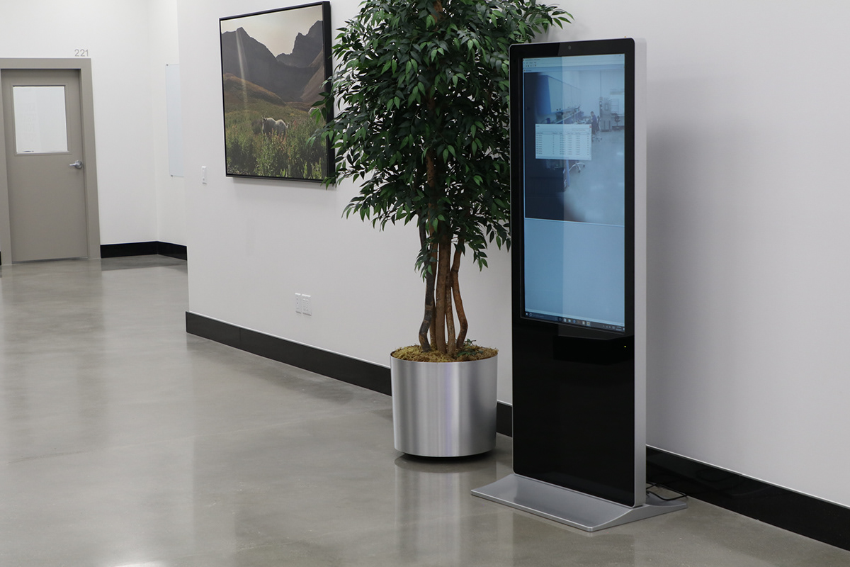
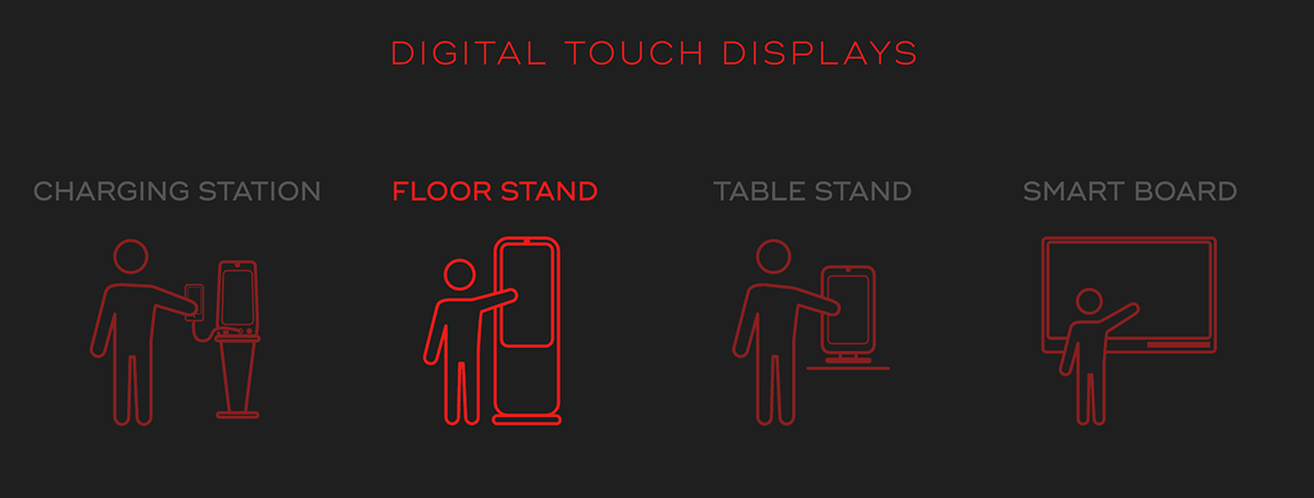
Metric Media customers need a way to understand the data gathered by their Touchscreen Kiosk.
Process:

Step 1: DISCOVERY
JTBD
Users don't necessarily understand the data-gathering and usage potentials of our kiosks.
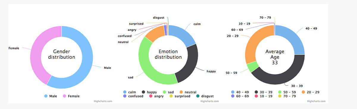
We must display the data gathered within the Client's business.
• This dashboard will constitute it's own product.
• Display enough data,
• Display the right data and
• Include enough interaction with that data
to justify a predetermined price point.
The location of this dashboard within our CMS has already been determined. It is included with every kiosk installation.

Users
We have 200+ screens installed in various brick-and-mortar businesses, all collecting user engagement data.
Even with so few machines out in the marketplace we generated almost 3 million lines of data, with several dozen data points on each line.

Step 2: Research
Design Evolution
After the VOCs with brick-and-mortar clients, I led the UX team to conduct some brainstorming sessions with the sales department.
We determined not only the types of data which needed to be shown, but some quick reference options as well.


Step 3: Design
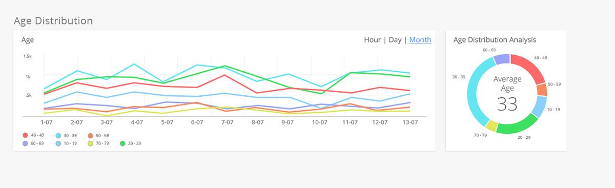
Initial Chart Design
(Out-of-the-box library)
Originally we used charts.JS to display our data feed. These felt 'canned' and lacked interactivity (at least without significant development overhead)
Eventually we settled on Power BI for the charts and other data display products.
Redesign Mock-up
Adobe XD
I took the feedback from users, and the results of the design sprints with our sales staff, and mocked up some charts in Adobe XD.
Step 4: Development
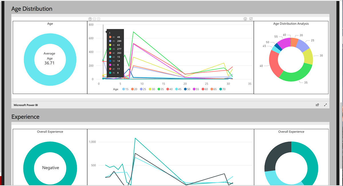
First Pass with Power BI
Power Bi came with its own challenges. The individual windows didn't display cohesively. They also had trouble integrating the interactivity between charts.
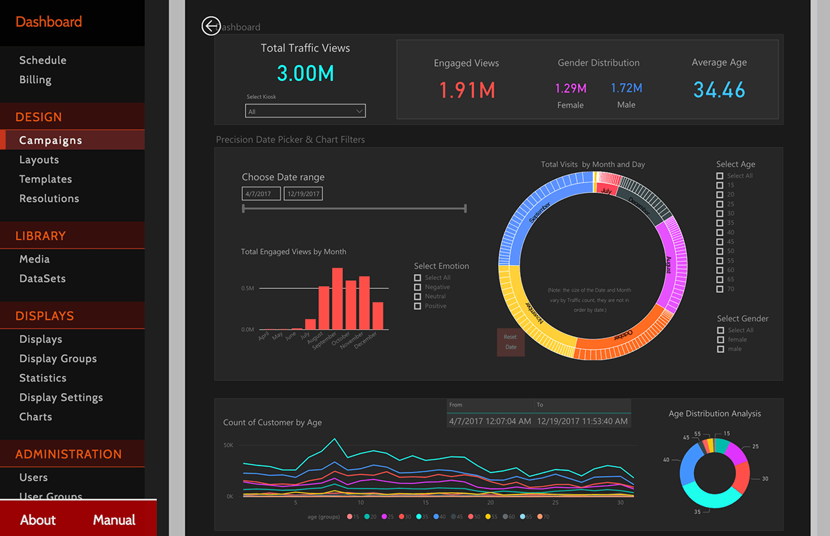
Eventually we decided to display all the data in a single I-frame, rather than partition the data out between several I-frames.
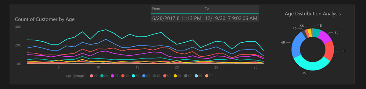
Final Designs
Using the 'dark theme'
An 'Identity Redesign' occurred in between the initial designs and our development of the Data Product.
Management decided that they wanted a sleek, advanced look to the product. I was able to adapt our 'Light' designs to the sleek tech look.
I was also able to introduce a date/time navigation dashboard.
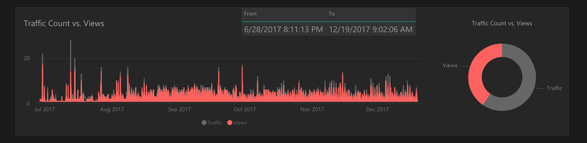
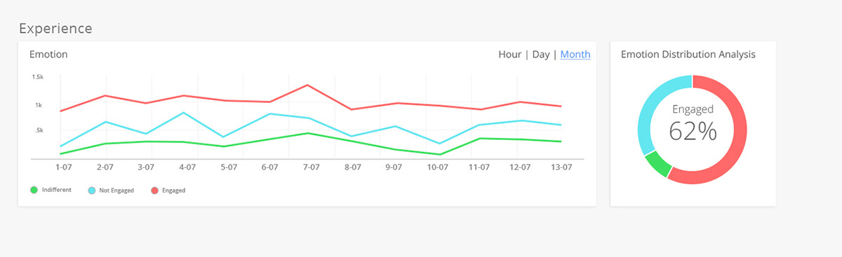
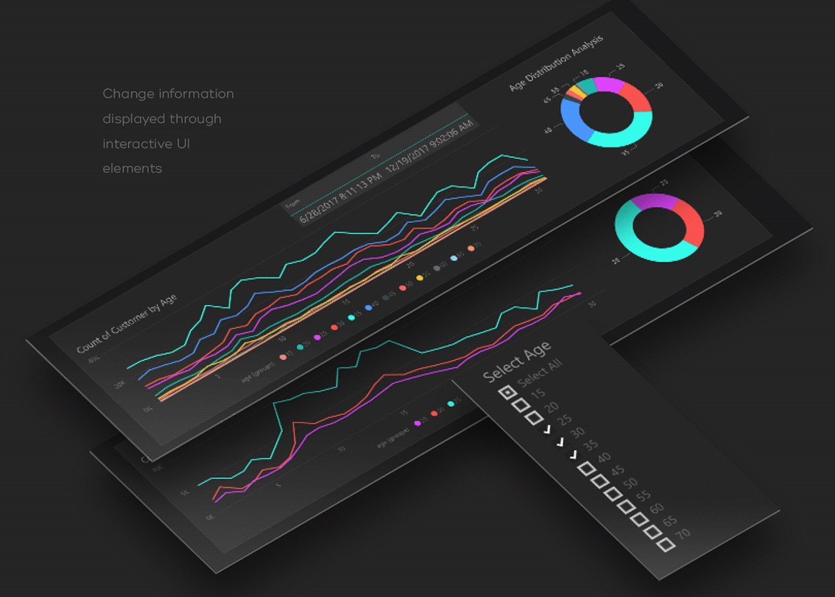
INTERACTIVITY
Dashboard
Selection of Date and Data sorting


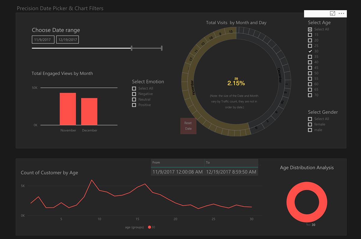


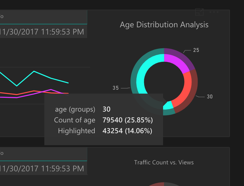
Chart Interaction
Selection of Chart Interactions
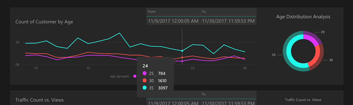


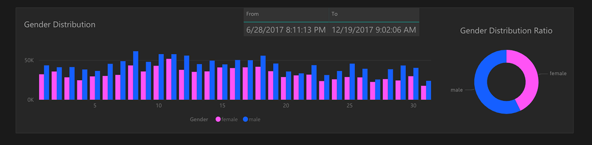
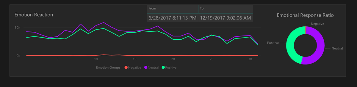
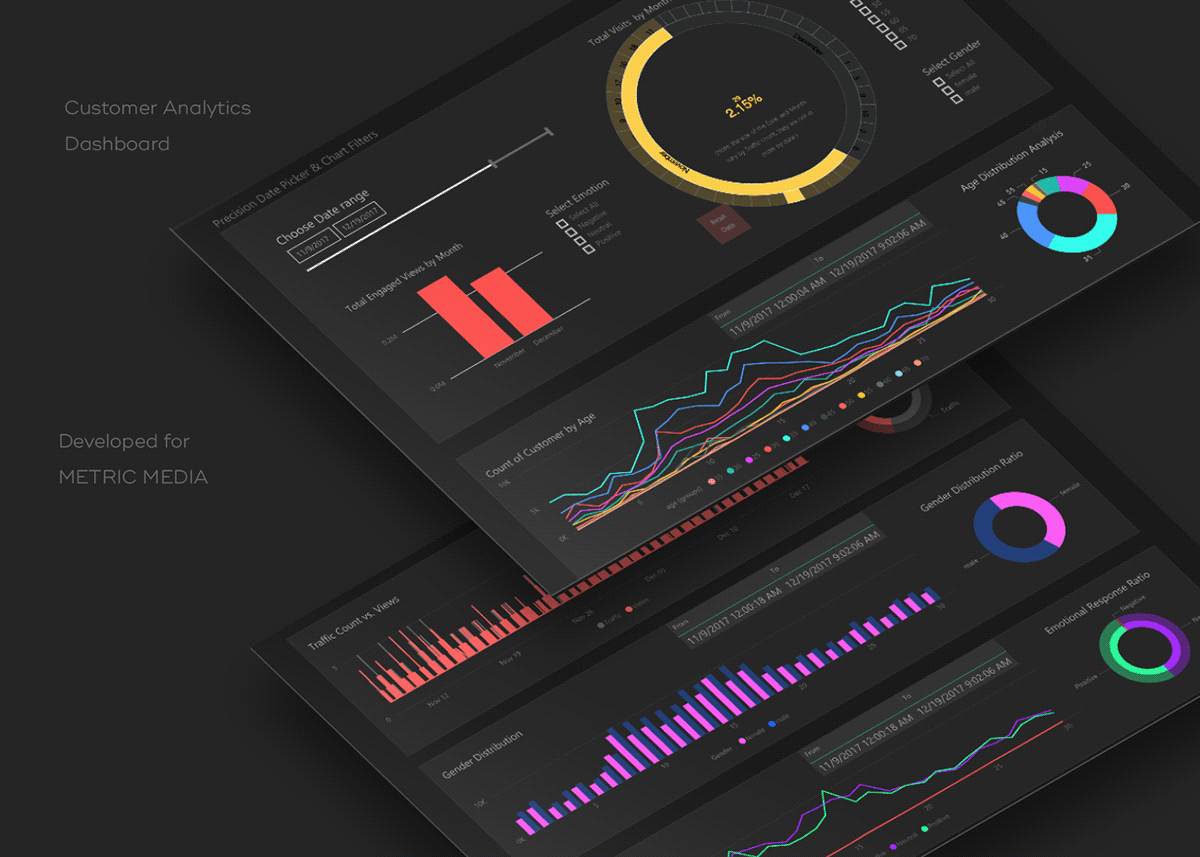
Finished Product:
Charts In Action
Step 5: Validation
Results
The feedback we got from customers was extremely positive. Our data and interviews indicated that we had come up with a product which we could sell.
What I'd revise in Hindsight
• Clearer Text: The text is actually easier to read than it appears in this case study due to the size of the original design on-screen. I'd still push the contrast and boldness of the text, however.
• Date Range format: The 'from/to' display on each chart is an issue. A single, larger and clearer representation of the date might work better - rather than the long series of numbers appearing on each chart.
It would depend on several factors like:
- Does Power BI support 'sticky headers'
- If not, What would it take to build our own which could properly interact with PBi?
- How would changing the info on each individual chart affect the CSV download?
• Reset Data: Although resetting Data was easily accomplished, it was a little awkward. The button method on the dashboard/control panel was a little unrefined as well.
• Relevant Data: Additional information which could be useful to Customer. For example Sales data displayed on the same timeline as the rest of the info.
Dashboard in Dark Design
Charts in Light Design (Accessible)

Thank You

