


Driftwood Bar
Driftwood, the perfect place to end your night. Have some beers and a burger or two before heading on your way back home after a good night out drinking. Great place to bring your buddies and chill a bit after you are tired of jumping and dancing around. Driftwood will provide you with everything you need, from drinks and food, to ice-coffee and free lemon water to help you with the hangover in the morning. There will also be a shuttle van transporting customers between the city center and the bar for both a safe entry and safe return, at no extra cost.
The logo is designed to be open to more than one interpretation, although its main meaning is as a log. To you it may look like everything from a log, to a vinyl record, a wheel, a burger, the top of a beer glass etc. Whatever your interpretation is, it will likely still convey the concept of the bar in a way or another.
(Personal project)

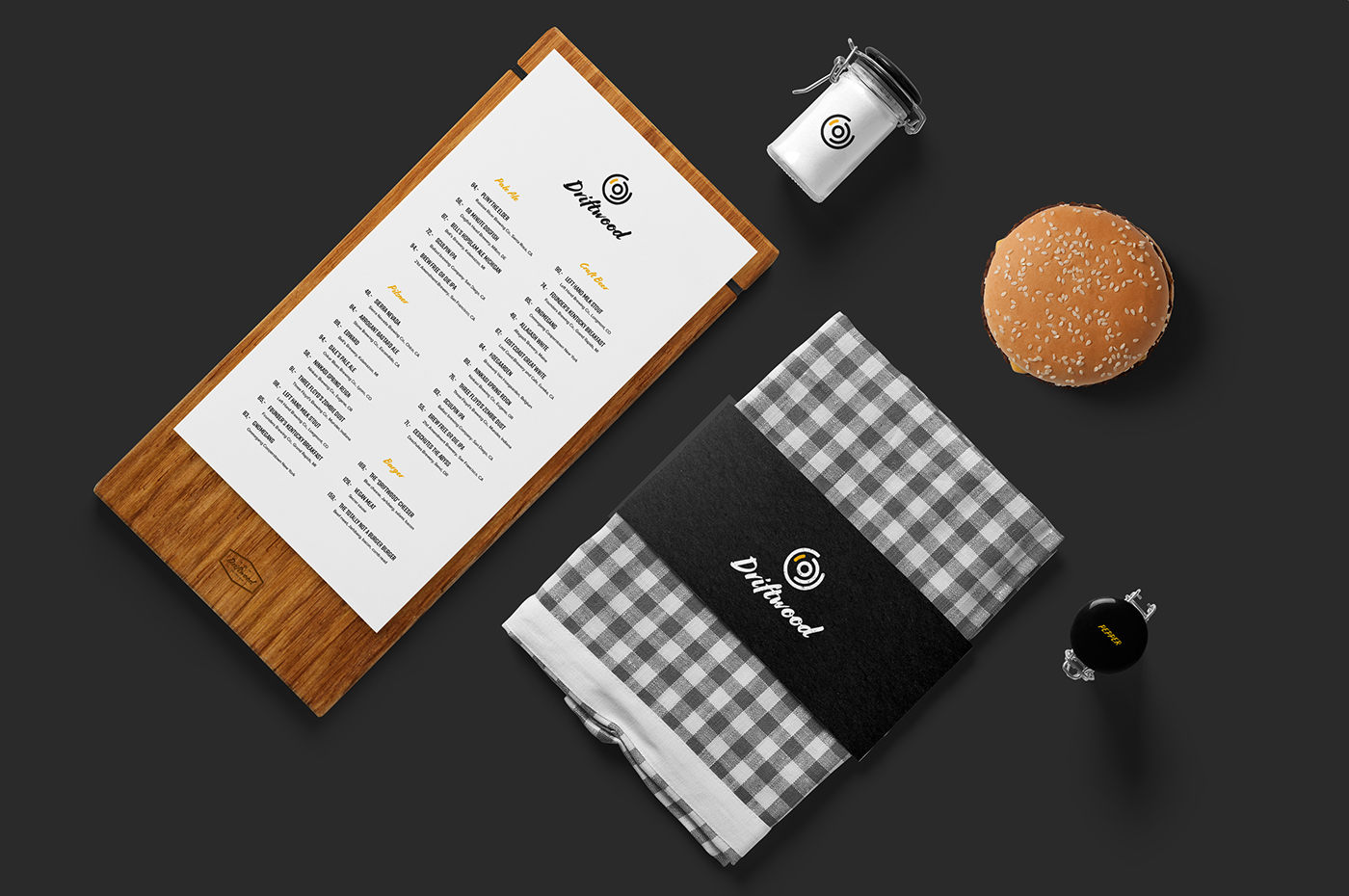
Food and drinks: Packaging design of the burger box, napkin, takeaway box and the most important, Driftwood's own beer emblem. This emblem is also used as a detail in some signage, menus and other places where the main logo is not needed.
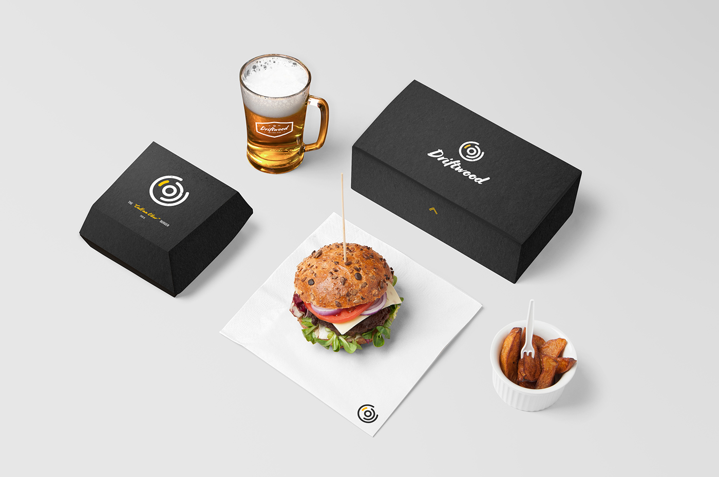
Packaging design and business card: Packaging design of the dip jar, burger box, takeaway bag, pen, ice-coffee and simple, but recognizable business cards. Everything brought together by using elements from the same visual profile.

Employee shirts: A clean and recognizable t-shirt for Driftwood's employees.

Shuttle Van: A way to transport customers quickly and safely to and from Driftwood. Most customers will travel with public transport, but the option of traveling with the shuttle van is available to every customer, at no extra cost.

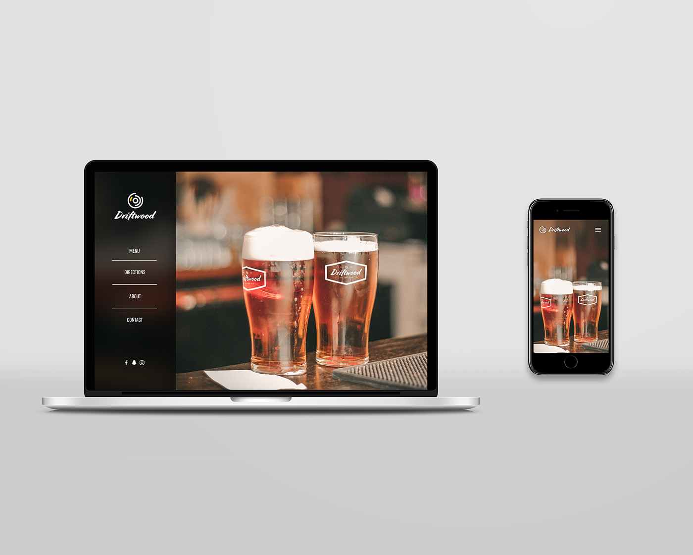
Website: I wanted the website to be quick and easy to navigate. I did not want it filled with unnecessary and uninteresting information, but only what people really want from a place like this; the menu, directions, about and contact information.
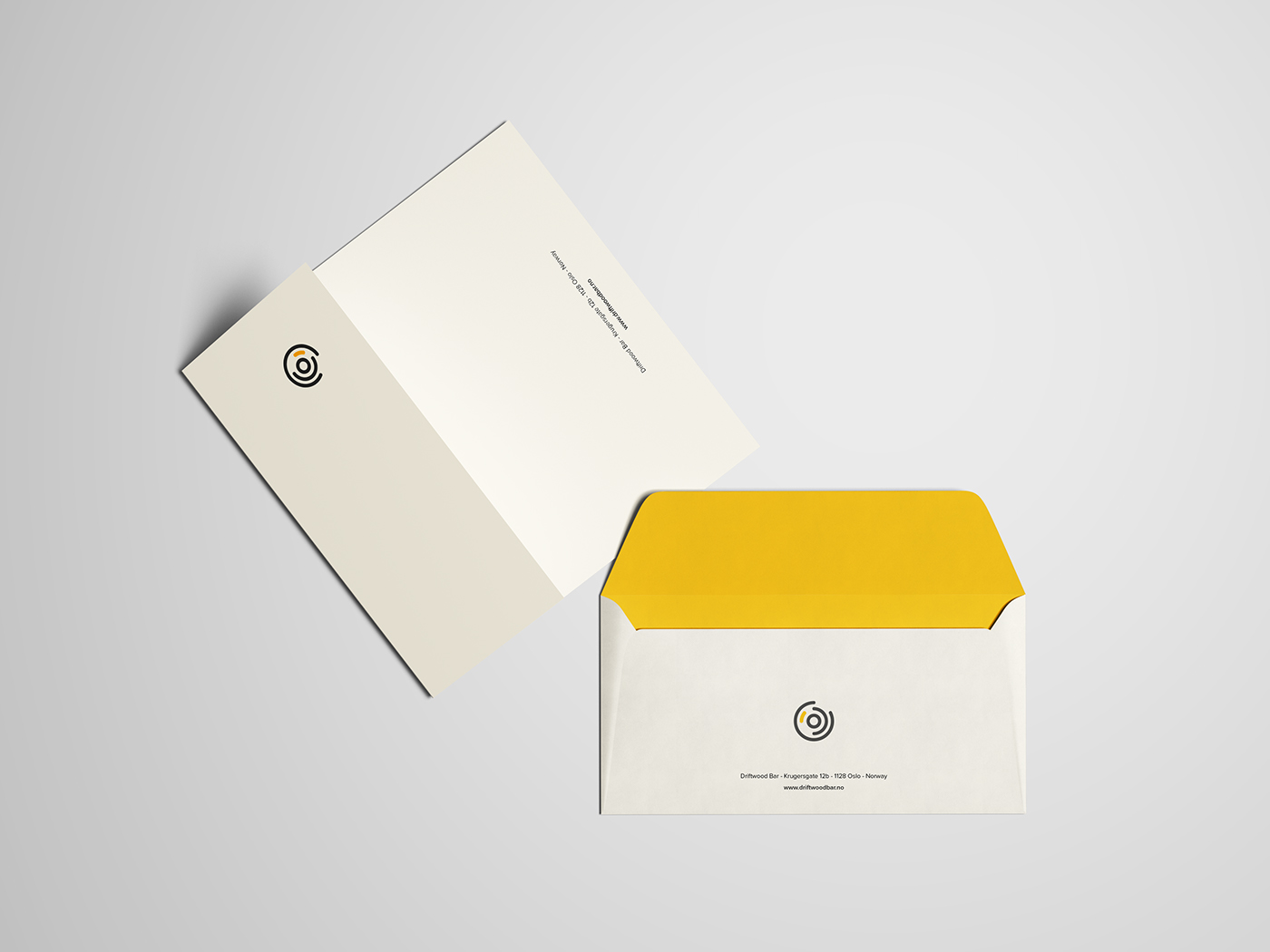
Envelopes and letters: I wanted a bit more formal design for this, but for it to still be within the same visual identity. Other than using the same logo as always, I used the yellow accent color on the inside of the envelope to make everything feel coherent.

Thank you for viewing!
_________


