


#academic_work
#ESAD_Matosinhos
#Project_I
#february_2018
Cineuropa
It is very difficult to introduce something with a label of "European Cinema" because there are many countries, films, movements and different authors. But as George Cloney's character in No-Scale Love says, "I'm like my mother. I create stereotypes. It's faster".
There are several ways to approach films produced in Europe. Through the general history of cinema, the career of its directors, the historical and political context that films often reflect, or through dichotomies. The latter option seems more instigating for an introduction, although more limited and slight. If we go back to the first dispute about the idea of what cinema would become, as we know it, Thomas Edison and the Lumière Brothers already offered a vision of two poles of film production, which can adapt to different times and to the present day.
While the Lumière relied on the evidence of the image because their improvements of Edison's kinetochoscope made the recording clearer and more fluid, in addition to the projection for public rather than individual viewing, films produced in the United States followed the format of reproducing attractions, like boxing fights and dances. The films of the Lumière showed elements such as rhythm and composition (as in the famous The Exit of the Lumière Factory in Lyon and The arrival of the train in the station), besides being chronic of the domestic and social life, and later, reports of the various corners of the world where his cameramen were posted. A little of that will embody European cinema in all its trajectory. While in the United States, moving image is still conceived as attraction, its kinetic aspect detached from the reflective. [...]
The analysis of these authors is an integral part of cinematographic knowledge, as much as the films, and help in the most important experience of the spectator, beyond any argument or discussion, which is to experience what happens on the screen in their own way, rational or privileging the emotion . And for these two perspectives, or for both simultaneously, European cinema is full of opportunities.


Alphabet
From the words of the famous European film critic Roger Ebert, "every great movie should seem new every time you see it", I set out to convey the idea of something at first sight, immutable, but that harbor changes that establish a dialectic between permanence and evolution. This was the basic concept for the creation of the entire visual identity of Cineuropa.
I think the phrase is easy to associate with the festival, since all the films that will be shown are, by chance, already known, but, reunited in a festival, gain a new meaning, which makes possible, on the part of the spectator, a new look.
I think the phrase is easy to associate with the festival, since all the films that will be shown are, by chance, already known, but, reunited in a festival, gain a new meaning, which makes possible, on the part of the spectator, a new look.
I therefore proceeded to the creation of an alphabet that would support this idea conveyed by the phrase. All letters are composed of circumferences of the same diameter, that is, all the same, symbolizing the unity that allows the movies of the programming to assume the joint characteristic of a festival. However, some circumferences present a distinct color, a small change in the chromatic level that represents the individuality of each work.

Poster Program
I decided to highlight the title of the festival in my poster and for that, I centered the title, using the alphabet I created. I set the title of the films trying to create a certain dynamics and kept the same font size in the program, subtitle, place and date, to convey the already mentioned idea of uniqueness between the different films.


Flyer
For the fold-out I chose to perform the folds in a more conventional way: one fold in half and five vertical folds, totaling 15 sheets. I chose to do it in size A2, since I considered it to be the most appropriate, given the amount of text and information that would need to be introduced. Each film is accompanied by its respective technical data sheet, synopsis and frame.

Post-Cards
For the postcards on the front, I applied a red or blue filter to the frame and its caption with the name of the movie and the year of its release. On the reverse side I also kept by the conventional, placing just the title of the festival, the logos and the space for the seal. The rest of the space remains blank so that the user can write his message and enter the recipient's address.
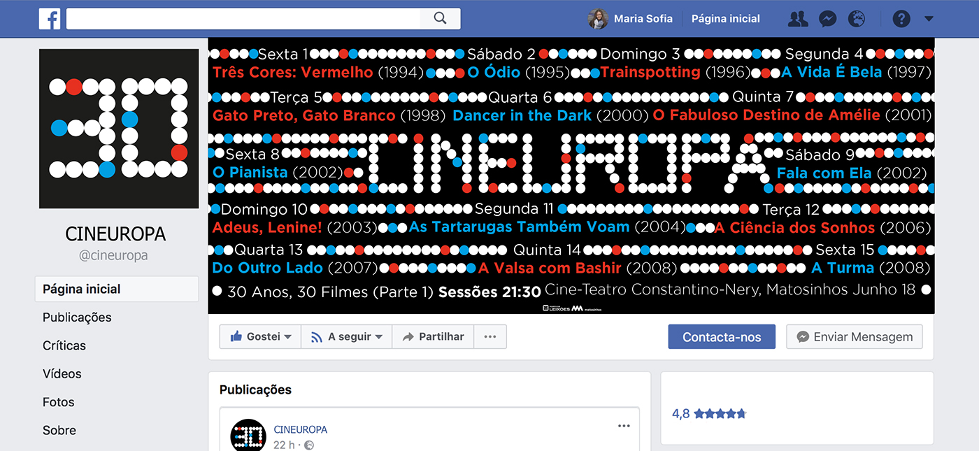
Facebook page
I tried to be as succinct as possible in the profile picture, putting only the number 30 with the alphabet I created. This choice was due to the fact that the number 30 is one of the characteristics of the festival - 30 years, 30 films - and my alphabet accurately conveys the characteristic visual identity. In the cover photo I used the same information as the poster program, adapting your organization to the space.

Banners
For the banners I restrict myself to the strictly necessary, placing only the title of the festival, sub-title, place and date. Again, I made a vector drawing for the mock-ups of them.
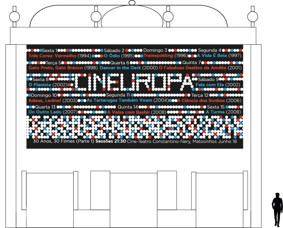
Big screen
After photographing the Cine-Teatro Constantino-Nery, I set out for a vector drawing of the building. I opted not to use a photograph, since I designed all the mock-ups and still not to cause too much visual noise, therefore, making it easier to understand. On the big screen, again, I used the same information as the poster program, organizing it according to the space available.

T-shirt
For the t-shirt I introduced the phrase that was the basis of any project, with the alphabet that I created, thus transmitting the visual identity of the festival.

Pin
The pin was made similar to the profile photo for facebook, for the same reasons I have already mentioned.

CD cover

CD
For the suggested object I created a playlist on spotify (https://open.spotify.com/user/11141564217/playlist/6pyLUUgGIiQvk1HL0VmD4O?si=D6XHeLvCRyCuNL61eWECRA), where I gathered a song from each of the soundtracks of the movies that will be displayed throughout the festival. I selected the most characteristic song of each work to constitute the playlist. Then, I made a cd, with the pattern of the circumferences that constitute the festival. In the cover of the cd we have the title and the sub-title and in the verse the title of each song and the respective film.
This work was featured in On Snot and Fonts http://luc.devroye.org/fonts-92955.html


