
We were delighted to redesign the identity of the MOUSIOU bakeries that have been established in Larissa since 1969.
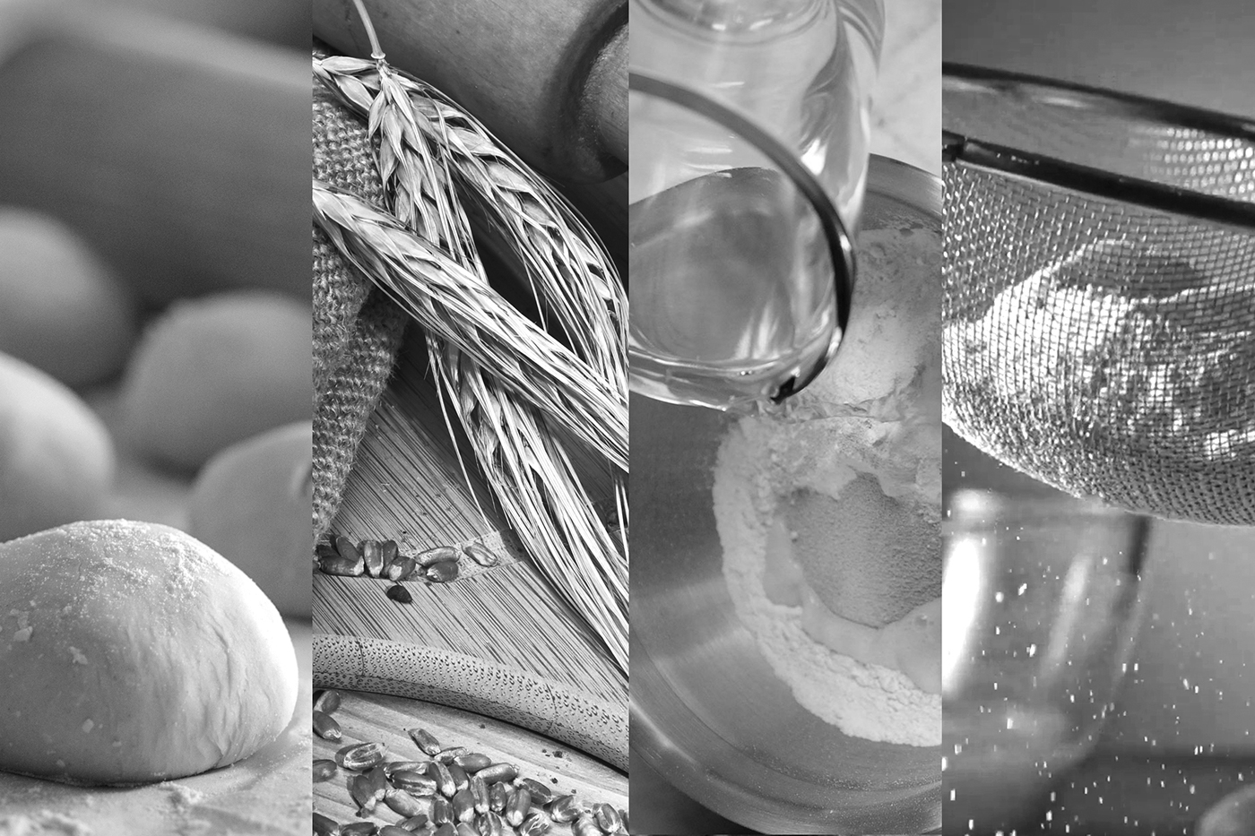
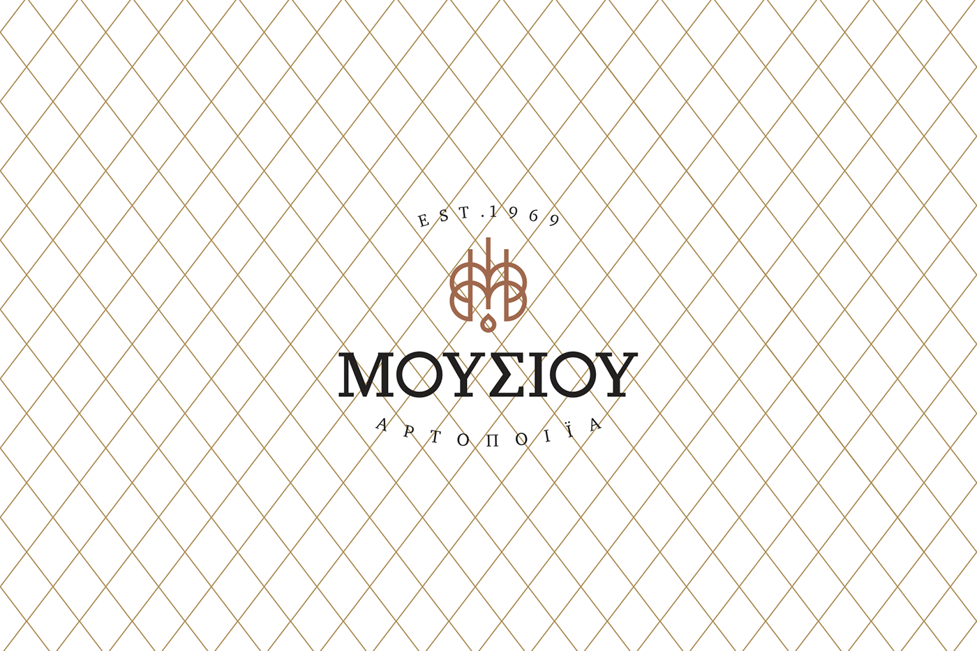
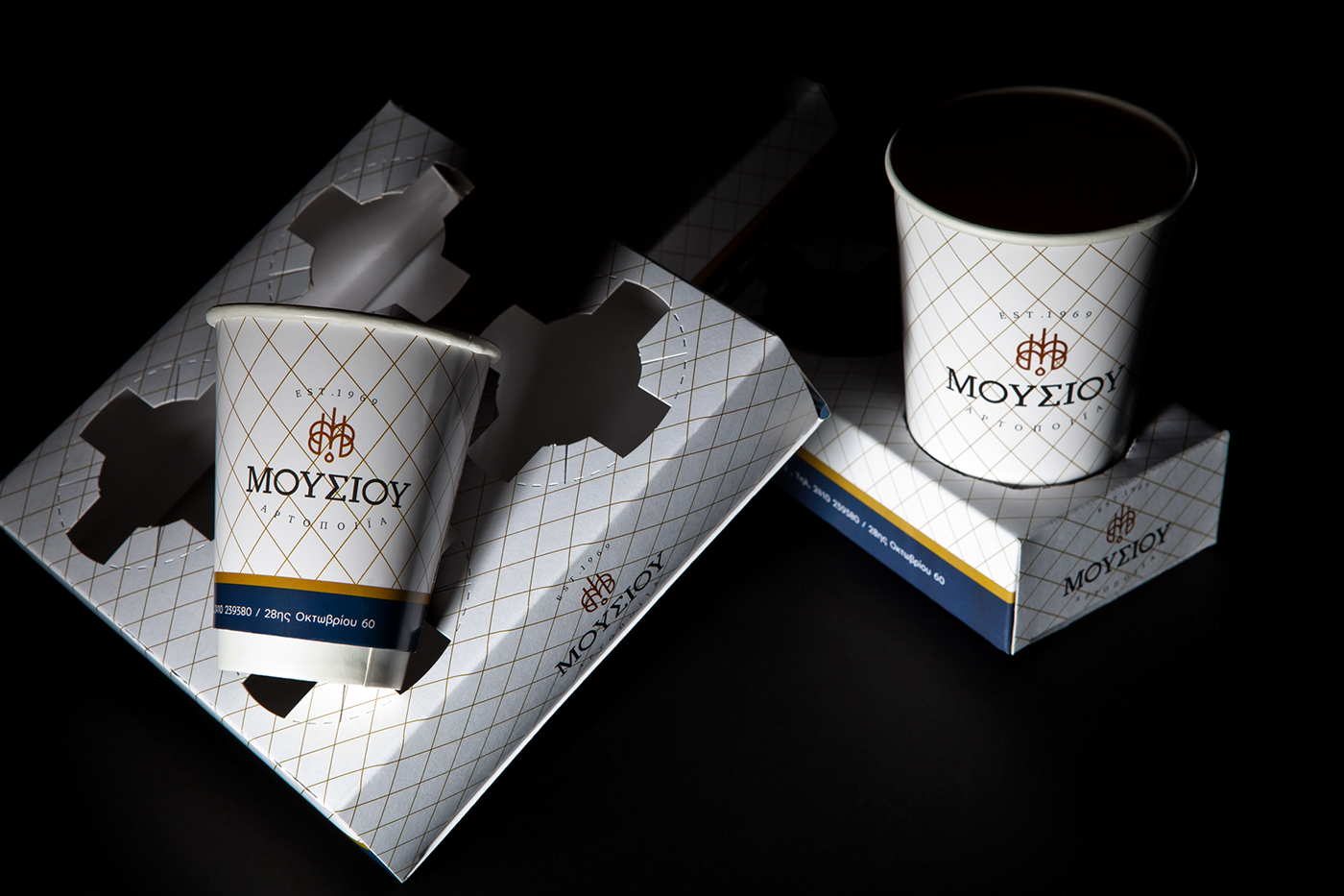
Inspired by the M in the last name of Mousios brothers, Michalis* and Dimitris - the owners of the bakery, and we used it in duplicate to form two concentric circles that create the image of bread.The logo was completed with strict vertical lines, which give the shape of wheat in a distinctive way. The drop of water - a basic ingredient for the production of bread - blends harmoniously into the symbol - a new logo of the Mousios Bakery.
A dominant element in identity is the sieve, used to sift the flour. The sieve gives its place in a unique pattern in all applications with respect to the tradition and history of the bakery. The colors chosen are gold, bronze and blue black, the color found on the granite used in the exterior lining of the space that houses the bakery.
*Mr. Michalis Mousios is president of the Federation of Greek Bakers.
Credits
Photography: Michael Koronis copyright ©
Photography: Michael Koronis copyright ©