TYPOGRAPHY - GOTHAM
Week 1 Assignment
GOTHAM A HISTORY
The Gotham typeface was commissioned by GQ magazine, editors wanted a new font that fused a geometric, masculine and fresh style into a new font. Gotham was designed in 2000 by American designer Tobias Frere-Jones. On a historical note it is found emerging and inspired by architectural lettering of the 1920s era and more so the, 1930s American Sans-Serifs and NEW YORK CITY’S argot lettering in building thrown together by engineers and draftsmen. The inspiration for Gotham came from New York’s port Authority bus terminal.
Otherwise emerging from urban landscape of New York. American in Its own right. The Gotham typeface is a result inspired by futura that mixed a general design approach. The association of the typeface with New York City it is one of the first American made geometric and modern typefaces. Gotham is multipurpose and is used in an assortment of ways. It is most often seen in logos for big brands. It is more humanistic, which makes it more ordinary but very up-to-date and new.
First used by men’s fashion magazine GQ who lost the license in 2002 seen the font being released publicly. Since creation Gotham has been highly visible due to its appearance in many places. It has been used by newspapers, corporate logos, movie posters and packaging for brands such as Coca-Cola, Netflix, Crest. It formed the central election campaign material in the 2008 US Presidential election used by John Edwards and Barack Obama. The font was also used by the Australian Labor Party in 2016. Other major branding campaigns or brands have incorporated and used Gotham. For example 2014 FIFA World Cup logo, the 2016 Chicago Olympics and is used by Saturday Night Live. Most recently The Cartoon Network Logo, Twitter logo and Miami University. The font has also been used as the cornerstone of the One World Trade C enter, the tower built on the site of the former world trade centre in New York. It is also the current font to be used by MPAA title cards for film trailers in the U.S.
Gotham Features
Gotham is a sans-serif geometric shaped typeface. With a range of diverse weights, and is very versatile and robust. The strokes of the font form uniform shapes, low contrast between thick and thin lettering. , however on closer inspection very slight difference can be observed within the lettering The typeface has very round near globular arcs with an x-height exactly in the middle of the ascent and decent which are petite, dumpy or tiny .
Gotham is humanistic in nature unlike the other geometric fonts such as futura and avenir and it ends this well but in a delicate way. Which can be seen when using the font The font has angled terminals and a mixture of horizontal and balanced crossbars. It yields both flat and extended terminals with square points and vertical stress like a new York building. Gotham has a variety of type fonts and form part of a large group of fonts. It boosts four widths, eight weights or different designs for online and VDU display.
Sources
Wikipedia https://en.wikipedia.org/wiki/Gotham_(typeface). Accessed online 10 February 2018
Flywheel https://getflywheel.com/layout/surprising-crazy-typefaces/ accessed online 10 February 2018
Hutwit, Gary. “A Font We Can Believe In.” Helveticafilm.com. 19 February 2008. Accessed online 23 June 2014.
Https://morganlmurrayims224researchtopic.wordpress.com/2014/06/23/gotham/ Accessed on line 10 February 2018
Week 2 Assignment
Monogram

MONOGRAM 1


Business Cards


Week 3 Assignment
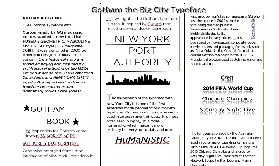
Gotham the Big City Typeface
GOTHAM A HISTORY
The Gotham Typeface was Custom-made by GQ magazine, editors wanted a new font that FUSED a GEOMETRIC, MASCULINE and FRESH style [GQ Magazine 2018]. It was designed in 2000 by American designer Tobias Frere-Jones. On a historical note it is found emerging and inspired by architectural lettering of the 1920s era and more so the, 1930s American Sans-Serifs and NEW YORK CITY’S argot lettering in building thrown together by engineers and draftsmen[Tobias Frere-jones].
GOTHAM
BOOK
BOOK
The inspiration for Gotham came from nEW yORK’S pORT aUTHORITY bUS tERMINAL Otherwise emerged from urban landscape of New York. American in
its own right. The Gotham typeface is a result inspired by FuturA that mixed a general design approach.
NEW YORK
PORT
AUTHORITY
The association of the typeface with New York City it is one of the first American made geometric and modern typefaces. Gotham is multipurpose and is used in an assortment of ways. It is most often seen in logos.. It is more humanistic, which makes it more ordinary but very up-to-date and new.
HuMaNiStIC
First used by men’s fashion magazine GQ who lost the license in 2002 seen the font being released publicly. Since creation Gotham has been highly visible due to its appearance in many places. it has been used by newspapers, corporate logos, movie posters and packaging for brands such as Coca-Cola, Netflix, Crest. It formed the central election campaign in the 2008 US Presidential election used by John Edwards and Barack Obama.
COCA-COLA
Crest
2014 FIFA World Cup
2014 FIFA World Cup
Chicago Olympics
Saturday Night Live
The font was also used by the Australian Labor Party in 2016. . The font has also been used in other major branding campaigns such as the 2014 FIFA World Cup logo, the 2016 Chicago Olympics and is used by Saturday Night Live. Most recent Cartoon Network Logo, Twitter logo and Miami University.
The font was also used by the Australian Labor Party in 2016. . The font has also been used in other major branding campaigns such as the 2014 FIFA World Cup logo, the 2016 Chicago Olympics and is used by Saturday Night Live. Most recent Cartoon Network Logo, Twitter logo and Miami University.
The font has also been used as the cornerstone of the One World Trade Center, the tower built on the site of the former world trade center in New York. It is also the current font to be used by MPAA title cards for film trailers in the U.S.
FEATURES
Gotham is a sans-serif geometric typeface. With diverse weights, and is very robust. The strokes of the font form uniform shapes, low contrast between thick and thin lettering. , however on closer inspection very slight difference can be observed within the lettering
The typeface has very round near globular arcs with an x-height exactly in the middle of the ascent and decent which are petite, dumpy or tiny .
Gotham is humanistic in nature unlike the other geometric fonts such as futura and avenir and it ends this well but in a delicate way. Which can be seen when using the font
The font has angled terminals and a mixture of horizontal and balanced crossbars. It yields both flat and extended terminals with square points and vertical stress like a new York building. Gotham has a variety of type fonts and form part of a large group of fonts. It
boosts four widths, eight weights or different designs for online and vdu display.
Sources
Wikipedia https://en.wikipedia.org/wiki/Gotham_(typeface). Accessed online 10 February 2018
Flywheel https://getflywheel.com/layout/surprising-crazy-typefaces/ accessed online 10 February 2018
Hutwit, Gary. “A Font We Can Believe In.” Helveticafilm.com. 19 February 2008. Accessed online 23 June 2014.
https://morganlmurrayims224researchtopic.wordpress.com/2014/06/23/gotham/ Accessed on line 10 February 2018

Week Four Assignment Poster
Poster 1

Poster 2


