Agua Branca park - Brand Manual
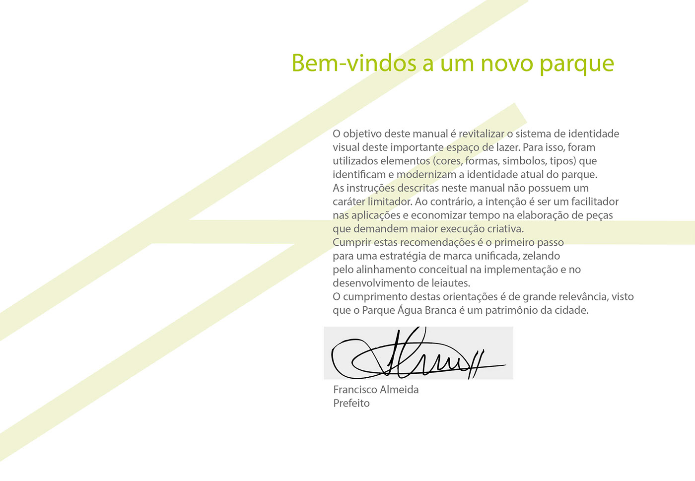
I created a beta brand manual to Agua Branca park, located in Sao Paulo, Brazil. The intention was to renew the visual communication of all signage of the park with modern appeal and valuing what already existed there, in the choice of the chromatic scale of all the elements.
The color B3C515 on the cover of the brand guide refers to the experience of rural interaction proposed by the attractions of the park.


Summary

Elements of primary identity - Logos

Elements of primary identity • Chromatic variations
Version color • PB version • Gray tones • Negative • Monochromatic versions

Elements of primary identity • Institutional Typography

Color Palette
The Agua Branca park color palette includes primary, secondary and tertiary palettes. The standard are tertiary colors may include orange, dark blue, brown and blue.
If you would like, you may use as few as two colors. When representing the sky, you may accent the Agua Branca blue with orange from the secondary and tertiary palettes.
For undergraduate materials, don’t be afraid to use to use the pink and purple as hero colors in the spread.

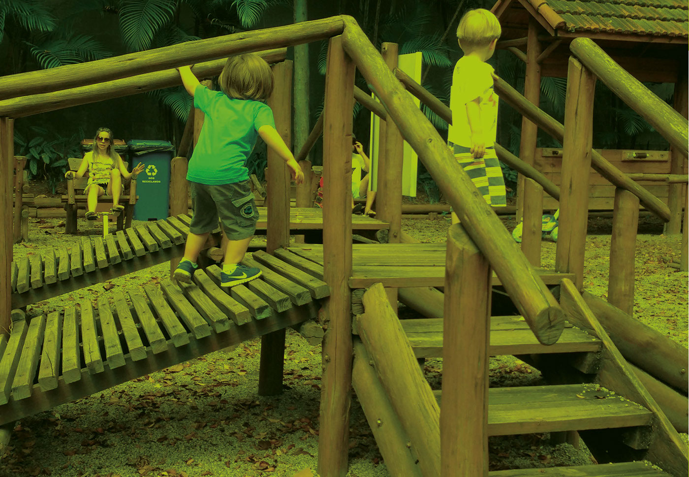
To the park-wide communications, use one or more tertiary colors as accents to copy or photos, but not as fields of color that compete with the overall orange, green or pink theme. On first picture ( on left), the organic products fair - it is traditional for offering fruits and vegetables grown without pesticides. It's health in abundance every Sunday to the public.

Primary Identity Elements
To call attention to sports practice in the park- such as running, the monochrome colors orange and blue, applied to the logo confirms the energy of the space.

Overarching color example - Office supplies

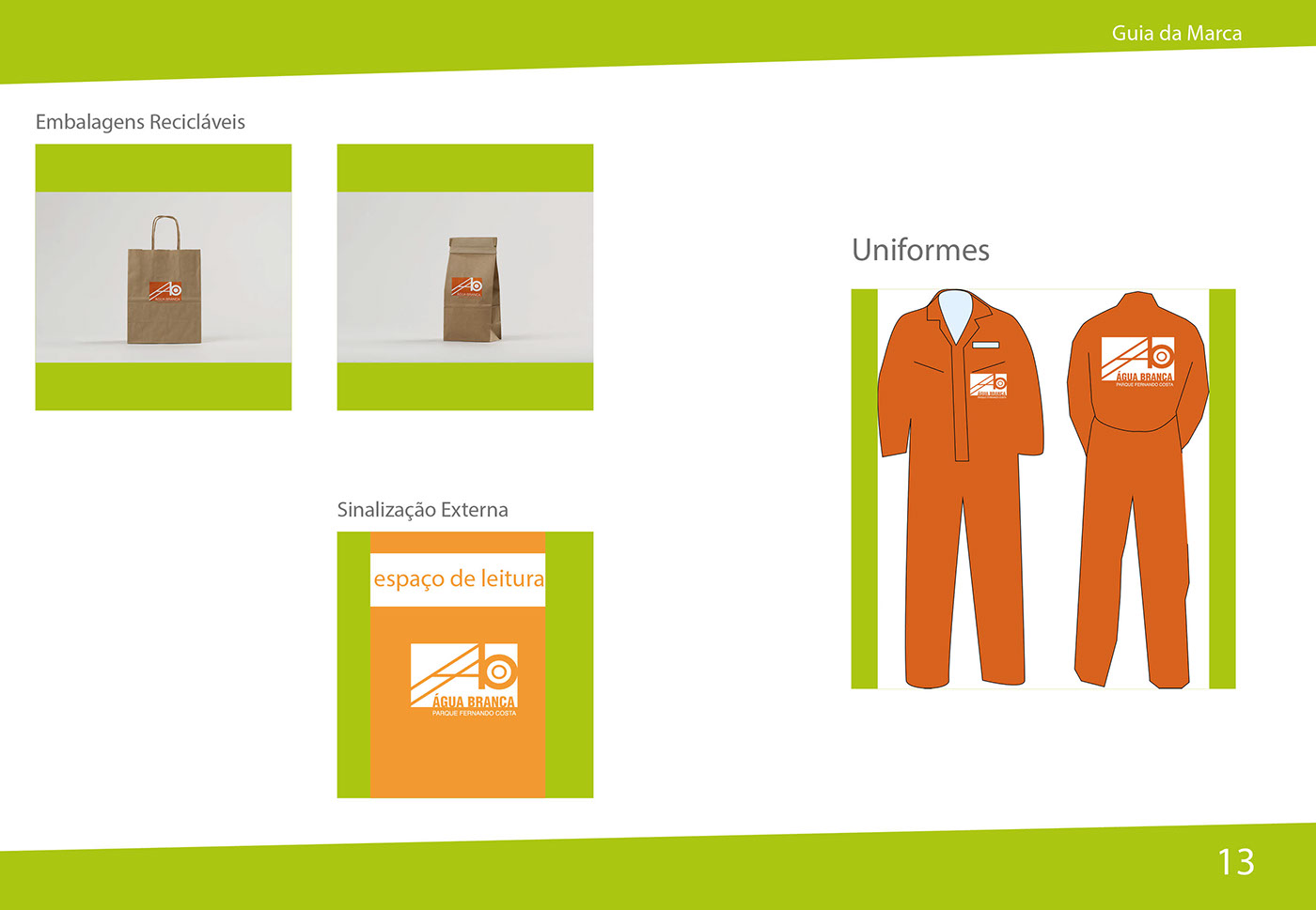
Recycled packaging/ External Signaling - Acrylic signs / Staff uniforms