


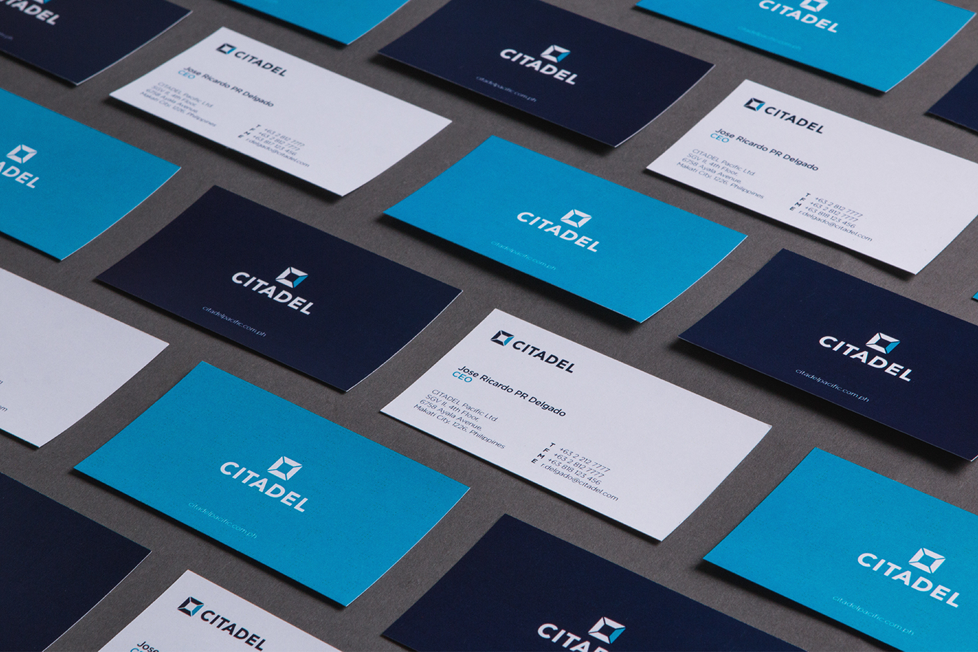

The CITADEL logo consists of a combined brandmark and logotype.
These are represented in a “C” symbol with a facet showing the top view of a citadel and a logotype for the company name.
This logo reflects a clean and contemporary appeal.


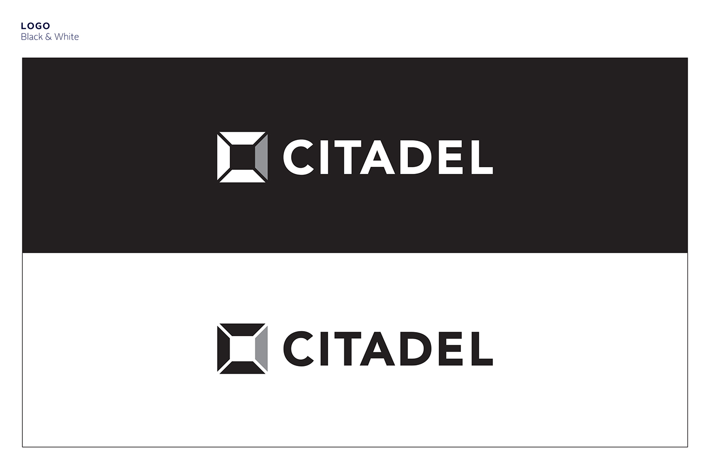


Reliability is represented in the citadel tower’s strong characteristic of being able to resist and withstand anything.
Growth is shown in the logo’s shape and form similar to a pathway reaching a goal which depicts moving forward or going upwards.
Diversity is implied in the facet that completes the form of a citadel tower as it denotes the various subsidiaries of the company.


