


Task
Sun City is a unique center of dance creativity for children and adults (from 3 years old, up to 70+), based on the deserved collective of folk art of Russia with 37 years of experience. The center trains and produces professional dancers who easily enter the choreographic universities, and also allows people with any level of training to practice dancing as a hobby.
Goal of the project is to expand the audience by changing the vector from the classes with children to the "dance for all" format.

Positioning and brand platform
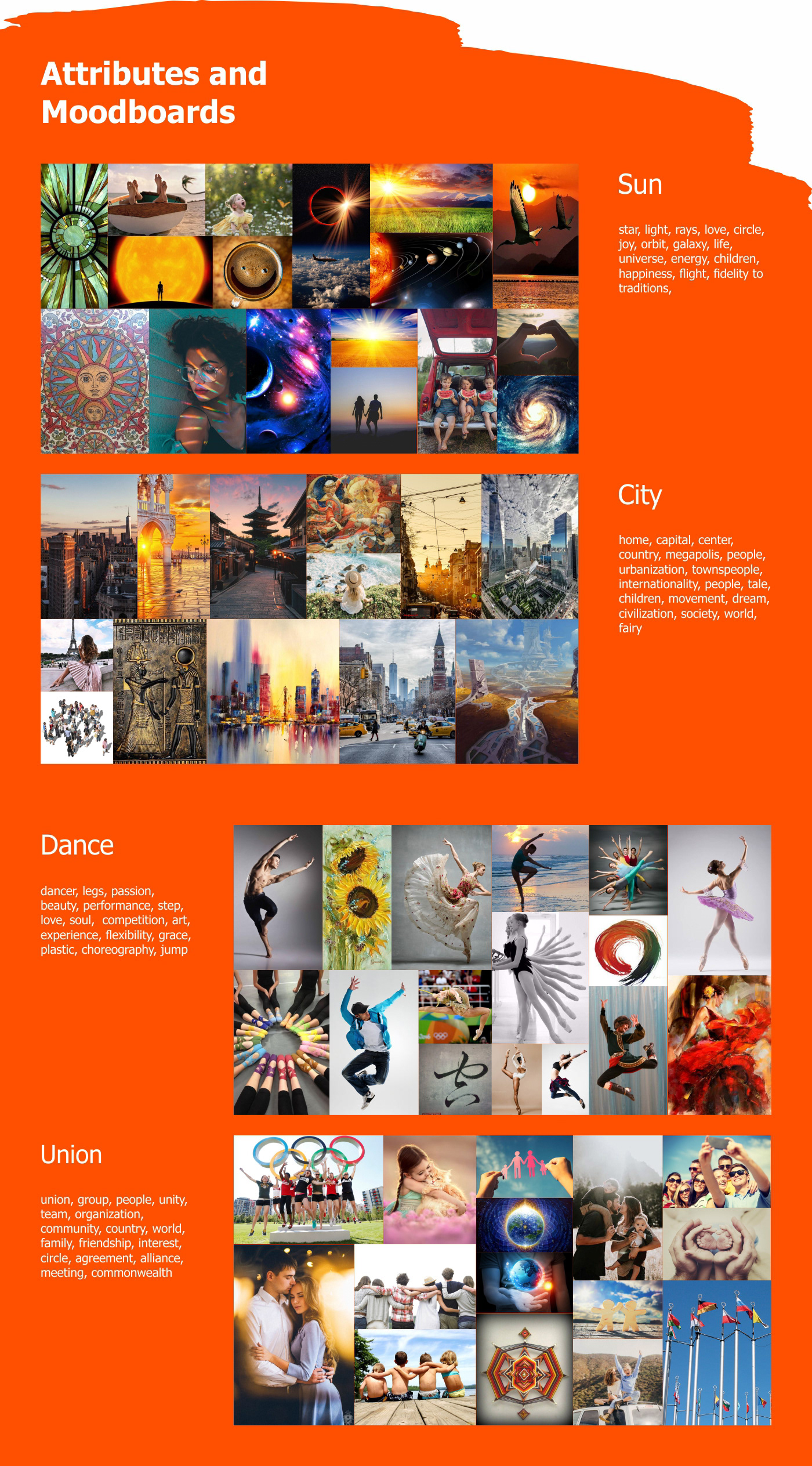
To attract such a diverse audience it was necessary to study why people might want to dance. In the course of market research, taking into account the company's resources, with the subsequent analytical part, the competitive advantages and values of the dance center were formed. This was used in the construction of the positioning strategy. The identified motives of target audiences were used in the communication strategy.
Naming
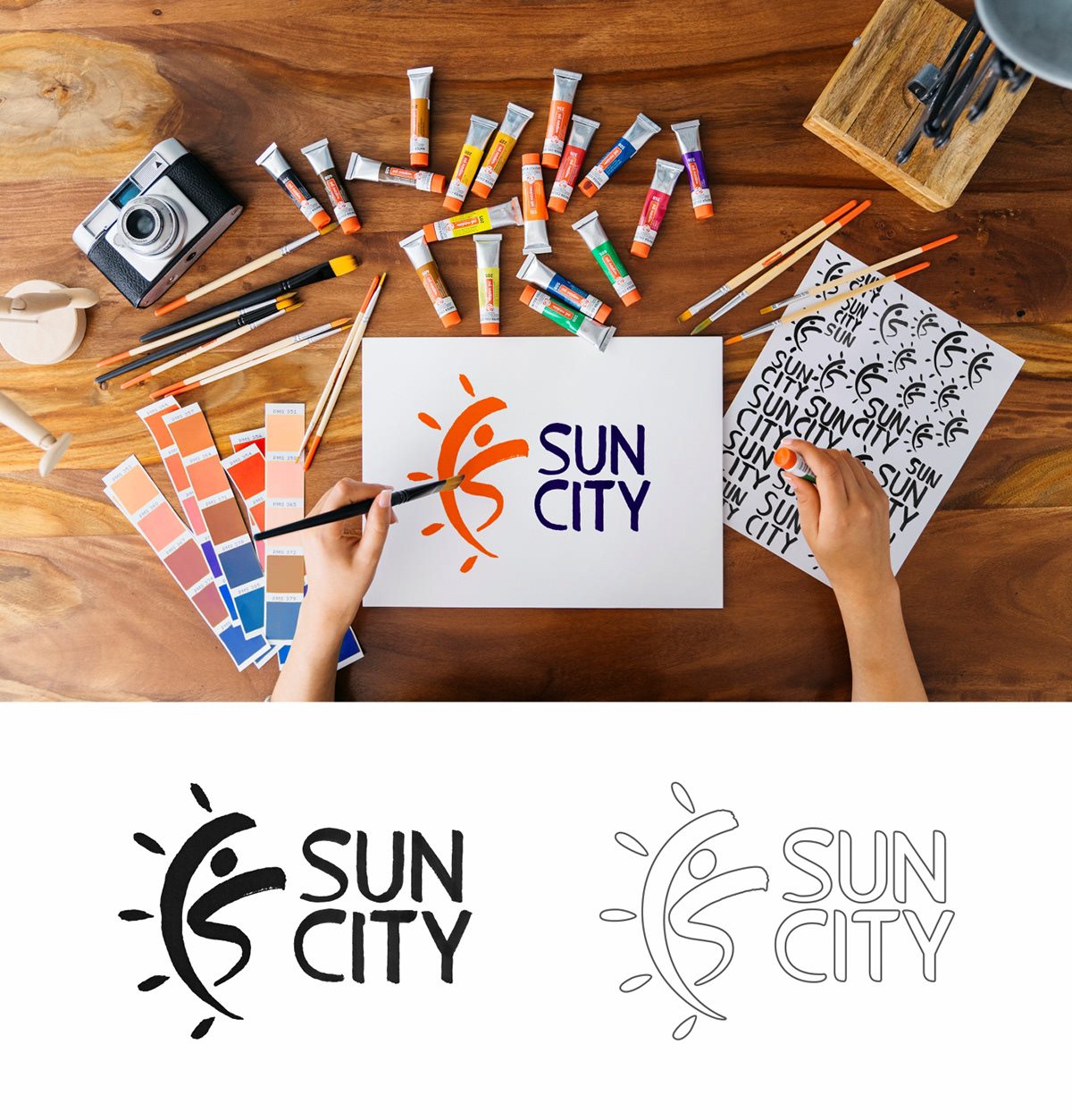
The dance center will cover the whole city and is designed for a very large number of visitors of different ages and different views. Also the client wanted to leave a binding to the choreographic ensemble "Solnyshko", on the basis of which the center was planned. Therefore, in the process of naming, a definition such as "Sunny City" appeared. In the end, we settled on the name "Sun City".
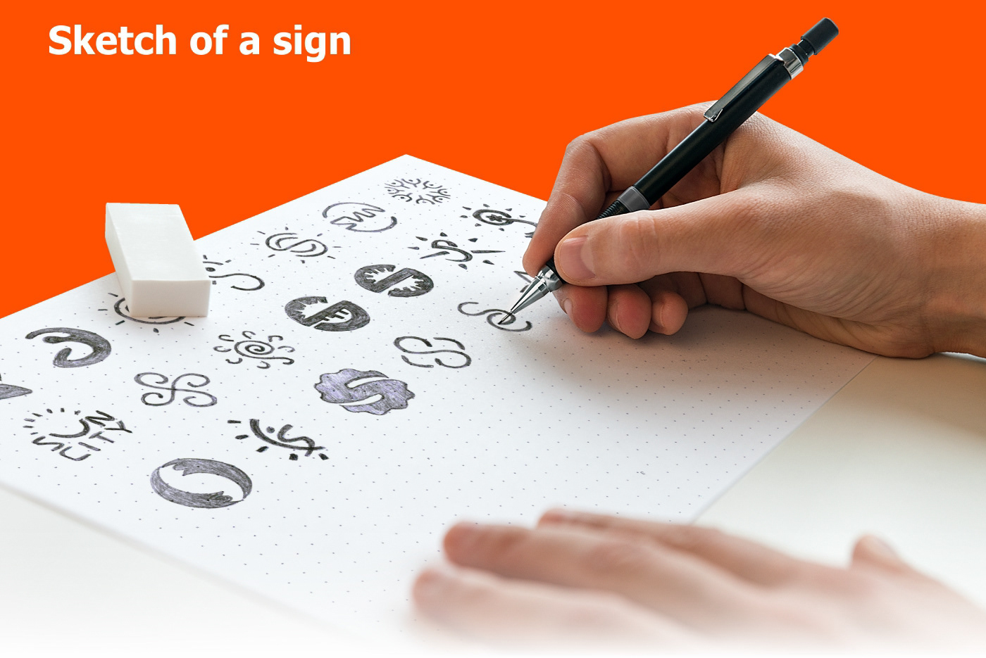
When choosing a form, I rely on the fact that the logo should be understandable for different audiences of different ages and with different preferences in dances. The form should be such that, depending on the context, the nature of the logo changes. I draw in the vector three most interesting sketch of the sign and compare it with the client.

Styling elements
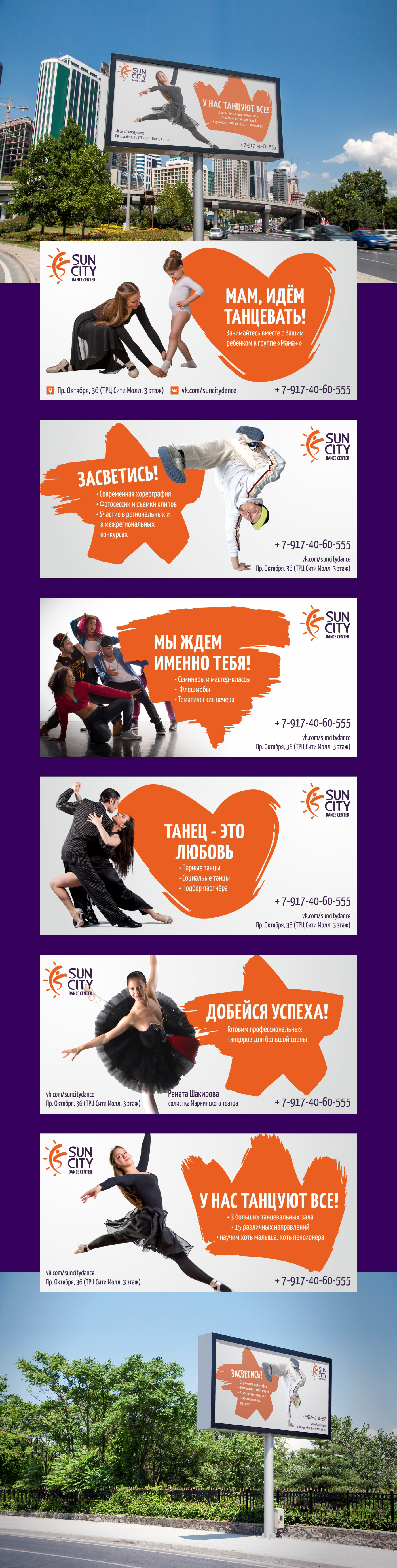
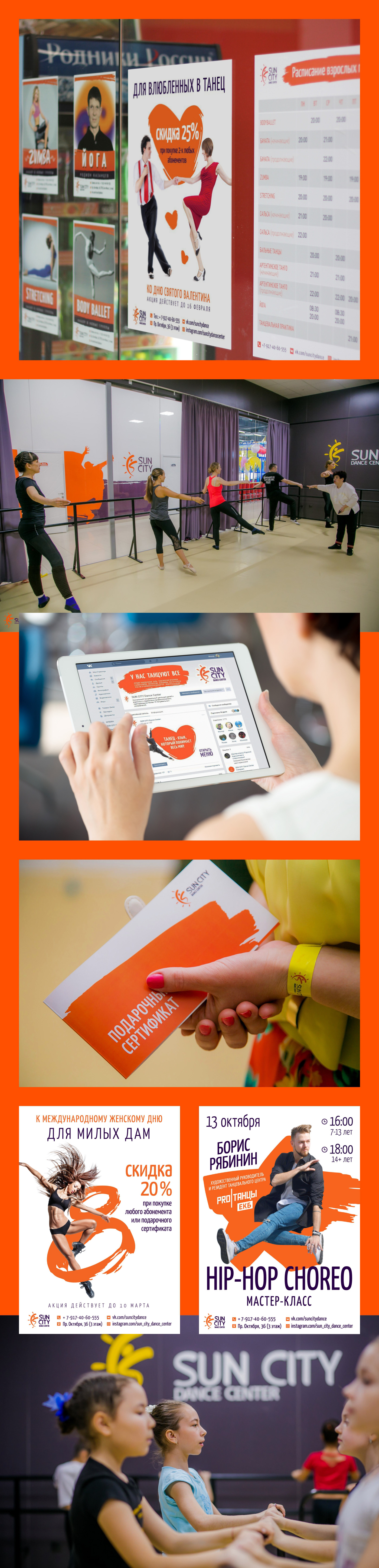
Universal style-forming element in the form of a brush stroke was developed. Brush stroke will give a reference to the idea of dance as an art and has a good potential for the development of visual identity.
It can be used as a graphic element for layout design, or as a branded dice, to focus on the text placed in it. The element itself can be of absolutely any shape. For additional visual reinforcement of slogans, basic elements of certain forms were drawn. They turned out to be rather multivalued and can be used for other messages.

Guideline
Creating a guide to working with verbal and visual elements of the brand is an important task. Due to the correct use of components, it is possible to achieve a holistic image of the brand. Media and promotional materials are not discordant, and each time complement the idea of your brand in the minds of people. Compliance with the rules of using the corporate style in the compartment with reliance on positioning is a powerful solution for creating effective communications that allow you to communicate the meaning and messages to the target audience more quickly and clearly.

Result
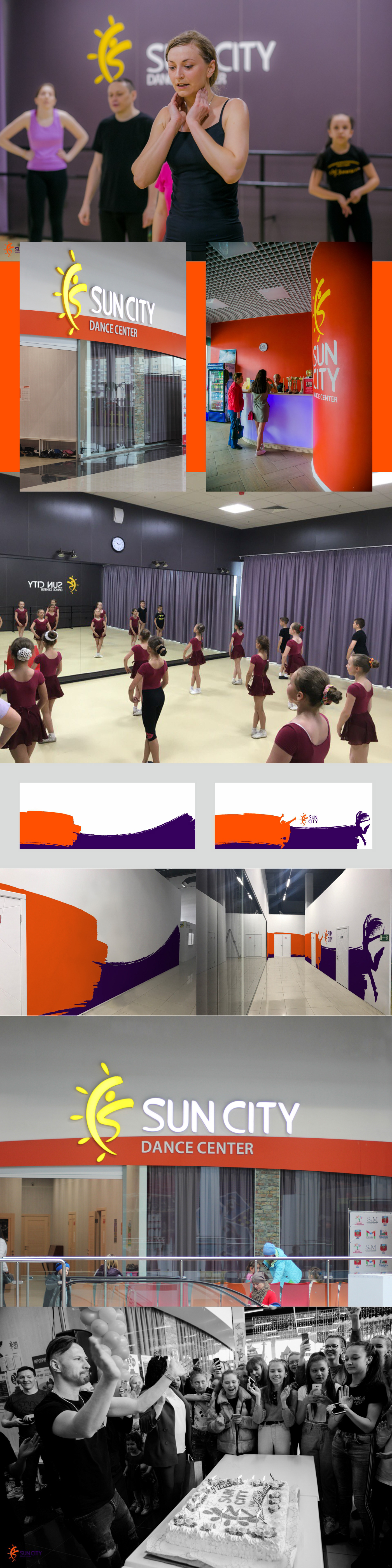
The stage of implementation is important in that it is in it that the meanings identified with the customer acquire the final form and begin to contact the consumer. And we managed to solve the issue of changing the nature of identification. It can look serious or daring, depending on the context. This can be seen from the fact that, without hesitation, young people come into contact with it, for which it is now a way to stand out, and older people, for whom it is a sign of the quality of the best dance center of the city.
The center is visited by people, aged from 3 to 60 years. The influx of customers was so great that, before the opening of the second season, it was necessary to expand the lease area and finish building 3 more dance halls and two additional dressing rooms. The big family of Sun City is growing and growing stronger.

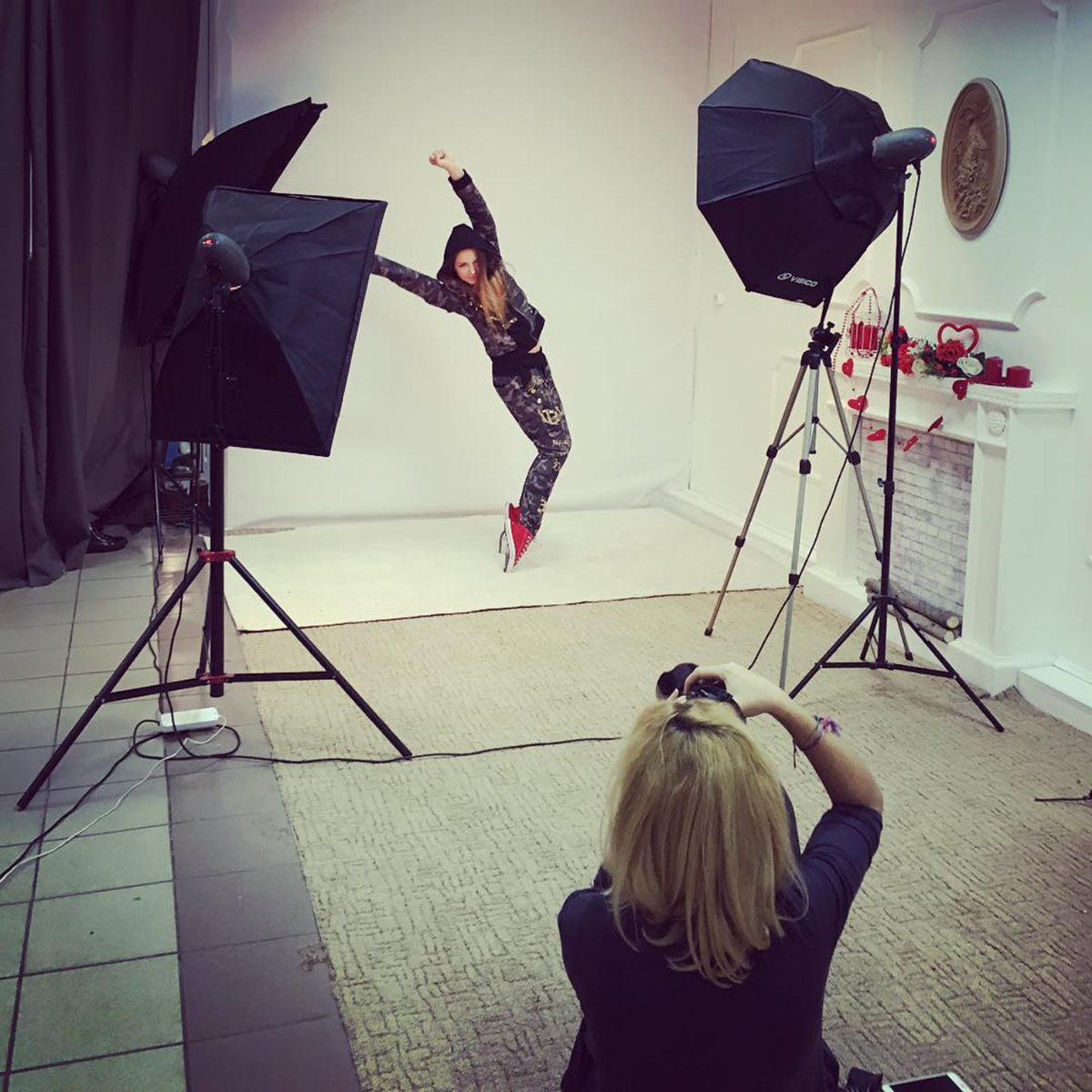
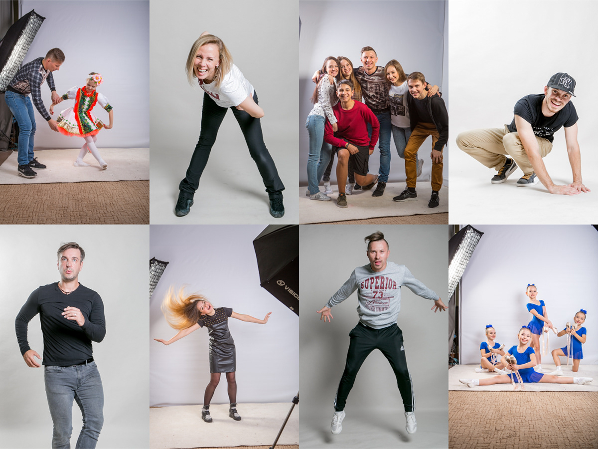
Photosession
To launch the project and its advertising campaign, advertising mock-ups were created, using photos of dancers. We spent a long time discussing the posing and setting of the light and, as a result, received excellent photographic material for the work.

Art Direction & design: Ilnur Nasretdinov
Photosession: Ekaterina Averyanova
Grafors, 2016
Photosession: Ekaterina Averyanova
Grafors, 2016


