


Antonio Vivaldi - Visual Hierarchy Project
This project focuses on producing a composition using visual hierarchy. During this process, I experimented with typefaces & type size; spacing & measurement; weight and scale. Then, I incorporated elements with color and image.
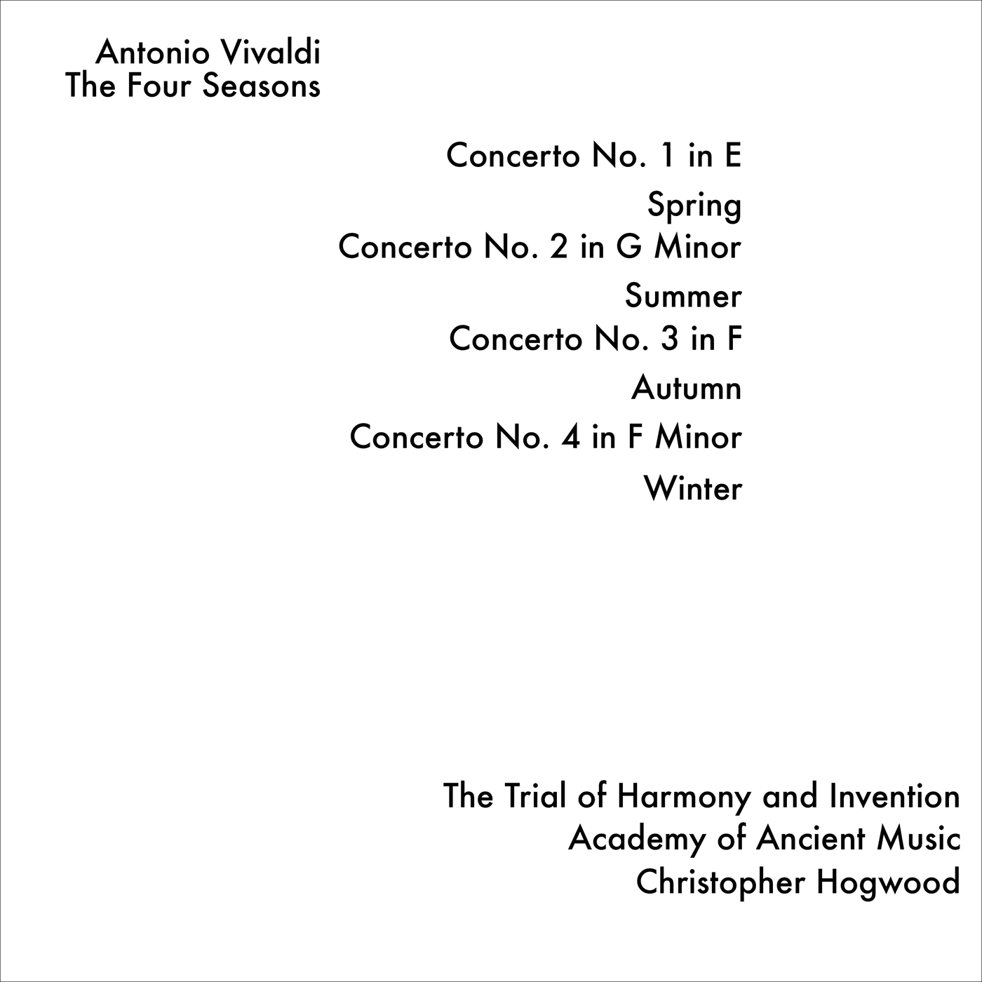
Part One - A: Experiment with one sized type, one weight, flush left, and ragged right.

Example: One weight, flush left, ragged right.


(Process Designs: The first part our project required us to play around with placement of type, but with a challenge to stay within a boundary.)
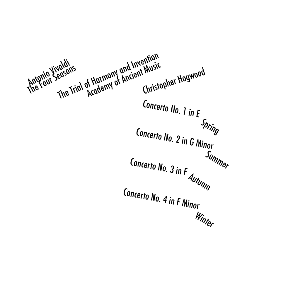
Part One - B: One Size, one weight, flush right, and ragged left.

(Process Designs: Similar to the flush left designs, these two pieces required me to experiment with placement of text with only flushed right. These designs challenged me as a designer, to create a piece that is similar to the flushed left pieces, but in a new method.)
Part One - C: Create pieces with one size, one weight, and asymmetric.
(Process of Designs: For these designs, I played with the placement and rotation of text. Allowing myself to experiment with a chaotic and messy arrangement of type.)

(Final Design: I chose this design out of the other process pieces, because it expressed a interesting composition compared to rest. While the main focus of the design is the large clump of text contracted to the isolated a small amount to the right.)
Part One - D: Using serval sizes, or weights.
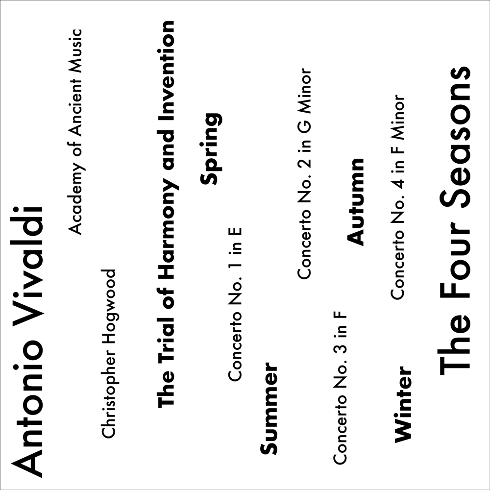
(Process Designs: Experimenting with different sizes and weights, I created a range designs. These designs mainly focused on a bold type, creating hierarchy, while the subtext communicates the information to the viewer.)

(Final Design: I chose this design as one of my final pieces, because it express a interesting and unique composition. Due to the arrangement of the bold type in a diagonal style, which leaves off of the page, creates a rhythm and flow throughout the piece.)
Part One - E: Experimenting with extreme scale.


(Process Designs: When creating these pieces, I played with the different sizes of the text. Throughout, my process I applied hierarchy to the most important information, such as, "The Four Seasons" or "Antonio Vivaldi" to grab the attention of the viewer.)
(Final Design: I chose this piece in particular, because the form and composition of the large silhouettes letters are unique to the piece. The letters create rhythm throughout the design, allowing the viewers eye to flow with the letters.)
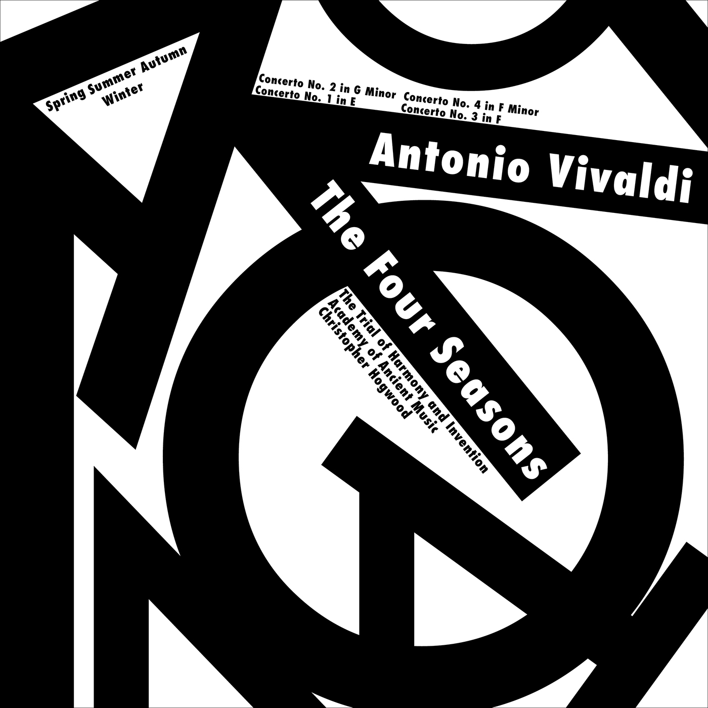
Part One - F: Adding color to old and new designs.


(Process Designs: Designing new and old designs in color was a challenge and a learning experience. With the use of a few simple colors, the hierarchy within a design can change immediately. Colors can also express a certain mood or action towards the viewer. These techniques can be seen throughput many of my process designs, as I played with a variety of color palettes.)

(Final Design (Above): I chose this design for my final pieces, because of the composition and hierarchy. With the use of color, the design represents a 3-D effect, giving the illusion that the "4" is popping out towards the viewer, without these colors, the designs would not have the effect. The color provides the hierarchy, while the outlines of text provide the composition and form.)


