Starting a Design System in Sketch from Scratch*
Quickly wireframe and then mockup layouts, while building components for future re-use.
Recently I was asked to "knock out some wireframes" for an sample redesign project proposal; in three days. I worked with our UX Researcher, he was acting as the Subject Matter Expert, having read through the project and also with a little knowledge of the system needing redesign.
We started with white boarding, in InVision Freehand. Then he took our starter Sketch file and over the first afternoon threw some text, rectangles, and placeholder shapes into blocks of content with very loose spacing. This gave me an idea of his vision to start designing. He followed up with our Director, verifying that our work was on a desirable path.
I came in early the next morning and worked the Sketch file into shape. Utilizing the Sketch layout overlay, I applied his blocks to a 12 column layout.
Following that, I started building components of the grouped items. Initially everything was just going to be grayscale. To me Wireframes are like creating a logo, start with monochrome, so as not to get hung up on colors. Then flesh out colors and typography with tested decisions. However, we were pressed for time, now down to about 16 work hours for handoff.
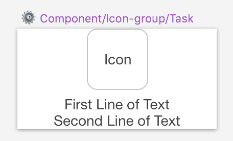
Initial grayscale text based component wireframe of an icon and text group
Following feedback from our Director, it was apparent that wireframes were not what was needed for the work, so we set out for Lo-fidelity Mockups.

A mockup of the Icon Group, for a "pop of color" in our proposal presentations
Lo-Fi Mockups
We drew together a demonstration palette based completely on arbitrary (untested) decisions from our collective knowledge of "industry" design patterns. Most of our projects employ Bootstrap in one version or another, and I carried forward with some of the naming conventions while working to keep the Sketch file clean and useful.
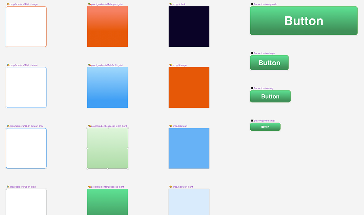
Border props, gradient props, and color props, feed into button components.
Grouping Symbols into Components in Sketch allowed for quick replacement in my Mockups.

Progress bar component groups and glyphs as symbols

An "In Progress" line item component with progress bar and action buttons
The progress bars fed into Line Item component symbol, which in-turn, fed into a progress report section. Buttons are built to edit the button text, border, and background with the preset symbols of border, color, and gradients seen in a sample above.

Utilize the "In Progress Line Item" in instances for a component layout of multiple items
In a future state, the borders, and colors would be a different symbol art board size, as to separate them from selection, but this was a quick-and-dirty implementation of the property symbols.

Quickly replace a property with another preset property symbol. Think CSS Props in a Declaration block.
The progress bars were built, utilizing the color 🎨prop for the ability to quickly re-color the progress bar with our design standard color or gradient palette.
The progress bars, being built early on as their own smaller components meant we could re-use the bar in a longer format for a "Stepwise" progress of workflow.
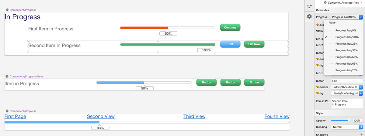
Stepwise workflow progress bar, utilize the progress bar component along with the in-progress components.
Takeaways
This was a fun project, and it allowed me to flex the Design System knowledge on a new, forward thinking, redesign project. I was able to get my head out of the Design System I had been focused on for several months and re-think how I shape components.
I am now refactoring the smaller components of my primary larger design system, which is my primary work focus. This exercise has improved already, the reusable parts, such as the buttons, links, and action toolbars.
you can always learn something new by getting your head out of the project you are on, even if its a temporary focus-split. It can certainly be a benefit to "come up for air" once in a while.
* From Scratch is a loose term here, I started with a wireframe symbol library I found, but quickly discarded it, deciding the structure of component was poorly thought out, not responsive to re-size, and I would be faster rolling my own.


