

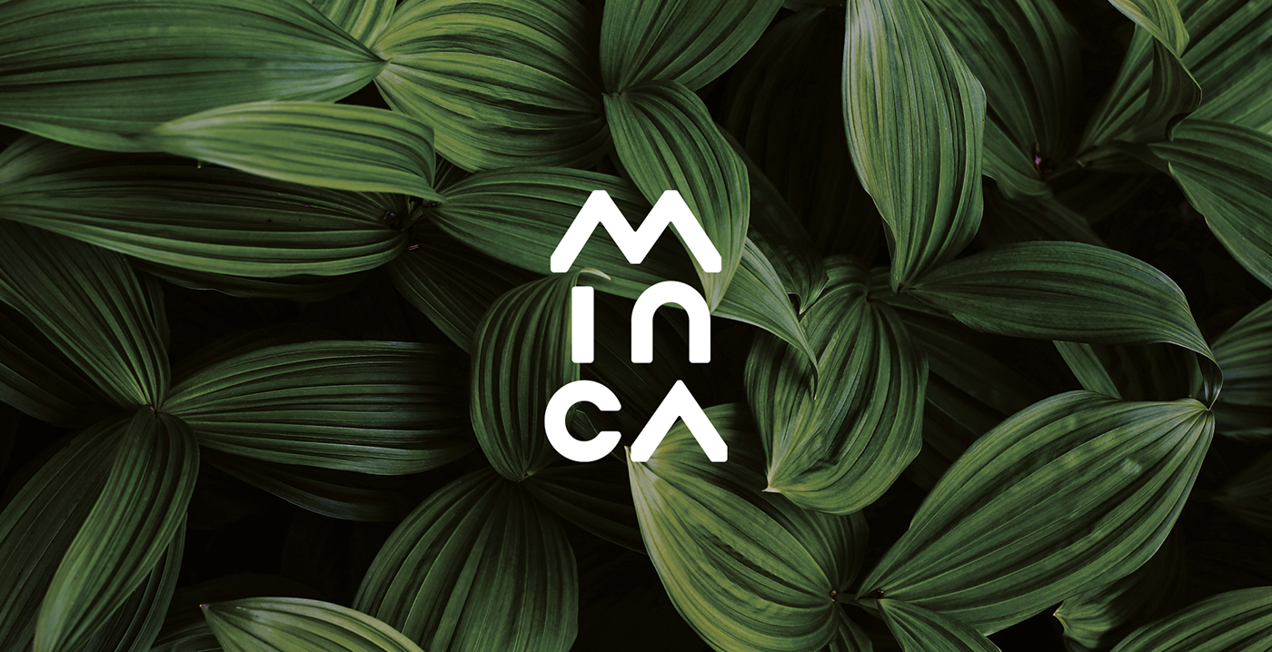
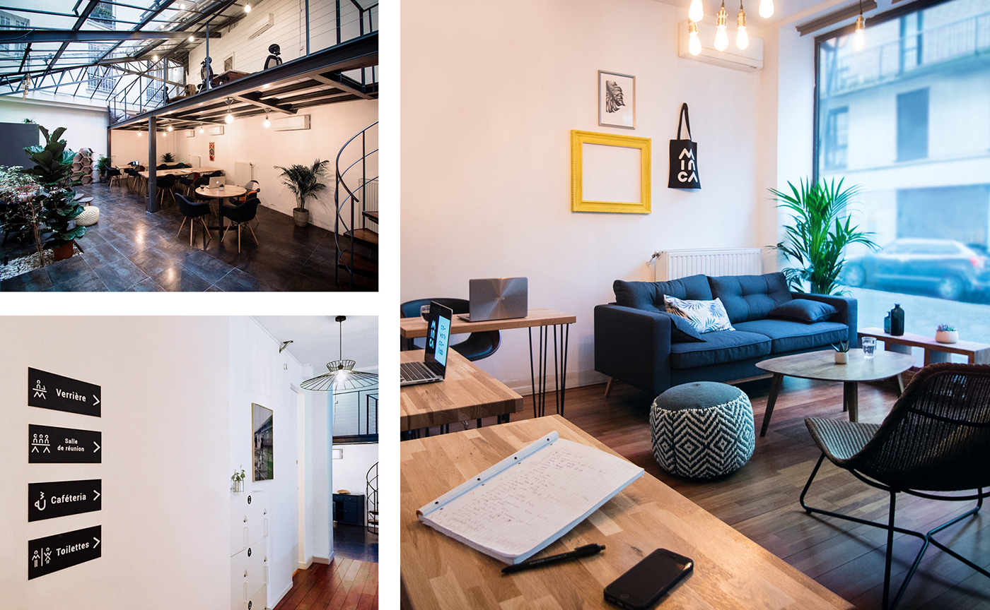
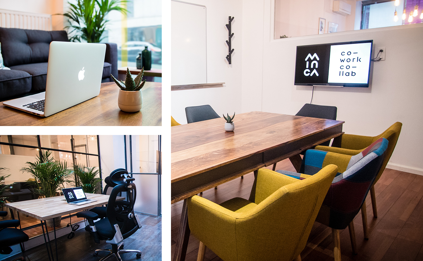
MINCA, a cozy and green coworking space in the heart of Paris
Minca participates in questioning traditional professional patterns in France by offering freelancers a pleasant work environment conducive to the development of their business.
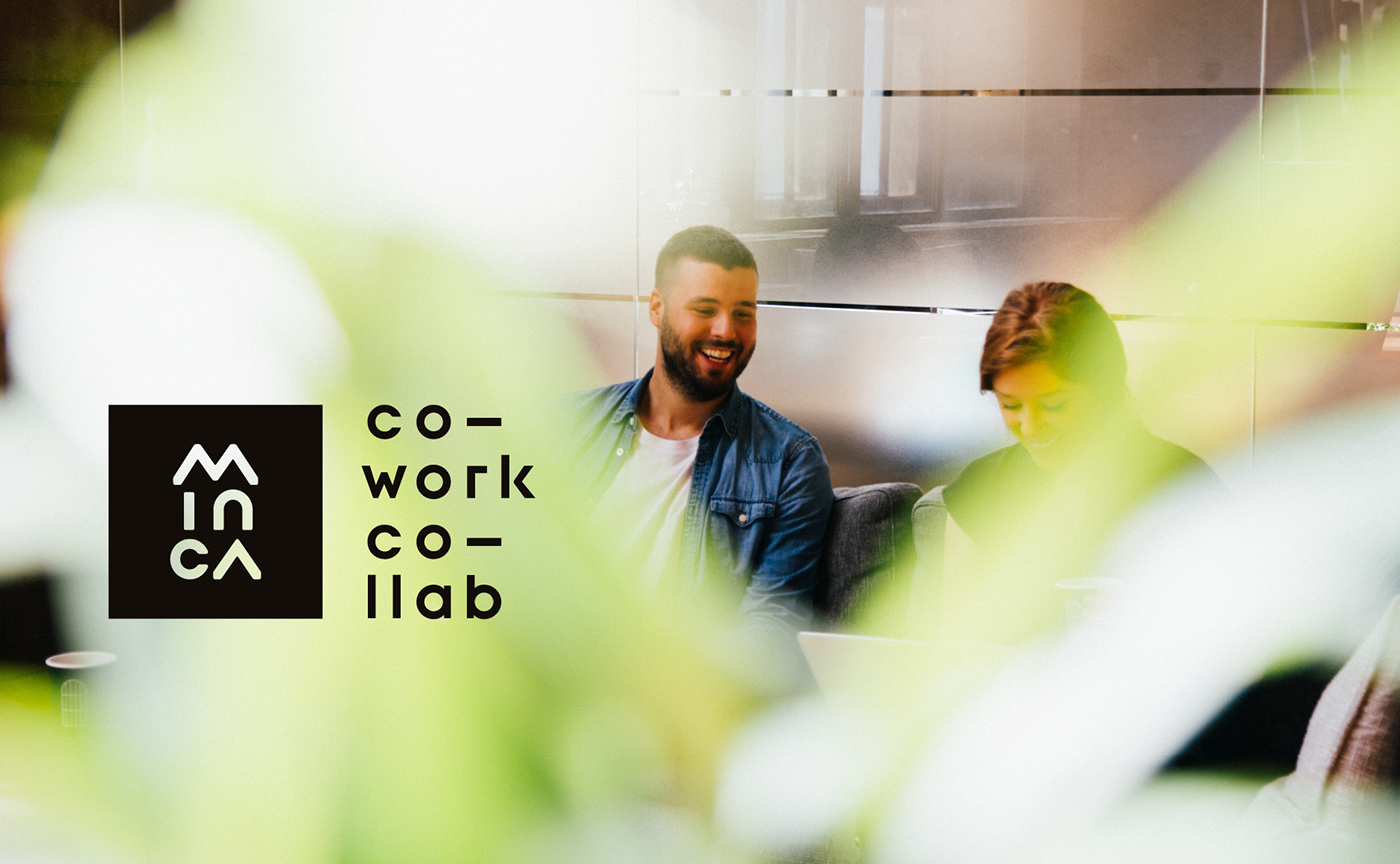
It’s a collaborative workspace dedicated to well-being and focused on the training and digitalization of means of communication. The main objective is to offer Minca community members opportunities for synergies with other members in order to develop their activities.
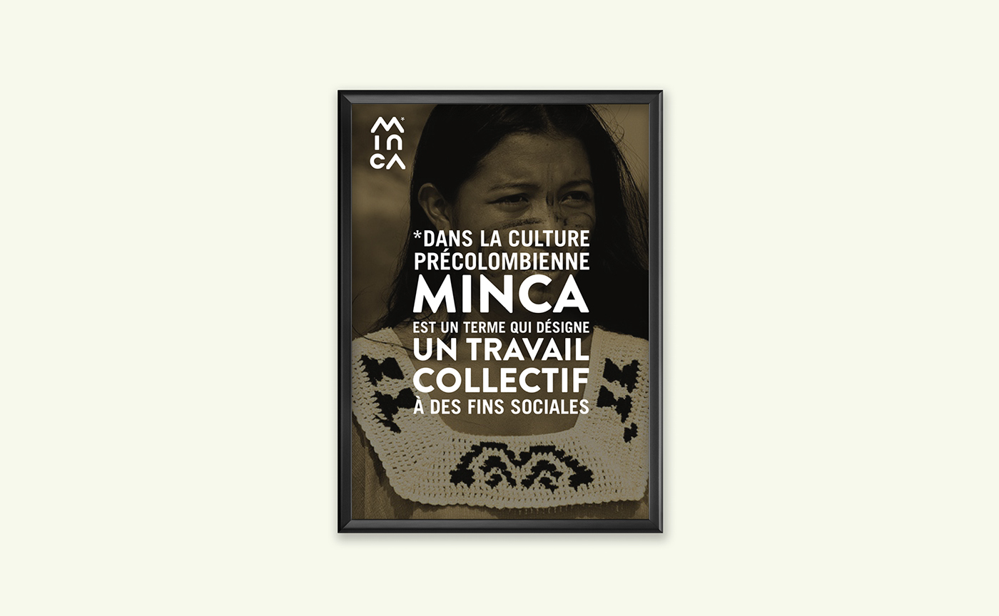
“In pre-Columbian culture, minca is a term for collective work with social purposes.”
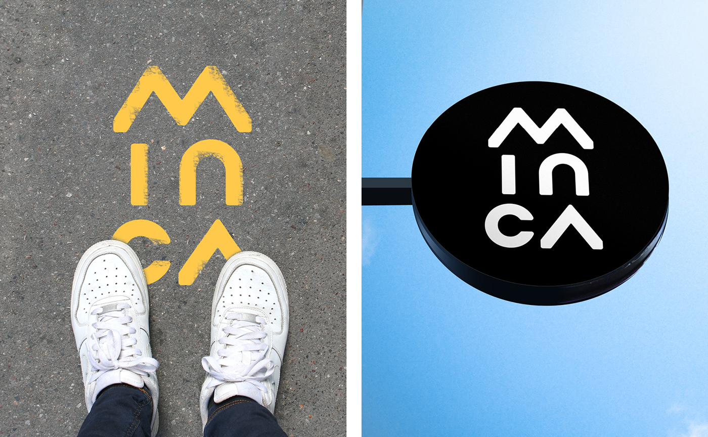
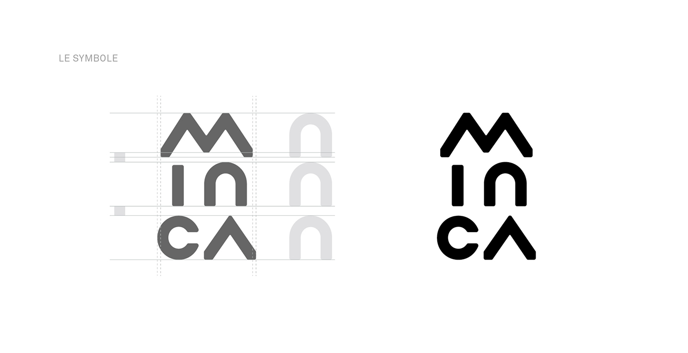
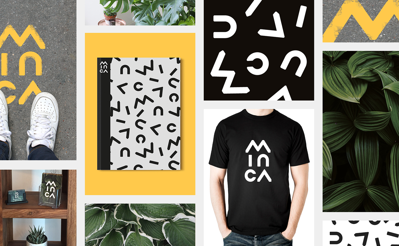
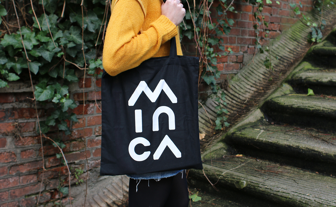
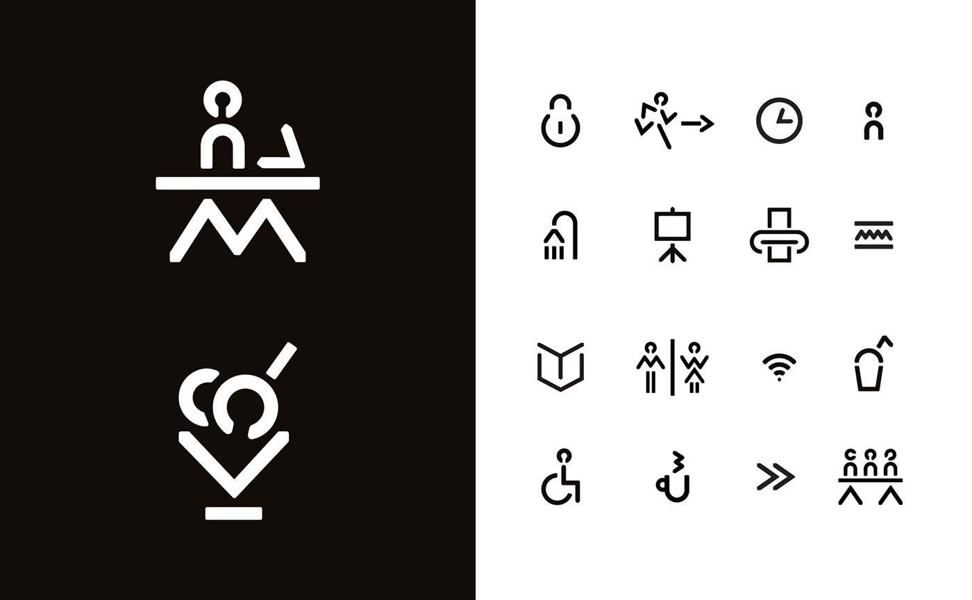
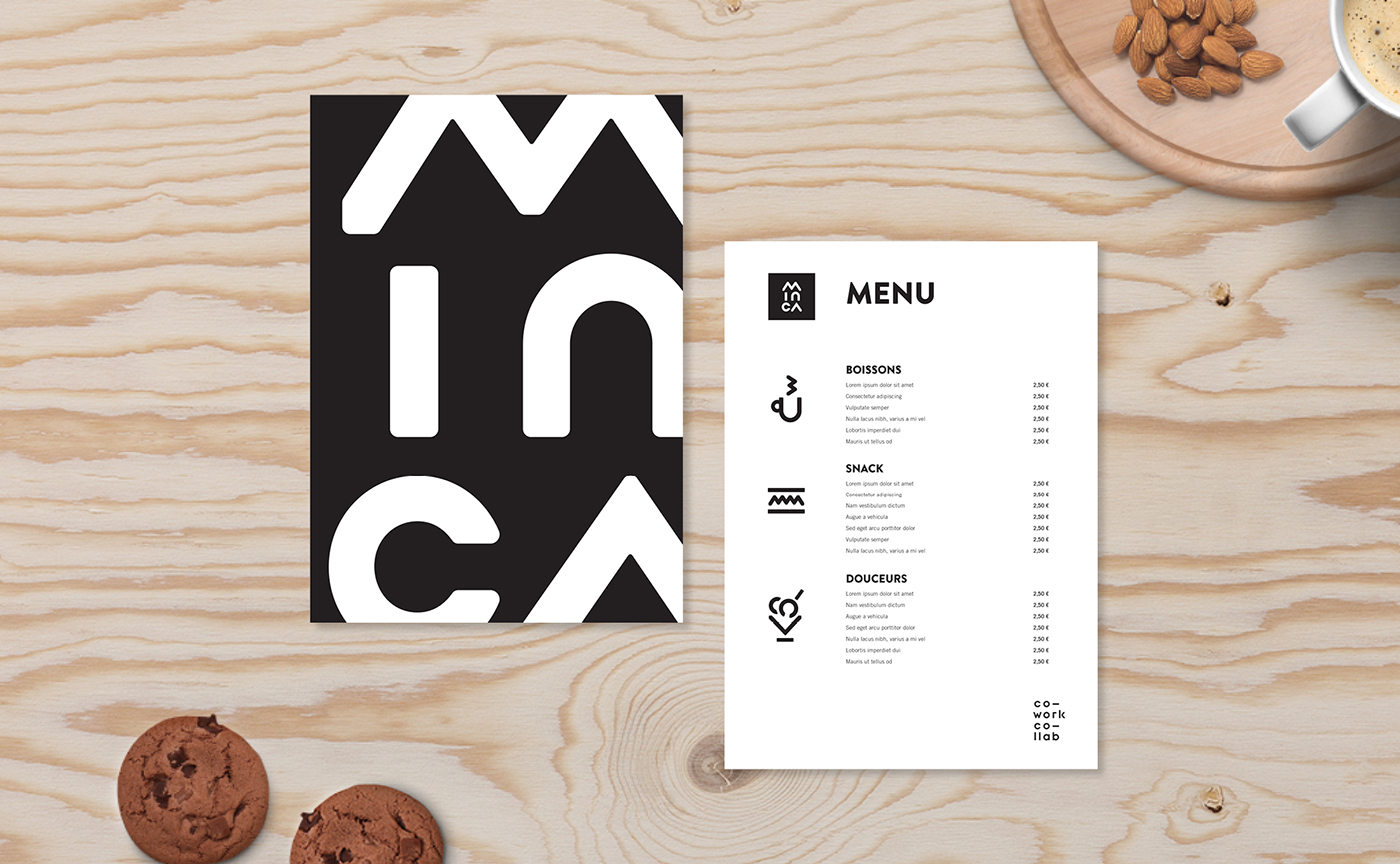
The visual identity designed by Graphéine aims to symbolize the unique spirit of the project, between modernity and tradition, here and elsewhere. Our proposal is an unexpected typographic layout of the title "Minca". Composed vertically, the lettering is stylized to hint the geometric patterns and stripes of "Mola", the art of traditional weaving practiced by Kuna Native American women. However, the logotype remains simple and contemporary, and it's has a great visual impact when used in signage and on the digital interfaces.

MINCA, un espace de coworking
cosy et végétalisé au cœur de Paris
Minca participe à la remise en question des schémas professionnels traditionnels en France en proposant aux travailleurs indépendants un environnement de travail agréable et propice au développement de leur activité.
C’est un espace de travail collaboratif dédié au bien être et axé sur la formation et la digitalisation des modes de communication. L’objectif principal est de proposer aux membres de la communauté Minca des possibilités de synergies avec d’autres membres afin de développer leurs activités.
C’est un espace de travail collaboratif dédié au bien être et axé sur la formation et la digitalisation des modes de communication. L’objectif principal est de proposer aux membres de la communauté Minca des possibilités de synergies avec d’autres membres afin de développer leurs activités.
“Dans la culture précolombienne, minca est un terme
qui désigne un travail collectif à des fins sociales.”
L’identité visuelle créée par Graphéine a pour objectif de symboliser l’esprit unique du projet, entre modernité et tradition, l’ici et l’ailleurs. Notre proposition est un travail typographique inattendu de l’intitulé « Minca ». Composé verticalement, le lettrage est stylisé pour évoquer les motifs géométriques et les rayures « Mola », l'art du tissage traditionnel pratiqué par les femmes amérindiennes Kuna. Le logotype reste cependant simple et contemporain, et il a un grand impact visuel lorsqu'il est utilisé pour de la signalétique et sur les interfaces numériques.


More details on:
EN: www.grapheine.com/en/portfolio/minca-coworking
EN: www.grapheine.com/en/portfolio/minca-coworking


