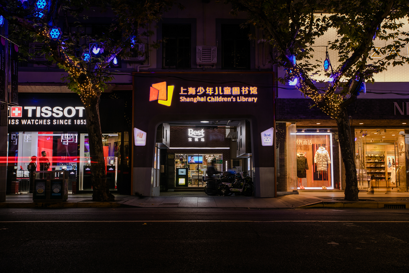
历史背景 Background.
上海少年儿童图书馆是全国历史最悠久,藏书最多的省级少年儿童图书馆之一,是上海地区少儿图书资源的中心,馆内设有低幼部,小学部,中学部等。1941年上海儿童私立图书馆成立,1952年由文化局接管,并更名为上海少年儿童图书馆,1958年迁至现址——原切尔西住宅,上海市优秀历史保护建筑。
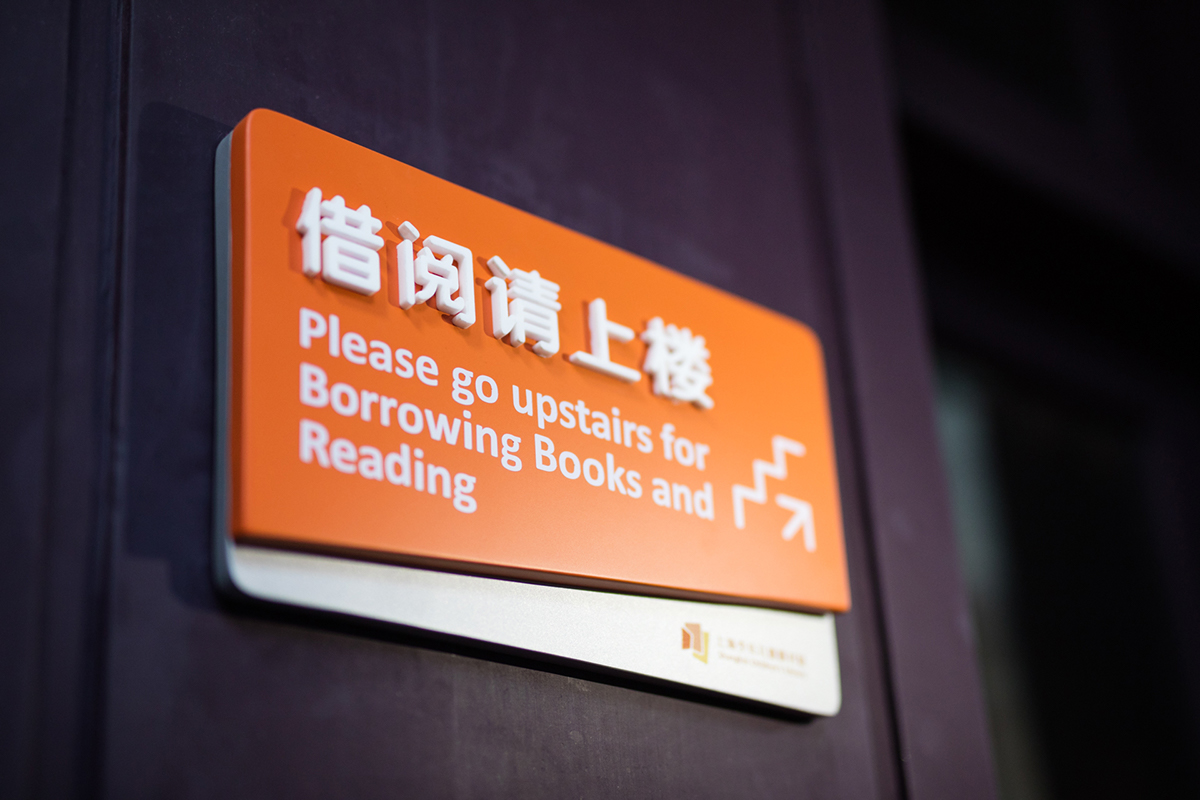
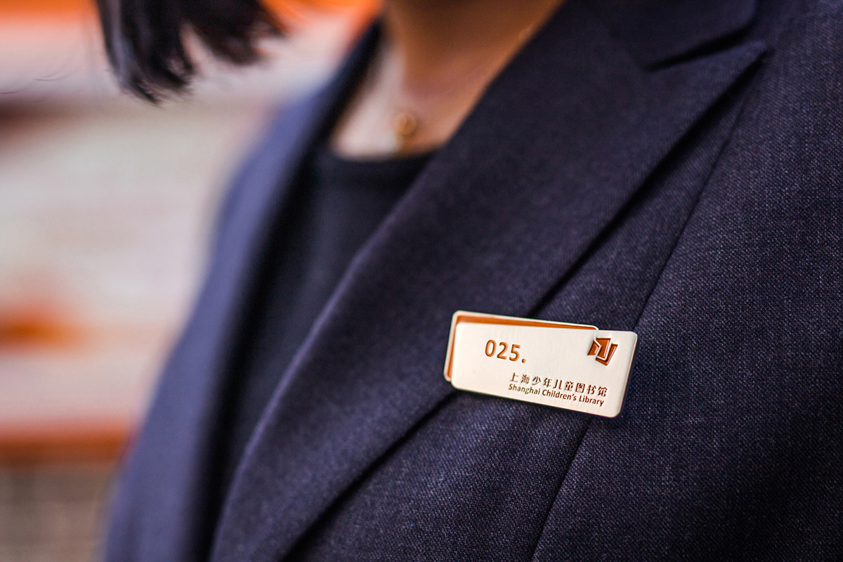
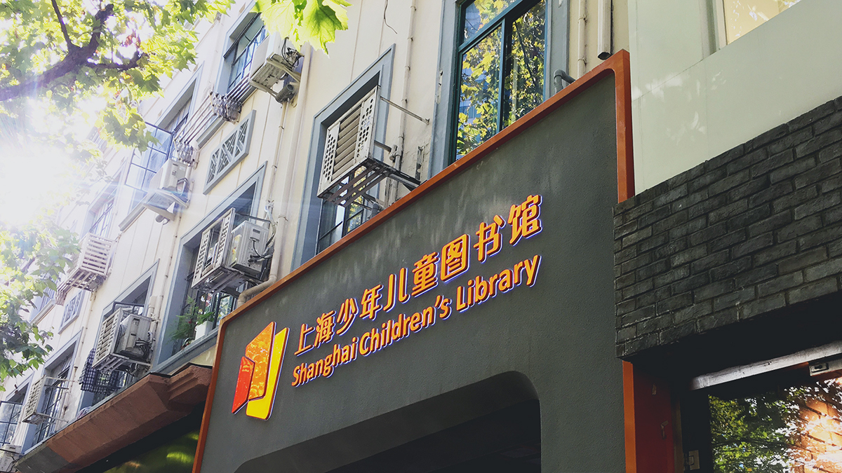
The Shanghai Children's Library (SHCL) Branding Identity Project was a Tongji University master student project. SHCL was located at the lively West Nanjing Road, opposite the entrance of No.1 Metro Station. SHCL was a provincial children's library in China and also the center of Children’s library in Shanghai, which was a famous Heritage architecture——Chelsea House built in 1929. The 1,592 m2 library encompasses three floors and is divided into the main three part of Pre-school area, Primary area, and Secondary area. From 1940 to present, it has approach 80years history.
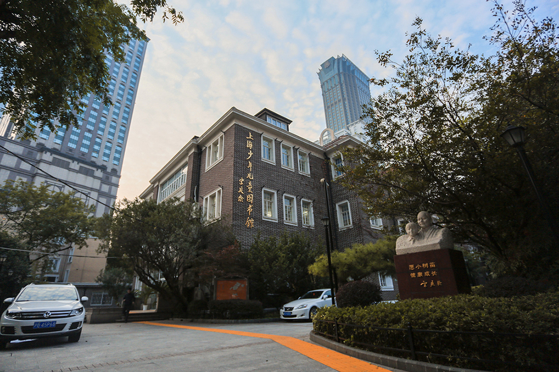
上海少年儿童图书馆原先并没有整体的视觉识别系统(Visual Identity System),基本采用1980年6月由国家名誉主席宋庆龄亲笔题写的馆额作为标识,馆区内“愿小树苗健康成长”的雕塑,表达了她对少年儿童的祝愿。随着时代的发展,儿童读物以及阅读方式的革新,书法题字虽然具有深厚的历史意义,但却无法满足日趋电子化和现代化的文化传播需求。
How to renew the new logo to replace the Chinese calligraphy by a famous person?
Shanghai Children and Children's Library did not originally have an overall visual identity system. The Library basically adopted the sculpture entitled "May the saplings grow healthily" in the museum area in June 1980 as the hallmark of a museum personally authored by the National Honorary Chairwoman, Song Ching Ling, expressed her wishes for children. With the development of the times, the innovation of children's books and reading methods, calligraphic inscriptions have profound historical significance, but they can not meet the increasingly electronic and modern cultural communication needs, moreover, it can not reflect the traits of children.
Shanghai Children and Children's Library did not originally have an overall visual identity system. The Library basically adopted the sculpture entitled "May the saplings grow healthily" in the museum area in June 1980 as the hallmark of a museum personally authored by the National Honorary Chairwoman, Song Ching Ling, expressed her wishes for children. With the development of the times, the innovation of children's books and reading methods, calligraphic inscriptions have profound historical significance, but they can not meet the increasingly electronic and modern cultural communication needs, moreover, it can not reflect the traits of children.

形象定位 Orientation
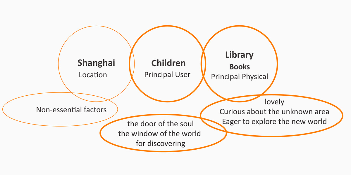
项目初期,设计师与少儿馆团队沟通整体形象设计定位,关于是否遵循现有建筑形态,是否体现人文历史背景等问题进行了讨论,最终制定了以“少年儿童”为服务主体的设计目标(后文简称“少儿”)。从少儿主体的角度出发,毛笔题字风格显然略成熟,强调了历史感,却缺少了少儿的稚气与活力。因此,少儿馆迫切需要一个更加符合少儿主体特性的新形象,以满足其易识别、易使用的要求,且能够体现少儿对新知识探索的渴望。该项目于2016年6月由原任韩筱芳馆长计划启动,由现任卢秋勤馆长接手后与同事的共同努力才得以顺利进行,历时一年多的新形象已于今年7月正式启用!
From the perspective of the juvenile subject, the brush pen inscription style is obviously a little mature, emphasizing the sense of history, but it lacks children's childishness and vitality.

概念来源 Concept
新视觉形象的概念来源于设计师与少儿馆团队的联合设计(Co-design),围绕少儿这个主体,探讨“书”与“少儿”之间的关系而来:少儿馆是开放包容的知识宇宙,鼓励少儿带着好奇心,去探索未知领域,学习用不同的视角去观察世界,认识世界。
The concept of a new visual image comes from the co-design of a team of designers and children's pavilions, focusing on the subject of children and exploring the relationship between "book" and "children" Children's library is an open and inclusive knowledge universe, Encourage children with curiosity, to explore the unknown areas, learn to use different perspectives to observe the world, to know the world.
书籍开启少儿的心灵之门,
是少儿探寻世界之窗。
Books are doors to children's minds and
windows that lead them to explore the world.
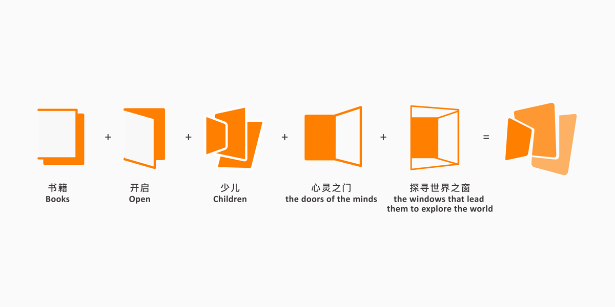

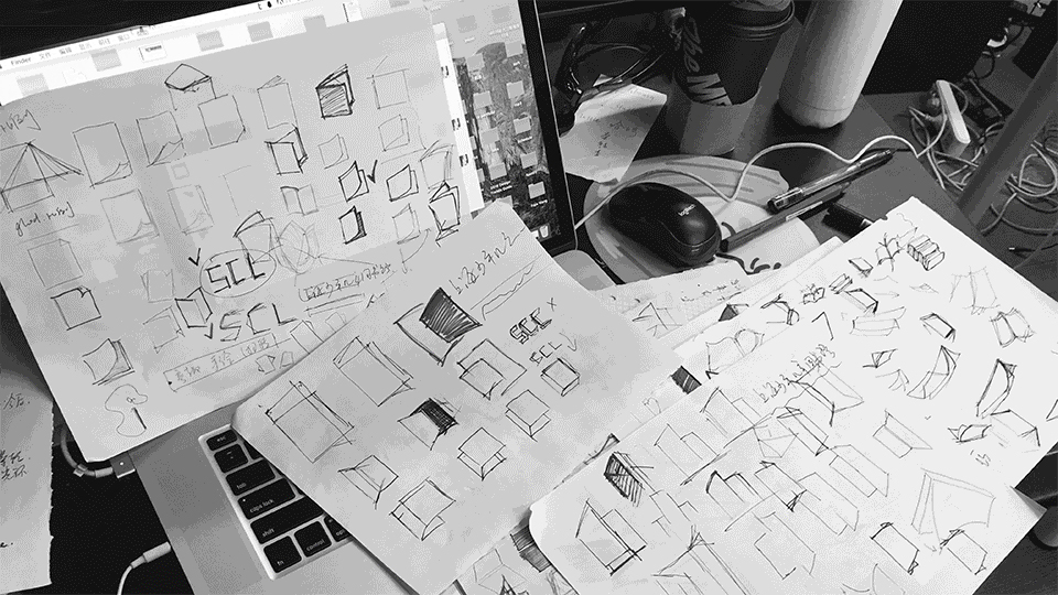
图形语言上,运用儿童抽象化、几何化的绘画语言来演绎“少”字与“心灵之门”、“世界之窗”的概念;图形边缘上,进行圆润化的处理更突显少儿的可爱;负形空间采用疏密变化体现书脊的厚度。明暗关系上,三个色块由深到浅的处理,表现书籍透视的同时拉开层次。
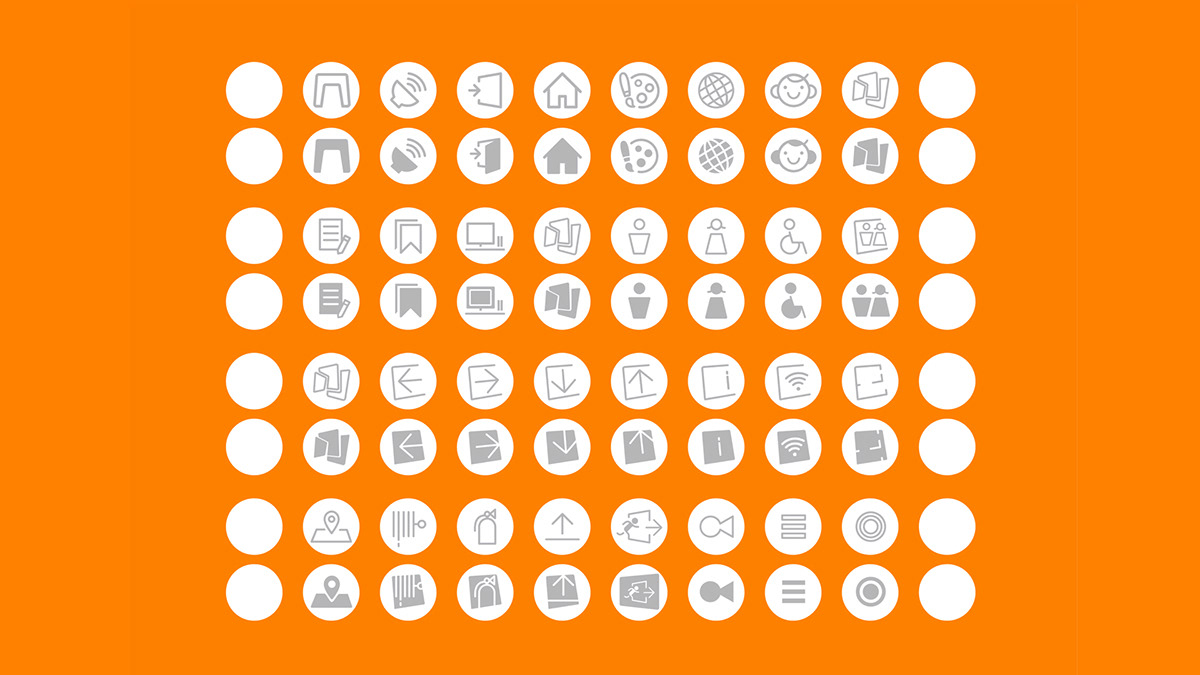
LOGO CONSTRUCTION & PICTOGRAM
The Logo of SHCL try to use abstract language, geometric drawing to interpret the "Shao (Children)" words and "the door of the heart," the concept of "Window of the World"; Graphics edge, rounded processing more prominent children's cute; Negative space density changes reflect the spine thickness. On the relationship between light and shade, the three color blocks from deep to shallow processing, performance books perspective at the same time opened the level.
The Logo of SHCL try to use abstract language, geometric drawing to interpret the "Shao (Children)" words and "the door of the heart," the concept of "Window of the World"; Graphics edge, rounded processing more prominent children's cute; Negative space density changes reflect the spine thickness. On the relationship between light and shade, the three color blocks from deep to shallow processing, performance books perspective at the same time opened the level.



新知识宛如一道“橙”光,一日之计在于晨,打开知识大门的时刻,犹如新生的太阳照亮心灵,知识的光芒,带给你快乐与能量!
“New knowledge like the sunshine at morning!”
The light of knowledge, bringing you happiness and energy! it was not only the reason of we use orange color as main visual for this place, but also a way to highlight and activate this historic building.




少儿馆团队
卢秋勤 馆长
韩筱芳 前馆长
沈 珺 副馆长
钟文清 采编部
设计团队
张雅琦 视觉形象总设计及项目管理
郑诚杰 中文字体设计指导
邹淑琪 标志动态演绎
杨屹沐 门头效果图设计
编辑/ 钟文清
图片/ 张雅琦
地址/ 上海市静安区南京西路962号
Shanghai Children's Library Team
Lu Qiuqin (Curator), Han Xiaofang (Former curator), Shen Jun (deputy director), Zhong Wenqing (Editorial Department)
Design Team
Zhang Yaqi (Project management & Visual Identity System Design), Zheng Chengjie (Tutor of Chinese font design), Zou Shuqi (Motion Graphic), Yang Yi Mu (Render design of Gate)
Client/ Shanghai Children’s Library
Location/ No. 962 West Nanjing Road, Jing'an District, Shanghai
Project Area/ 4,200m2
Open Date/ June 2017
Project Budget/ $11,200
Location/ No. 962 West Nanjing Road, Jing'an District, Shanghai
Project Area/ 4,200m2
Open Date/ June 2017
Project Budget/ $11,200
Photos/ Zhang Yaqi, Bi Jiashui
版权归少儿馆所有 未经允许请勿转载 转摘请注明出处
All Copyright for Shanghai Children's Libray
