INTRODUCTION
This project is the continuation of the research paper titled “From graphics to architecture - Projection mapping - From architecture to graphics” with the main question being “How can graphic design, nowadays, enhance the dynamic of visual communication without connecting with the societies shared memory, bringing to light the elements of the cultural heritage?”
To do this, it works with architecture, which is the most dynamic image but also the most common one since it plays a huge part in the everyday life of people and helps them cope. That is why it is interesting to collide the two arts and see how their cooperation can emerge through the cultural heritage of a place.
Projection mapping, as an intermediary link to this problem, by involving the aspects of technology, becomes the tool that forms the relationship between graphic design and architecture, while becoming the next generation of modern design in all arts.
With the evolution of technology, which is nowadays “vital” for almost all population groups, usually of younger and middle age,
as everyone is involved and uses technology either universally or partially. Technology can be useful and certainly is part
of “human progress” however; it can be used in such a way that instead of helping, it has negative effects. In any case, technology is necessary and has raised the expectations of mankind, who are constantly looking for newer versions in order
to be impressed. The main purpose of the research was to find this solution by examining the partnership of graphic design
in the stimulation of visual communication and architecture. Specifically, the question was “Can technology be the cause that unites these branches together?”
Furthermore, the role that visual communication plays outdoors and the public’s reaction is investigated. What is meant by cultural heritage and how is man and the urban environment affected by it, is also researched. Also, how the two-dimensional becomes three dimensional through the projection and the conditions set by the new "Projection Mapping" trend, using the illusion, becomes the main topic. By having a new virtual composition for buildings, which we have a particular visual and ideological position, encouraging a new look and how it can renew the relationship of man with the city that he lives. The project shows how all these can be done in reality by starting a new project named “FireWalkWithMe” in Thessaloniki.
TITLE OF PROJECT
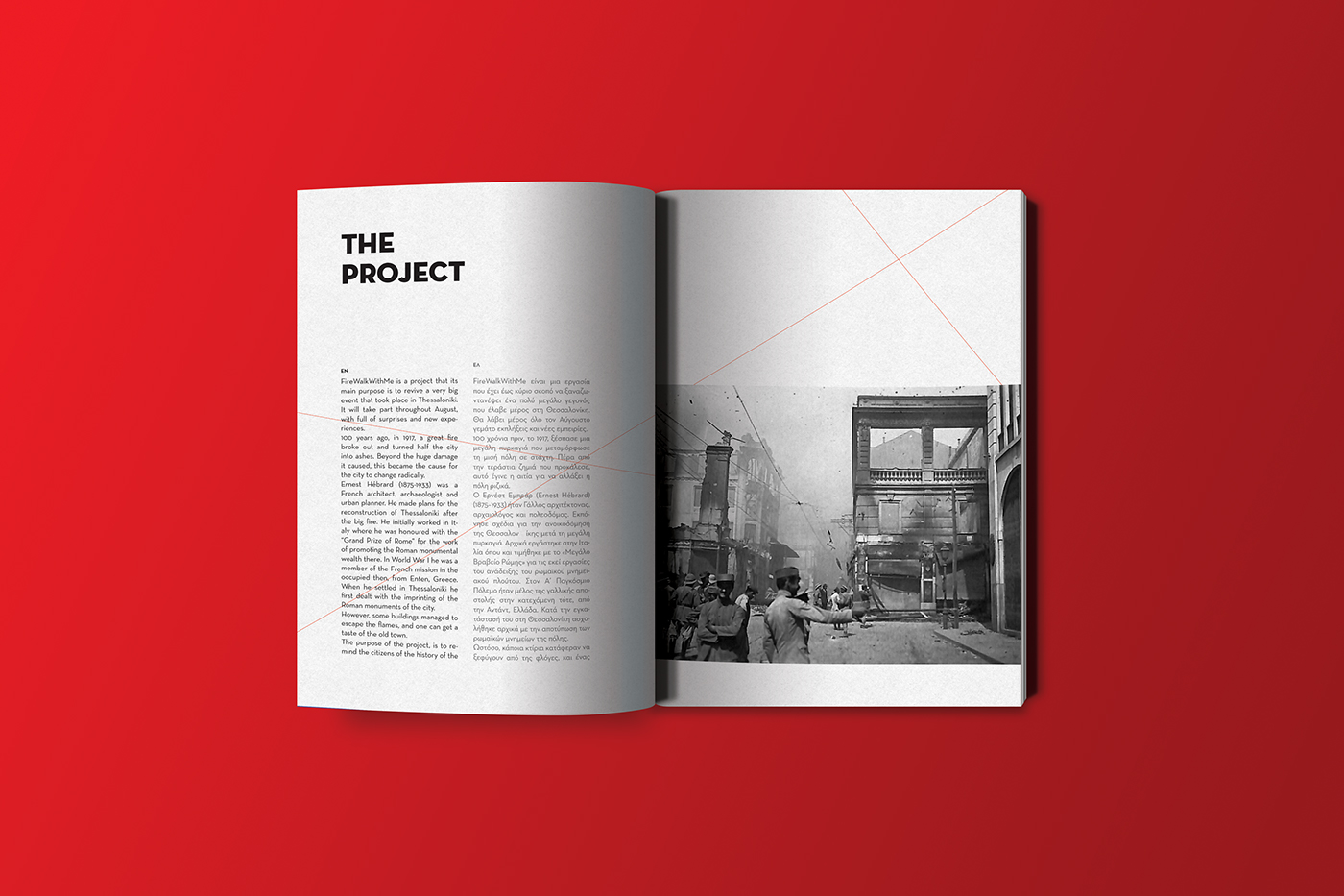
"FireWalkWithme" is a guidebook that gives you instructions for 17 projections that are going to be shown on specific buildings. The guide is not based on a real project but what could come to life in the second biggest city of Greece, Thessaloniki.
The projections will be shown throughout August. Its purpose is to remind people, of one of the biggest devastations that the city had to go through 100 years ago, the Great Thessaloniki Fire in 1917. There will be 17 projections each on a different building
for 17 minutes, showing the stories of the buildings before and after the fire in a more abstract way to keep them interesting.
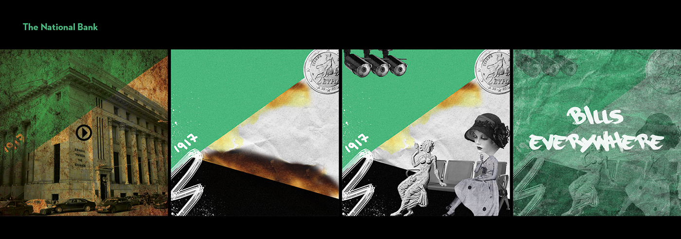
From the buildings selected, the 8 were rescued from the fire and the 9 replaced the ashes.
The title "FireWalkWithMe" with the subtitle "The Great Thessaloniki Fire" is emerged from the Great Thessaloniki Fire in 1917 and the route followed by the projections. More specifically, the reason of the fire is the cause of the projections and the historic flame is like "taking" the viewers from the hand talking them for a “walk” showing how the city was before the fire and how it has become today. All this is done, by using projection mapping.
LOGOTYPE
Using the means of typography, the logotype was designed reflecting elegance and class, but at the same time trying to be familiar with the viewer. The main influence for the design was the logic of the line, because it reminds the course, in this case, the path of the fire but also the one that the viewer will follow. Therefore, the line has a beginning and an end, which in the logotype that line continues until the bleeds of the page, leaving the viewer to an open journey. The title "FireWalkWithMe"
is intentionally written without gaps to symbolize the buildings that were very close to one another, one of the main reasons
that the fire managed to spread to half of the city. The last letter that is the "E" is designed in the following way, reminding
the projection of a projector. The word "Fire" is written in red to emphasize present during the fire incident. The logo comes
in two color codes, in its black form, and in white form. Red, except for fire, it symbolizes power, energy, speed, heat, aggression, danger, things that were experienced by those that were more on the fire. The black color stands for death, mystery, ash, and the past, and the white color stands for the memory, the purity and the birth of something new.

POSTER

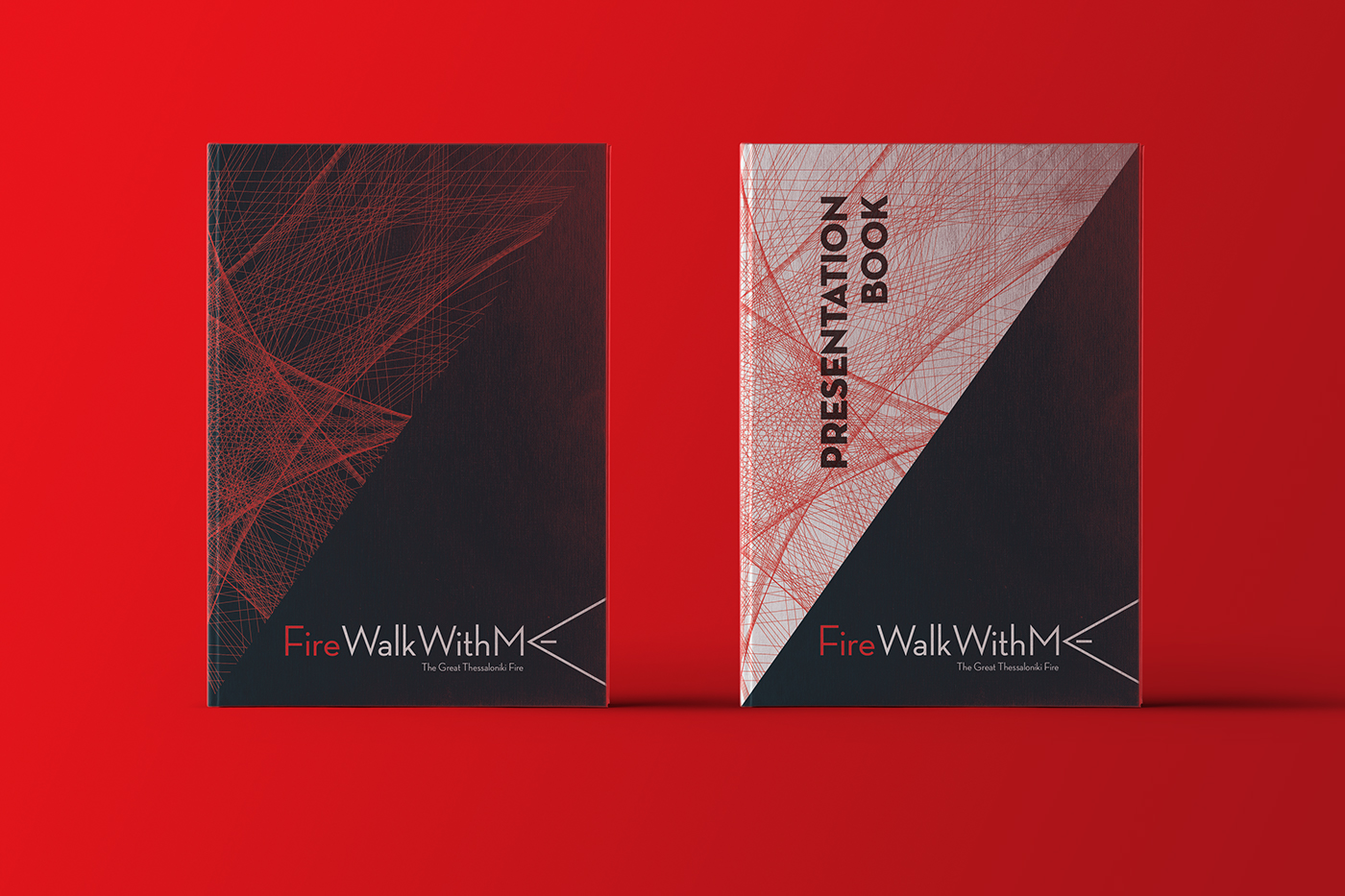
BOOK COVERS
The books covers are quite experimental. They consist of a grid of red lines, and strict geometric shapes. The red lines symbolize the path of the fire and the thousands of people who had to leave because of it. In addition, the dynamic of the combination
of lines leads to a more "visual" fire. Let's also note that the line is reminiscent of the logic of the linear architectural design
of the buildings. As a background color in the guidebook, black is used because the projections take place at night for a more impressive and intense effect.
BOOK MARKS

BAG

GUIDEBOOK
The guidebook is A5 in size to make it easy to move but it is big enough for the images to be seen clearly. It is divided in the middle, separating the old and the new buildings. At first, there is a map of the city with all the locations of all the buildings.
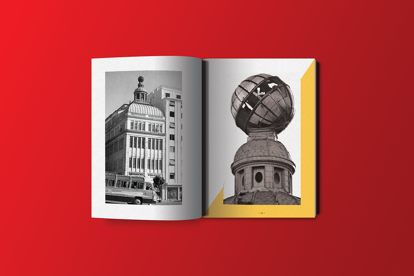
Then, the selected 17 buildings start. For each building initially, there is the name and the location. Afterwards, some images
and historical information of the buildings are shown. Moving on, the date is specified and some "sneak peaks" from the storyboard of the projections are put. The guidebook closes with the overall program.


ILLUSTRATIONS
The logic followed by the illustrations is that of collage. Due to the fact that this art can contain the element of photography, which has a direct involvement in visual communication, the work also gains its advantages. In other words, familiarity with the viewer,
a hidden story behind each shot and a direct relationship with the past. As a result, another value was given to the illustrations, each based on the hidden history of each building. There is the burned element in all images. In the buildings that survived the fire, the images start from fewer burnt emanations and end up in a totally burnt background. The new buildings are the opposite because something new was built on the ashes, while the old ones were present at the time of the fire, "burned".
The iconographic style in old buildings is more "dirty" and "black and white" to emphasize more on the "forgotten" element.
The iconographic style in old buildings is more "dirty" and "black and white" to emphasize more on the "forgotten" element.
On the contrary, in the new buildings the forms are more "clean" and in the background, we see mainly colors of green, black and yellow. In all the works, the form of paper is strongly emphasized in order to give the concept of the story, the "fairy tale", which each picture tells separately. Each storyboard concludes with a different slogan for each building.