Desafio:
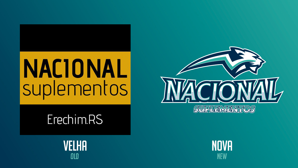
A Nacional Suplementos é uma empresa localizada na cidade de Erechim - RS. O principal desafio foi transformar a marca antiga em uma nova identidade que transmitisse algo revigorante, intenso e de acordo com os produtos oferecidos pela empresa.
Challenge
The National Supplements is a company located in Erechim - RS.The main challenge was to transform the old brand in a new identity to convey something invigorating, intense and according to the products offered by the company.
Solução da Marca
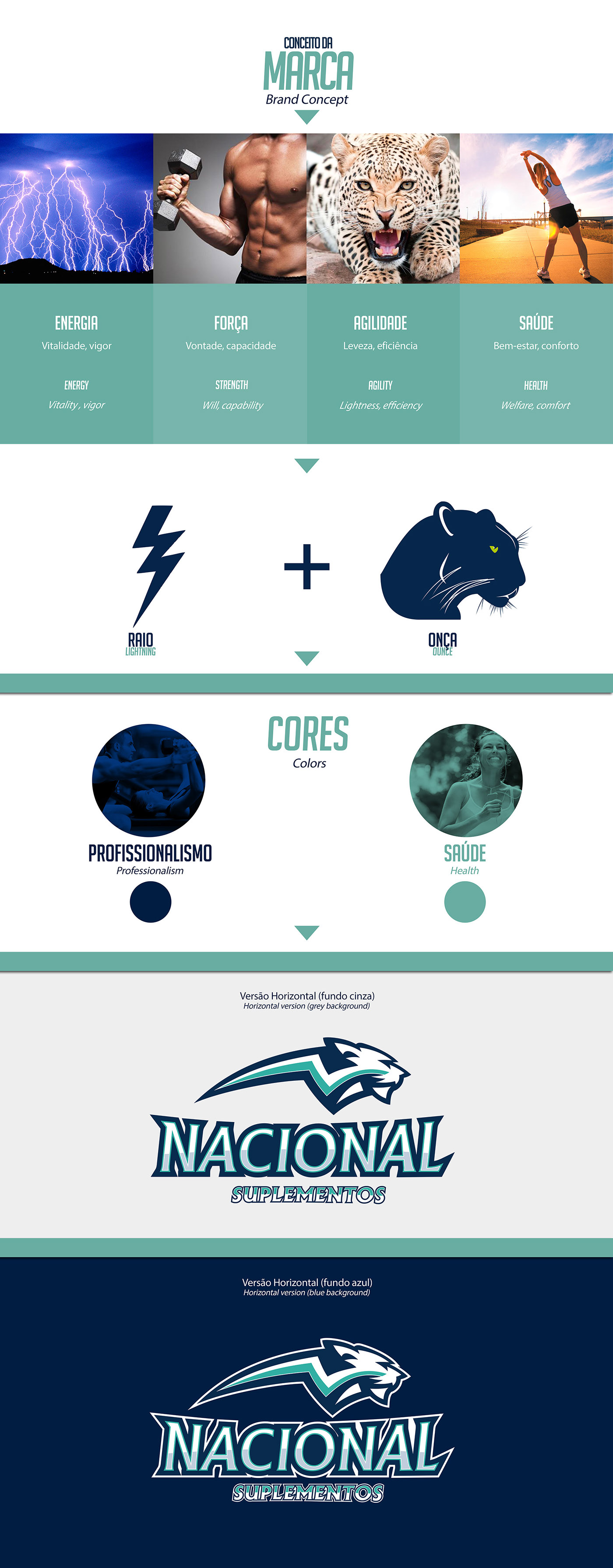
Após uma pesquisa de campo, analisamos os principais concorrentes diretos e indiretos, além de tendências neste segmento. Feita esta análise, chegamos a conclusão de que a marca precisava se reciclar e adotar um novo conceito para se consolidar no mercado. Elementos como qualidade do produto, resultados alcançados, competitividade, vida saudável, energia e segurança foram abordados para a elaboração da nova marca.
Solution Brand
After a field research,we analyze the main direct and indirect competitors,and trends in this segment.Made this analysis,we conclude that the brand needed to recycle and adopt a new concept to consolidate the market.Elements such as product quality,results achieved,competitive,healthy living,energy and security were addressed for the development of the new brand.

Identidade Visual
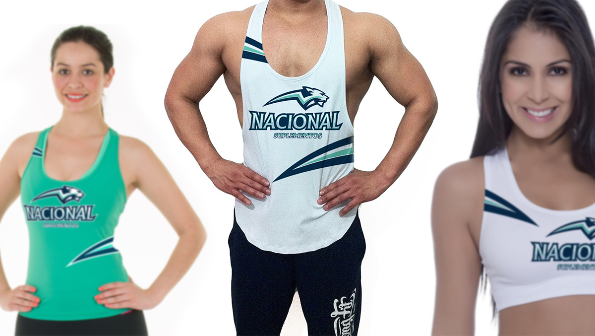
Os elementos que compõem a nova marca foram escolhidos com base no estudo realizado, onde identificou-se a necessidade de incorporar a essência da proposta oferecida pela empresa. Para isso, usamos o raio, que representa explosão de energia, potência, disposição. A inspiração na saúde busca reforçar o compromisso que a empresa tem com seu público alvo, por fim, a onça, um dos animais mais astutos do reino animal, que representa agilidade, ferocidade e velocidade. Sobre a tipografia, a escolha do estilo Serif foi a mais adequada para fazer parte da logotipia, pois é um estilo sólido, forte e seguro, o que vai de encontro com a proposta da marca e seus produtos oferecidos.
Visual Identity
The elements that make up the new brand were chosen based on the study,which identified the need to incorporate the essence of the proposal offered by the company.For this we use the lightning,which is burst of energy,power,disposal.Inspiration health seeks to reinforce the commitment that the company has with its target audience,finally,the jaguar,one of the shrewdest animals of the animal kingdom,which is speed,ferocity and speed.About the typography,the choice of Serif style was best suited to be part of the logotype,it is a solid,strong and safe style,which meets with the proposal of the brand and its products offered.