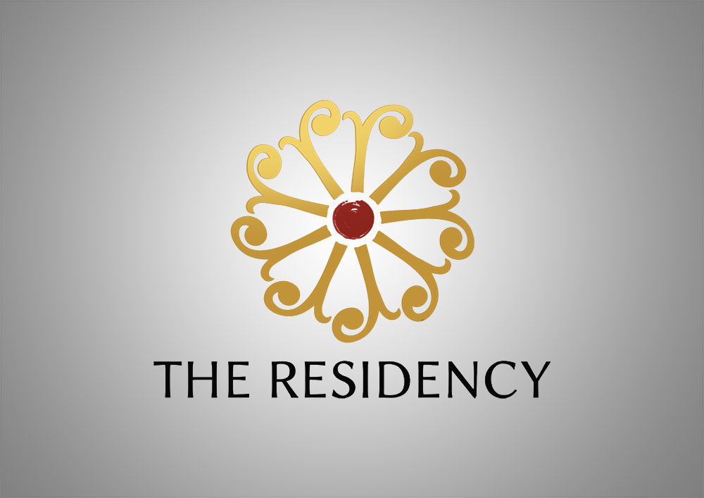
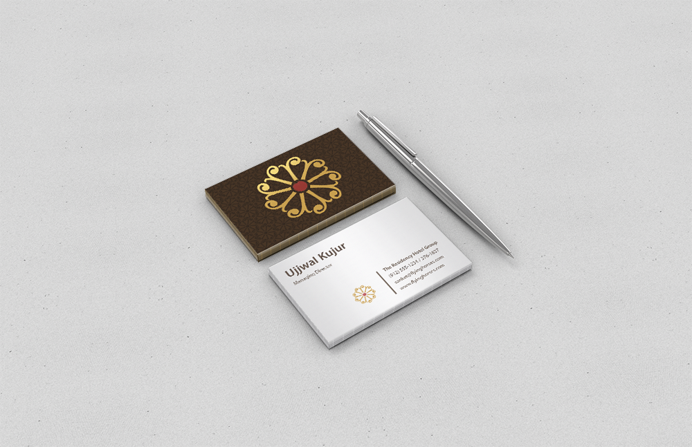
The existing logo of 'The Residency' hotel does not communicate the warmth of the hospitality industry that it should. Also for the same reason the floral pattern is made in new logo with 'r' as the motif and the central dot has jagged edge which has personal touch to it similar to a brush stroke. Use of the dot is also considered auspicious on forehead and had been a cultural signifier so the colour has been kept red and the petal formation around in the bright ochre hue. The use of 'r' motif and the central dot are common between the existing logo and the new that has been designed here. The slight rawness has been preserved by adding a sophisticated backward stroke to 'r'. Overall the appeal has been made to invoke welcoming feeling and vibrancy.
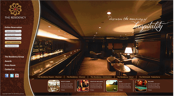
Website design for 'The Residency' group of hotels.
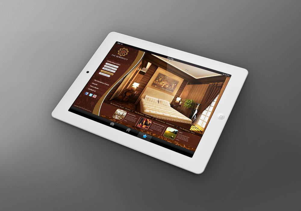
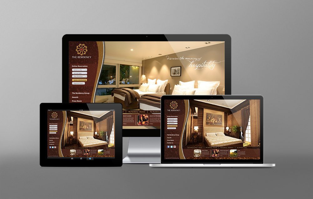
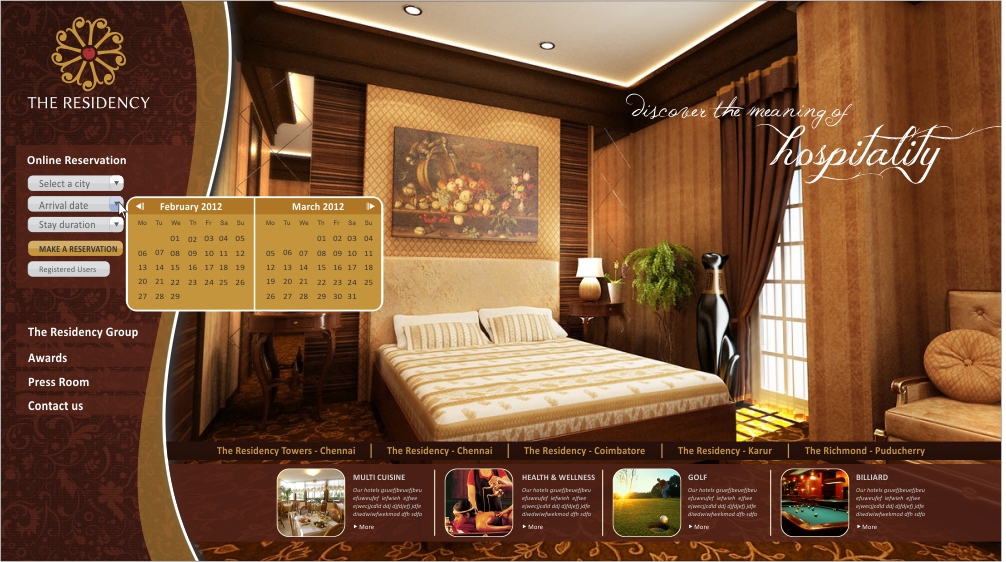
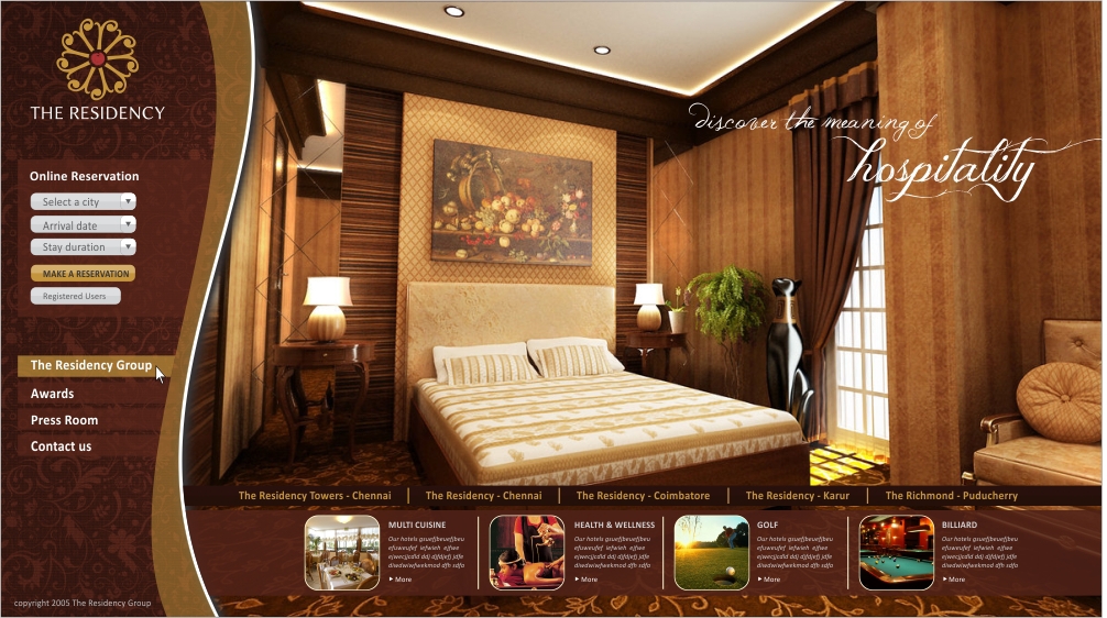
Here are some screenshots of website layout for 'Residency group of hotels'. Will tried to maintain the warmth of the hospitality industry. Overall the appeal had been made to invoke welcoming feeling and vibrancy.
Here are some screenshots of website layout for 'Residency group of hotels'. Will tried to maintain the warmth of the hospitality industry. Overall the appeal had been made to invoke welcoming feeling and vibrancy.