Sequent
A Typographic Thesis on the Future of Digital Reading
The more we, and future generations, see sans-serif typefaces in digital body copy, the more familiar we will become with reading them. The more familiar these typefaces are, the more quickly and easily we distinguish their forms. Sans-serif typefaces have the potential to become what is most recognizable and legible to us. Therefore, in looking to the future of reading, Sequent stands as a sans-serif typeface built on a foundation of print and digital legibility principles. By updating and optimizing the sans-serif reading experience, we can help fashion the future of what is comfortable for reading online and with e-readers.
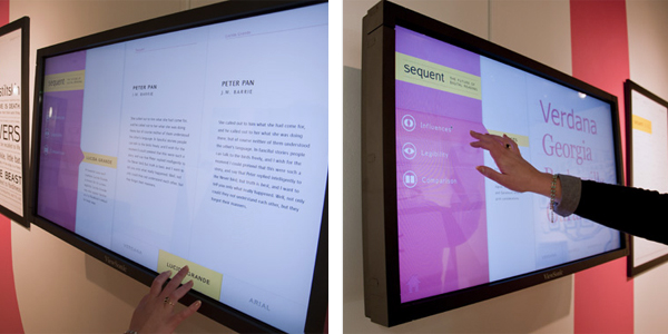
Sequent was created as part of my Visual Communication Design Capstone and exhibited as an educational experience explaining aspects of type design as a whole and my theory on the future of digital reading.
A Typographic Thesis on the Future of Digital Reading
The more we, and future generations, see sans-serif typefaces in digital body copy, the more familiar we will become with reading them. The more familiar these typefaces are, the more quickly and easily we distinguish their forms. Sans-serif typefaces have the potential to become what is most recognizable and legible to us. Therefore, in looking to the future of reading, Sequent stands as a sans-serif typeface built on a foundation of print and digital legibility principles. By updating and optimizing the sans-serif reading experience, we can help fashion the future of what is comfortable for reading online and with e-readers.
Sequent was created as part of my Visual Communication Design Capstone and exhibited as an educational experience explaining aspects of type design as a whole and my theory on the future of digital reading.