Art Therapy Portfolio - Zahra Moledina

'A40'
Final Piece
Ink Drawing with splashes of water colour.
This painting is part of a project I carried out in my second year of studying Illustration. The project was called ‘A sense of place’, it was about having a feeling or a connection to a place or environment. Throughout this project I illustrated many places I travelled to but I realised that it was not a place I needed to illustrate, it was the journey getting to or from it.
The motorway on the A40 for me is always a horrible journey to take, for some reason it is always raining and gives me a gloomy feeling. I have tried to express this feeling through this painting.

‘There was an old woman who swallowed a fly’
Final Piece
3D artwork, with a mixture of paper engineering, water colour and recycled jars.
‘There was an old woman who swallowed a fly’ is a song written by Rose Bonne for children aged 0-5.
This project was a competition I took part in since I was focusing on learning how to illustrate children’s books as part of my practice. The aim was to re-illustrate this song in a unique way. As a 3D artist I saw the opportunity to recreate the song in my style of paper engineering. I Illustrated each scene of the song inside a recycled jar, and then photographed each scene in order to present the 3D illustrations in a portfolio to submit.
I was successful with this project and was presented ‘The best 3D approach' awarded by; Derek Brazell & Sarah Coleman.
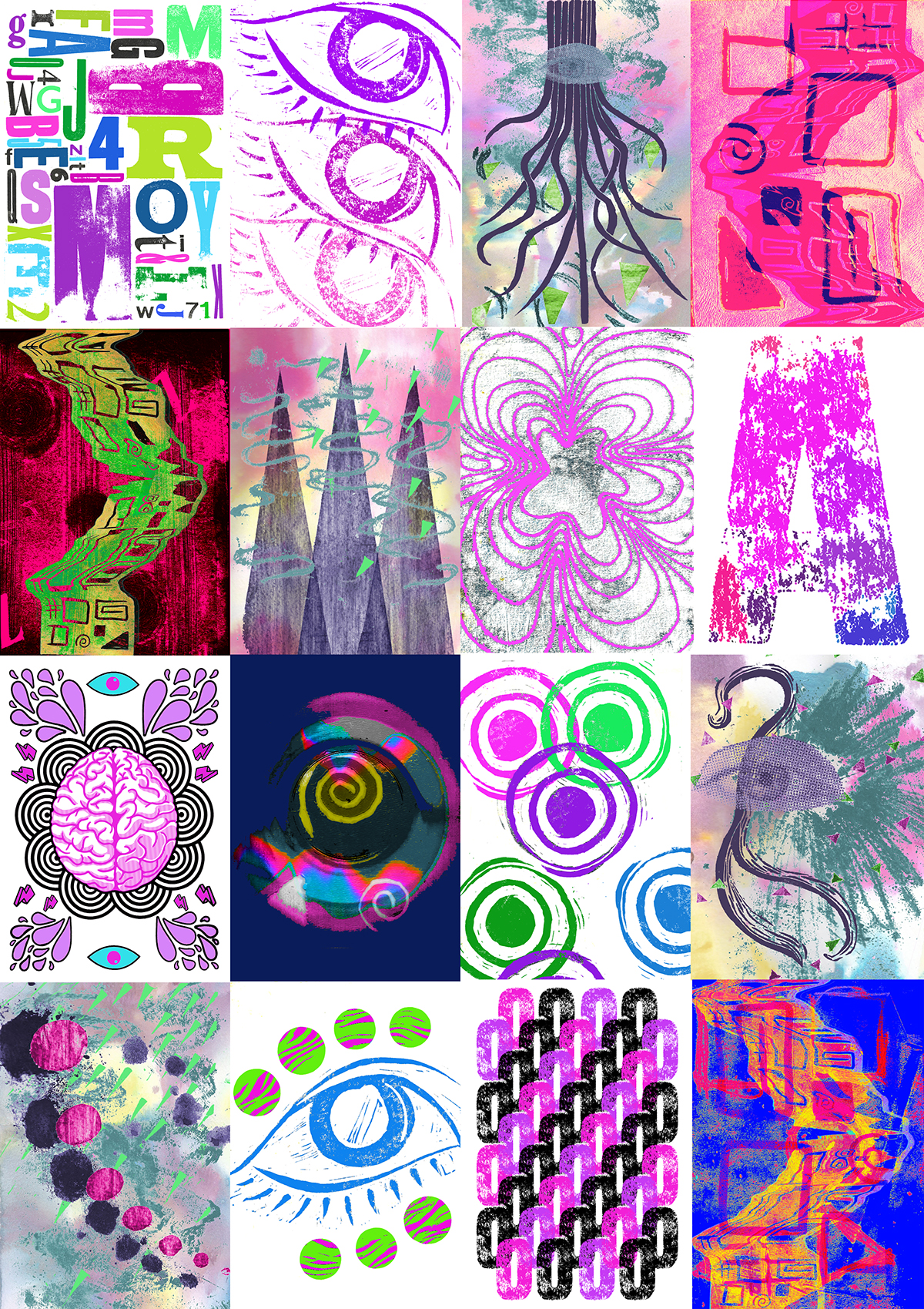
‘Synesthesia (Plaid – Hawkmoth)’
Final Piece
Collaboration with an illustrator and two graphic designers.
Mixture of Lino cuts, mono prints, drawings, letter press, YouTube and Adobe software.
According to the Oxford dictionary the meaning of Synesthesia is ‘The production of a sense impression relating to one sense or part of the body by stimulation of another sense or part of the body.’
During this collaboration the aim was to understand the word Synesthesia and create a music video for the Song Hawkmoth by Plaid which is a track classed under the dance/electronic genre. It was also an opportunity to explore the world of print where we used lino cut, mono print and the letter press. In order to create the music video, we had to feel the music and illustrate what we could hear, feel, see, and possibly taste. It was a very therapeutic project which taught us how to use all our senses when it comes to expressing art.
The final outcome was a publication poster which is above and a music video which is posted on YouTube (the link is below).
https://www.youtube.com/watch?v=mdF3LgvdxnM&app=desktop

‘Synesthesia (Plaid – Hawkmoth)’
Development
Lino cut, mono print, photoshop.
Above is a development piece part of the Synesthesia Project. The process shows a simple Lino cut scan developed into a final outcome.
1. Initial blue Lino cut scan
2. Second Lino cut scan with more depth of paint and edited from the colour blue to orange.
3. Lino cut dragged along the scanner whilst scanning.
4. The dragged scanned image, a coloured mono print and an experiment of colours.

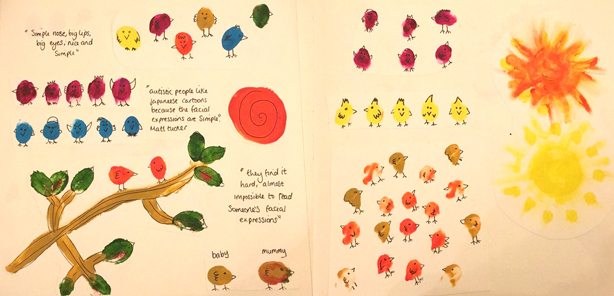
‘Expressions (Illustrated eyes)’
Sketchbook
Pencil and watercolour drawings.
In my spare time I like to practice drawing portraits and always start with a collection of facial features. I initially draw these in pencil, then photocopy the images and finish by colouring them in with watercolour pencils.
These drawings were also featured in the Synesthesia (Plaid – Hawkmoth) music video.
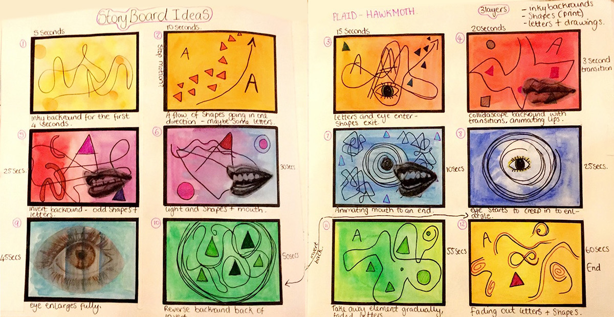
‘Synesthesia (Plaid – Hawkmoth)’
Sketchbook
Water colour, pen drawings, printed tracing paper.
Above is the story board of the Synesthesia (Plaid – Hawkmoth) music video.

‘Phoenix (character design)’
Development
Coloured ink, PVA glue, newspaper, paper, wire.
Above is a development piece of one of my character designs. The character is a phoenix bird which was exhibited at the Solihull 6th form college in 2013.
1. Final drawing of the character.
2. Experimentation with mediums (PVA glue and Ink).
3. Making of the skeleton.
4. Papier-mâché with a wing template.
5. Plastering the PVA glue/Ink material onto the body.
6. Final outcome suspended at the exhibition.
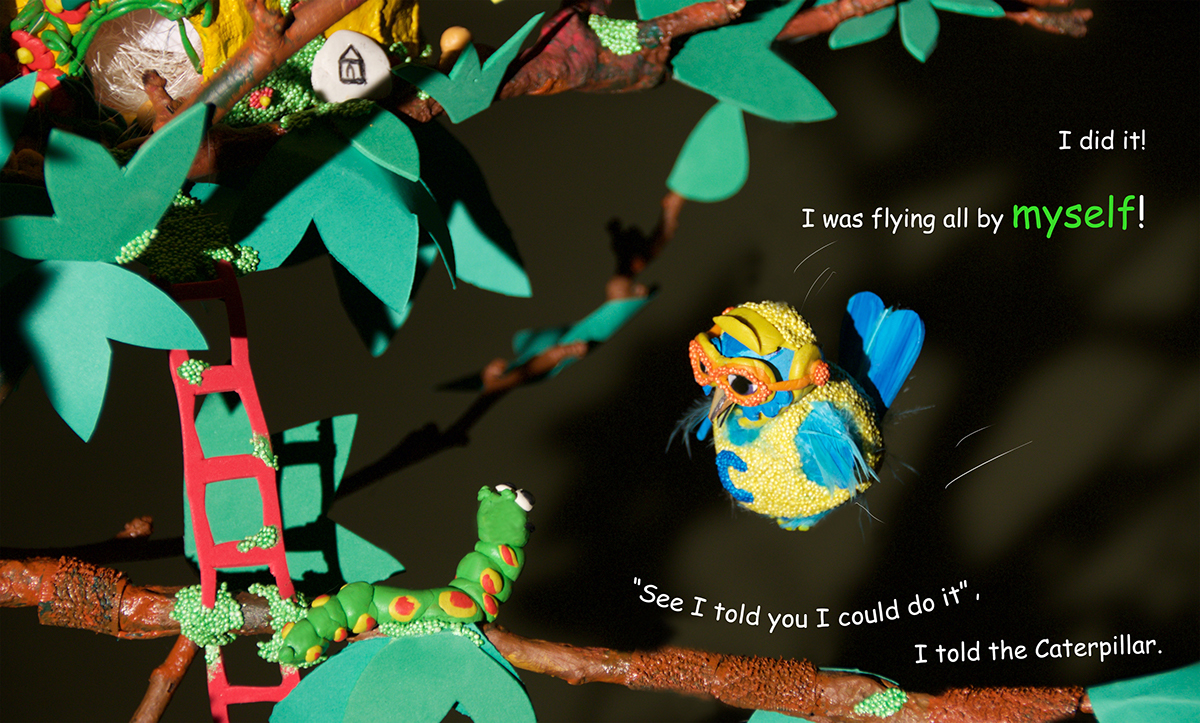
‘Fly Fairy-Wren Fly’
Final Piece
3D artwork, photography, paper engineering, recycled materials and a real tree branch!
Fly Fairy-Wren Fly is a children’s book I wrote and illustrated.
'Fly Fairy - Wren Fly' is a novel about friends, family, fear and frustration.
The main character Chirp learns to beat his fear with the help of Mummy Bird, who helps him to develop his skills. Whereas his best friend, The Caterpillar, creates a smart plan to help him do so.
A story for neurotypical children, to help understand Autism Spectrum Disorders.
It may also help provide children with the understanding to overcome various frights and experiences.
The sequel book 'Be Brave Fairy Wren Be Brave' is dedicated to all young children who have been diagnosed with cancer. Maybe it won't make
them medically better, but its aim is to lift their spirits even
if it's just by a notch.
them medically better, but its aim is to lift their spirits even
if it's just by a notch.
‘Fly Fairy-Wren Fly’
Sketchbook
Finger painting and research.
Above is a sketchbook spread of some of the initial art work and research I created after writing the story line.

‘Fly Fairy-Wren Fly’
Development
Research,drawings, colour pencils and a tree branch.
Some early stages of the character Chirp.
1. Research on different birds that could match the characteristics of Chirp (The Fairy-Wren).
2. Character drafts
3. 2D character mockup of a final illusion.
4. More development on the character Chirp.
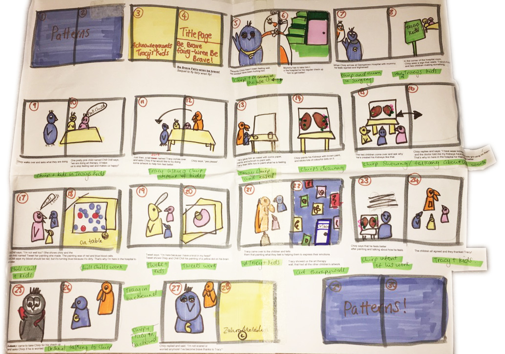
‘Fly Fairy-Wren Fly'
Sketchbook
Drawings and markers.
Storyboard of ‘Fly Fairy-Wren Fly'.
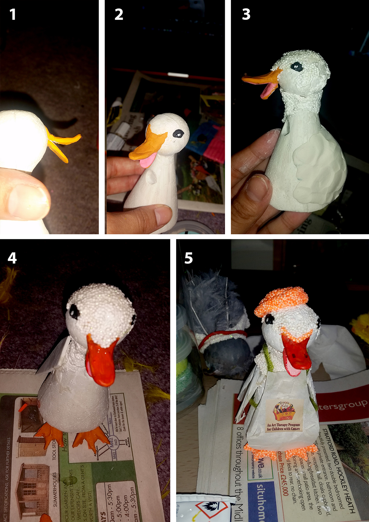
‘Fly Fairy-Wren Fly'
Development
Development process of the character Tracy from the second book (Be Brave Fairy-Wren Be Brave).
Foam clay, glue, paint, coloured clay, feathers, polystyrene.
1. Creating the skeleton of the character.
2. Painting the features.
3. Adding foam clay for texture.
4. Adding wings and webbed feet.
5. Finished with some paint, foam clay and a paper apron.

‘Venice’
Final piece
Pencil drawing and Photoshop.
I was very fortunate to visit the city on water. Venice is beautiful and definitely a place for an artist to visit. Surprisingly I was stunned by the architecture more than the canals on this trip, and found the details of each building designed with such detail.
Let’s just say I illustrated a lot of windows on this trip!

'Venice'
Development
Pencil drawing.
Above is the development process of a drawing I did in Venice from a photograph I took on a Gondola ride.
