Design Brief
Over the years, Kargo has asked many agencies to create a logo that is both timeless and fresh, familiar without being derivative of a trend, and representative of Kargo’s business without feeling too “tech.” Design firms have responded with all kinds of ideas, many of which were brought into practice in the short run, but didn’t have what it took to survive in the long term.
While these previous exercises didn’t yield a lasting brand for Kargo, it provided the company with a way to better evaluate and edit design options against a set of rules and metrics:
- If the logo isn’t legible as a 16px X 16px .ico, it’s too complicated.
- The logo should be fully scalable, and hold as much impact as a thumbnail or billboard.
- The logo should be equally powerful in black and white as it is with color, gradients or shadows.
- The logo should not be in perspective.
- The logo should be a silhouette – it can be figural (like Twitter’s bird) or abstractly geometric.
- The logo should be balanced. It doesn’t have to be symmetrical, but also shouldn’t feel like it’s going to
topple over.
- The logo can use the forms of a “K,” which Kargo sees as ownable: Facebook owns “F,” Tumblr owns “T,”
Pinterest owns “P,” and Kargo can become synonymous with K.
Any color treatment must adhere to the following palette:

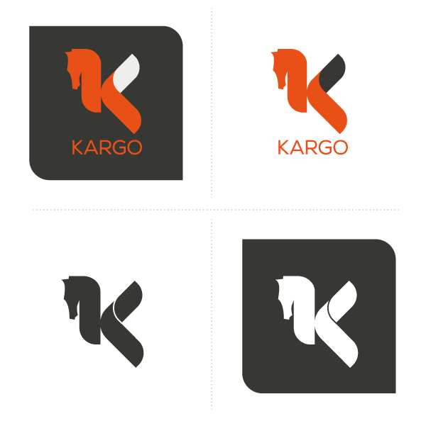
Pegasus is a symbol of knowledge, glory, and inspiration.
Since ancient times, Pegasus has been a symbol of power and speed as well as imagination.
Symbol of wisdom and especially of fame from the Middle Ages until the Renaissance, he became one symbol of the poetry and the creator of sources in which the poets come to draw inspiration, particularly in the 19th century.


