


Brutage [Брутэйдж] – линейка одежды для людей, любящих тяжелую музыку, экстрим и активный отдых. В основе графической части логотипа лежит изображение кузнеца. Он уже выковал название бренда из металлических прутьев и заканчивает работу, укладывая верхний элемент шрифтовой части. Неровность букв и линий логотипа говорит о ручной работе, в своем роде крафте в одежде, об индивидуальности и брутальном характере бренда.
Brutage is a clothing line for fans of heavy music, life on the edge, and active leisure. The basis for the graphic part of the logo is the image of a blacksmith. He has just forged the brand’s name from metal rods and is finishing up his work by laying the top element of the lettering. The unevenness of the letters and lines of the logo points to manual work, a «craft» in clothes of sorts, the individuality and rugged nature of the brand.

Изначально, логотип должен был состоять только из металлических прутьев, образующих латинскую букву «B» и/или целое слово BrutAge (от англ. Brutal Age – суровый/брутальный век). "Железо, кованые прутья, металл, средневековые пики, решетки, пытки.... брутально!" – именно это хотел видеть заказчик в логотипе.
Originally, the logo was supposed to consist of only metal rods forming letter «B» and/or the complete word BrutAge (from Brutal Age). “Iron, wrought iron rods, metal, medieval spears, lattices, tortures… brutal!” This is exactly what the customer wanted to see in the logo.

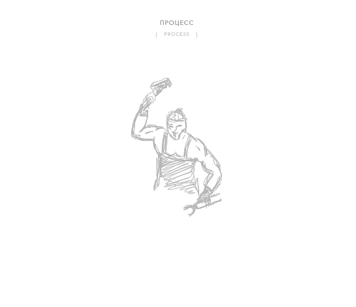
В процессе создания логотипа родилась идея передать брутальность через образ человека. Выбор пал на лесоруба и кузнеца. Почти сразу было принято решение в пользу второго, который выковывал бы название бренда Brutage. Т.к. основная целевая аудитория одежды любители металла (в данном случае музыки), а кузнец работает именно с металлом, то данный образ на 100% отвечает поставленным перед брендом задачам.
The idea of conveying brutality through the image of a man was born in the process of creating the logo. Then, a lumberman and blacksmith were chosen. Almost immediately, the decision was made in favor of the latter who would be forging the name of the brand «Brutage». Since the target audience of the clothing are metal lovers (in this case, music), and the blacksmith works with metal, this image is a 100% match for the brand’s set goals.


... «Большой город – это ареал хищников. Дикая природа не терпит слабости – ее нужно покорять раз за разом, двигаясь с нарастающей динамикой. Максимальный комфорт движения может обеспечить только одежда из качественных материалов и натуральных тканей. Мы создаём не просто удобную, но и универсальную одежду. BRUTAGE ™ – это лаконичный стиль мегаполиса и стойкость вне городских условий. Мы совмещаем милитари и рок в одном продукте, раскрывая вашу индивидуальность. Одежда BRUTAGE ™ готова бросить вызов трудным обстоятельствам и природным катаклизмам. Любишь экстрим или просто готовишься к Зомби-апокалипсису – BRUTAGE ™ подчеркнет твою крутизну и невозмутимость в любой непонятной ситуации».
... «A big city is a natural habitat for predators. Wildlife does not tolerate weakness – you need to conquer it time after time, moving with increasing dynamics. Maximum comfort of movement can be delivered only by clothes from quality materials and natural fabrics. We create not merely comfortable, but versatile items. BRUTAGE ™ represents the laconic style of a megalopolis and endurance beyond urban conditions. We combine military and rock in one item revealing your individuality. BRUTAGE ™ clothes are made to defy challenging conditions and natural cataclysms. Whether you love living on the edge or you are just preparing for Zombie Apocalypse, BRUTAGE ™ will emphasize your toughness and cool in any circumstance.»
_____________________________________________________
BRUTAGE ™
Made in brutal country for brutal people!
Made in brutal country for brutal people!


