


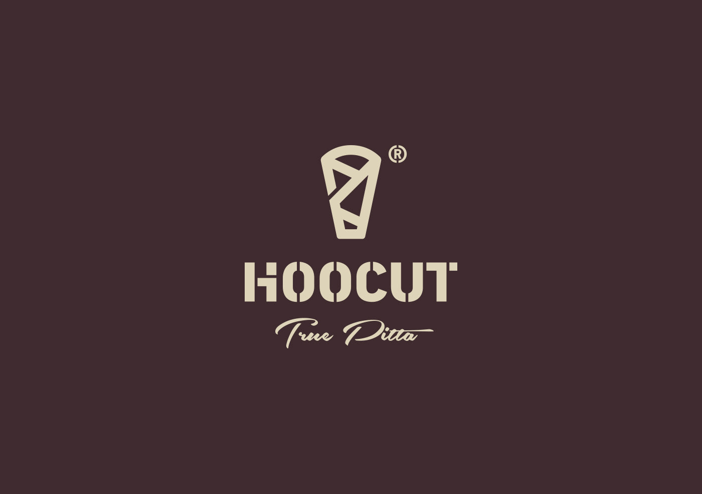
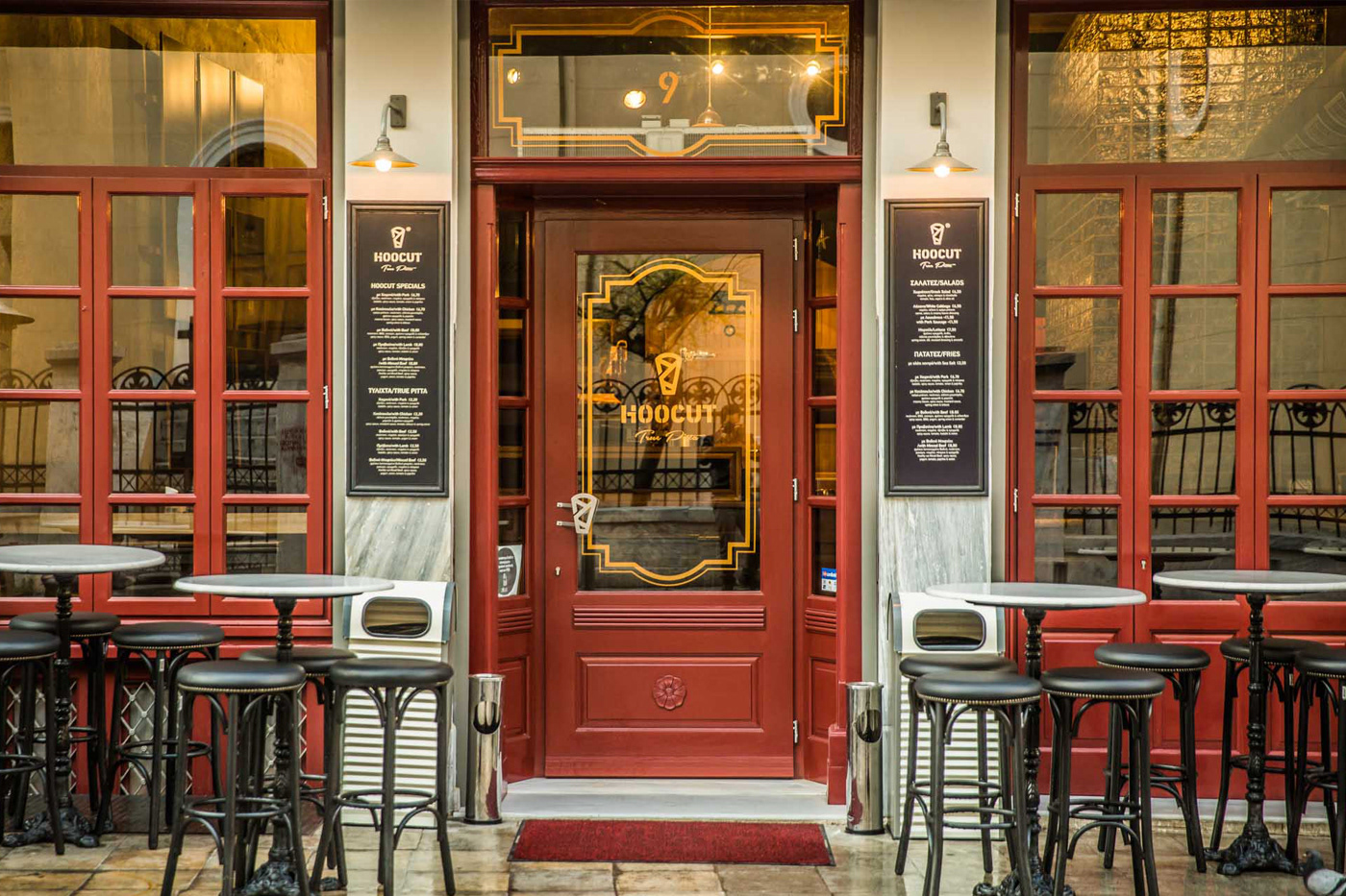
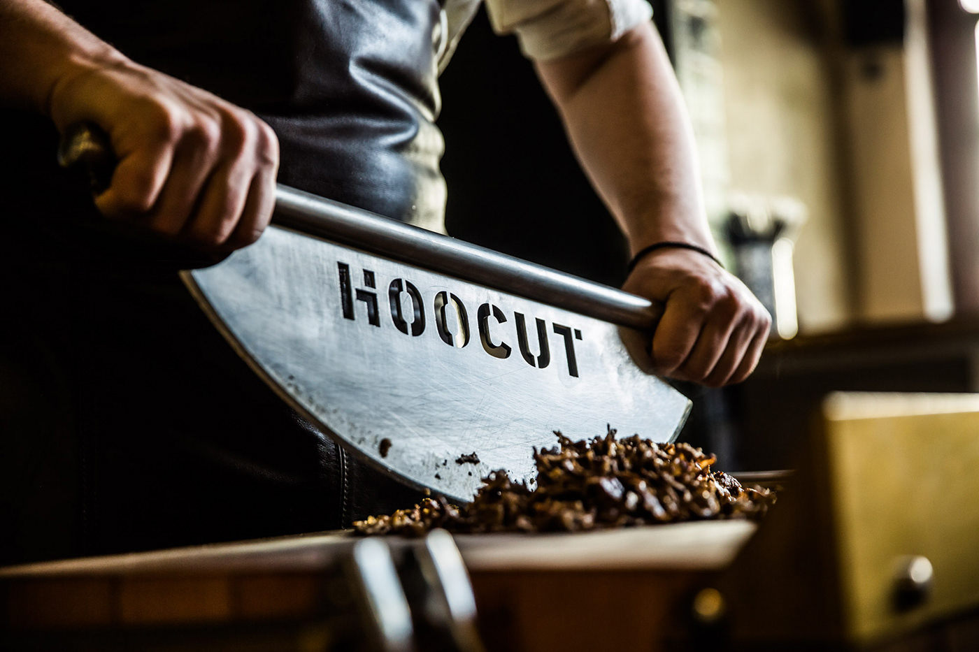
Hoocut® | True Pitta
The naming was created from the combination of the word "hook" and, in this case, the hook from which the meat is cut, and the word "cut".
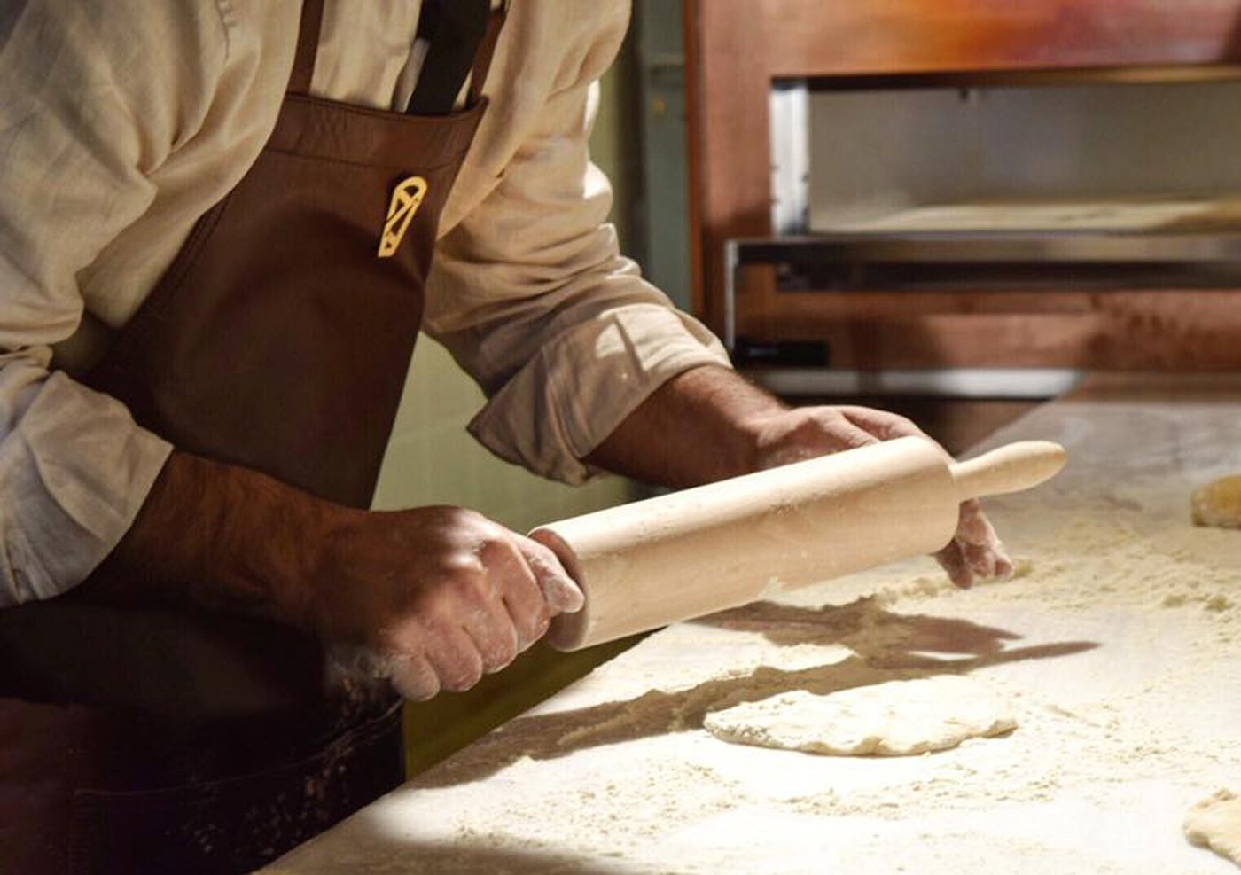
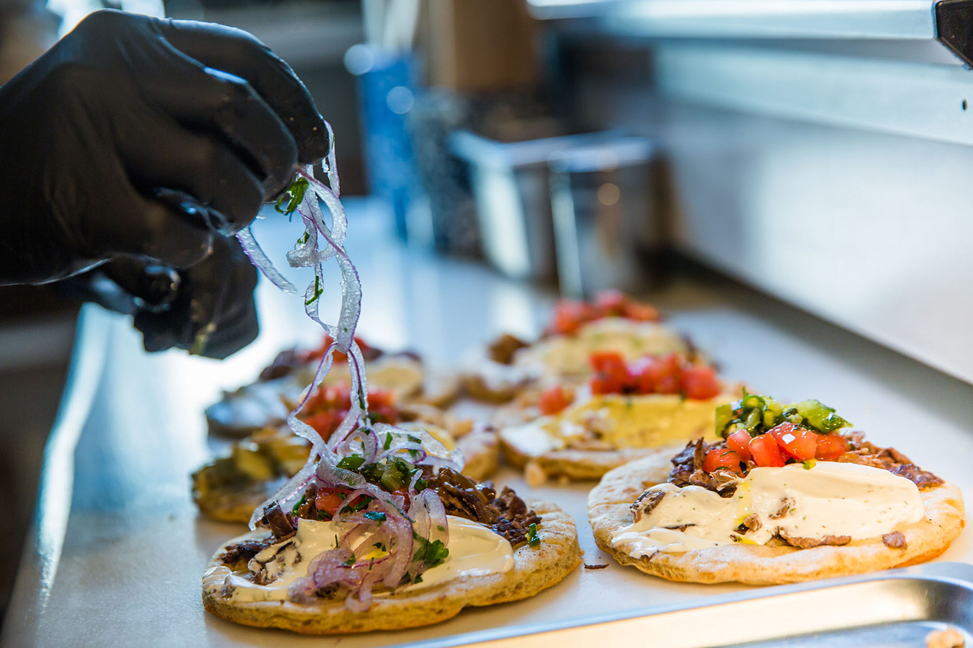
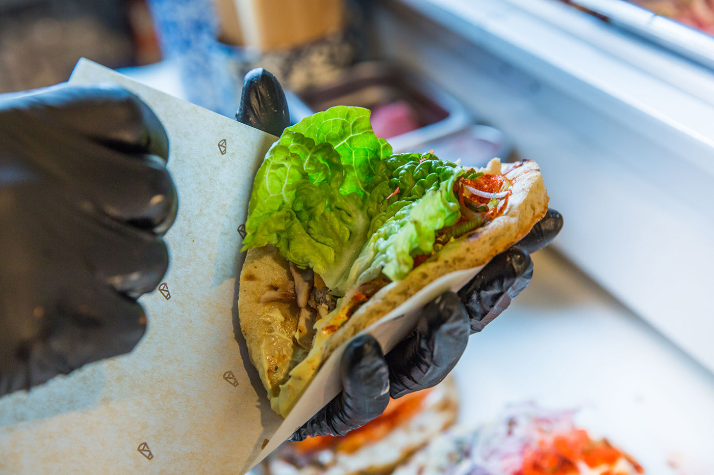
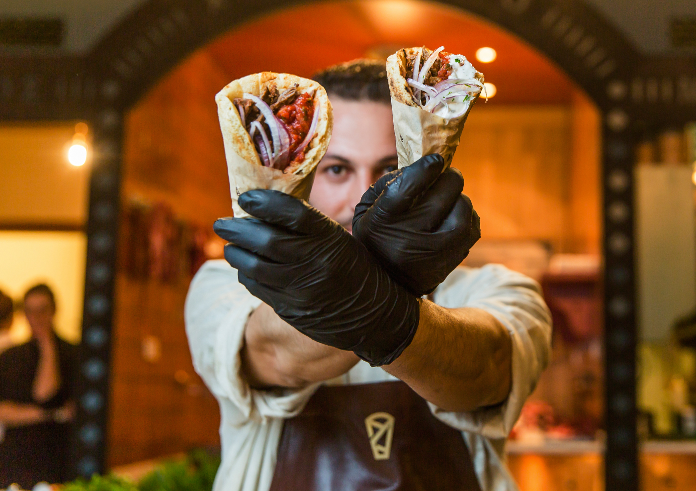
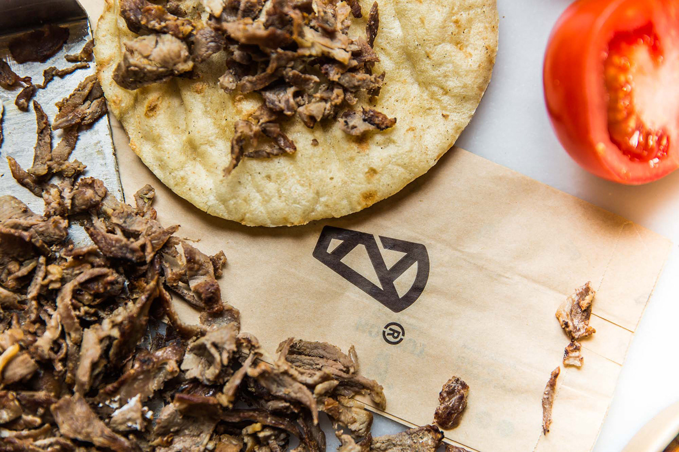
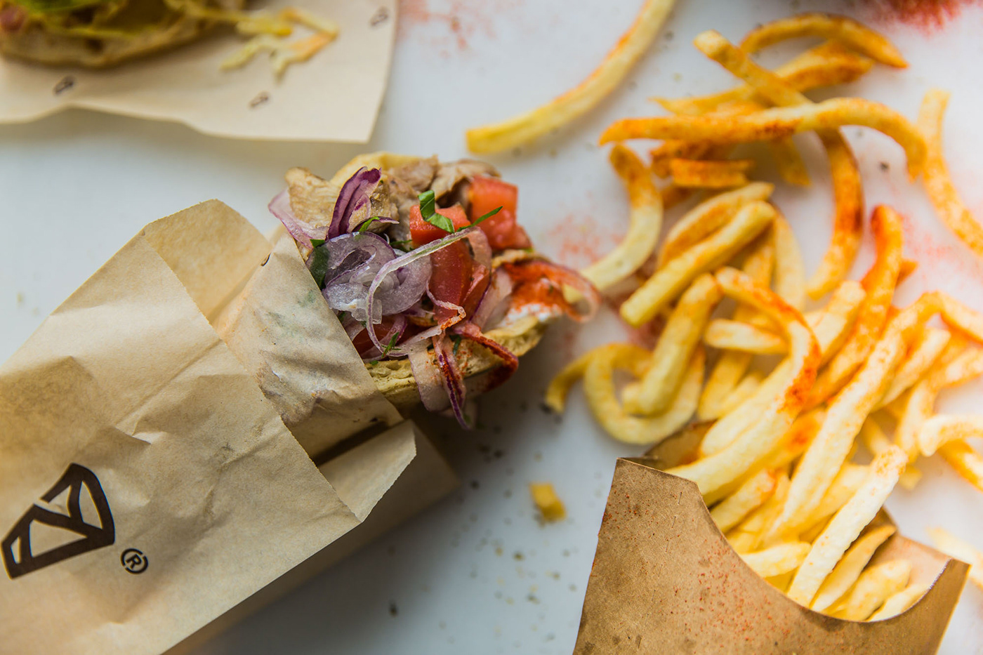
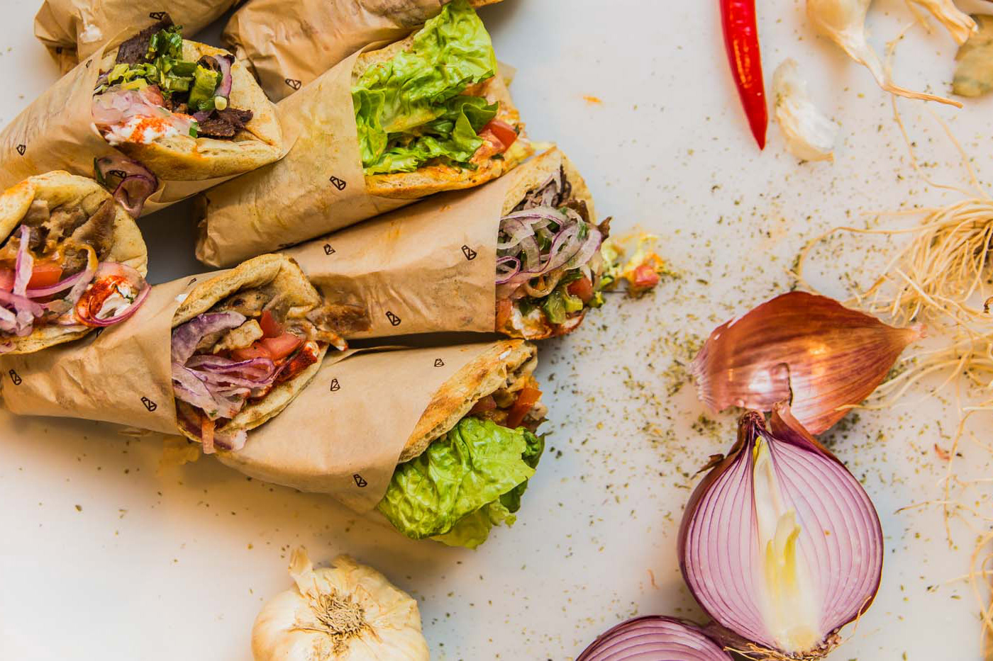
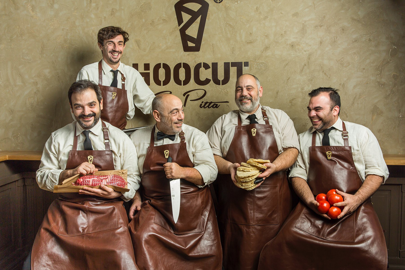
The descriptor “True Pitta” highlights the actual product, which is the Greek pita wrap.
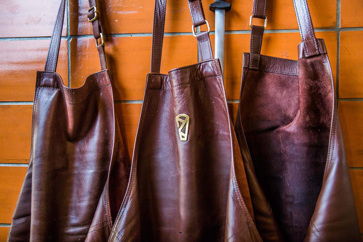
The symbol of the logo visualizes the pita wrap in a geometric form. The typography chosen is Stencil, with a clear reference to cutting.

Η ονοματοθεσία προέκυψε από τον συνδυασμό της λέξης “hook”, που σημαίνει “γάντζος” και, εν προκειμένω, ο γάντζος που κρεµάµε τα κρέατα, με τη λέξη “cut”, που σηµαίνει “κόβω”.
Ο προσδιοριστικός τίτλος “True Pitta” υπογραμμίζει εύστοχα το πραγματικό προϊόν.
Το σύμβολο του λογοτύπου οπτικοποιεί με γεωμετρική φόρμα την τυλιχτή πίτα. Η επιλογή της τυπογραφίας είναι Stencil, με σαφή παραπομπή στην κοπή.
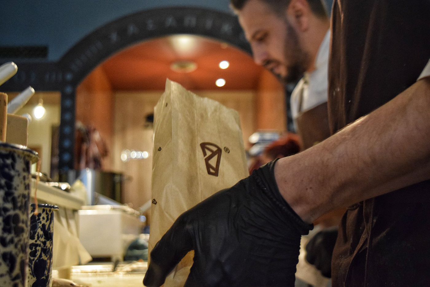

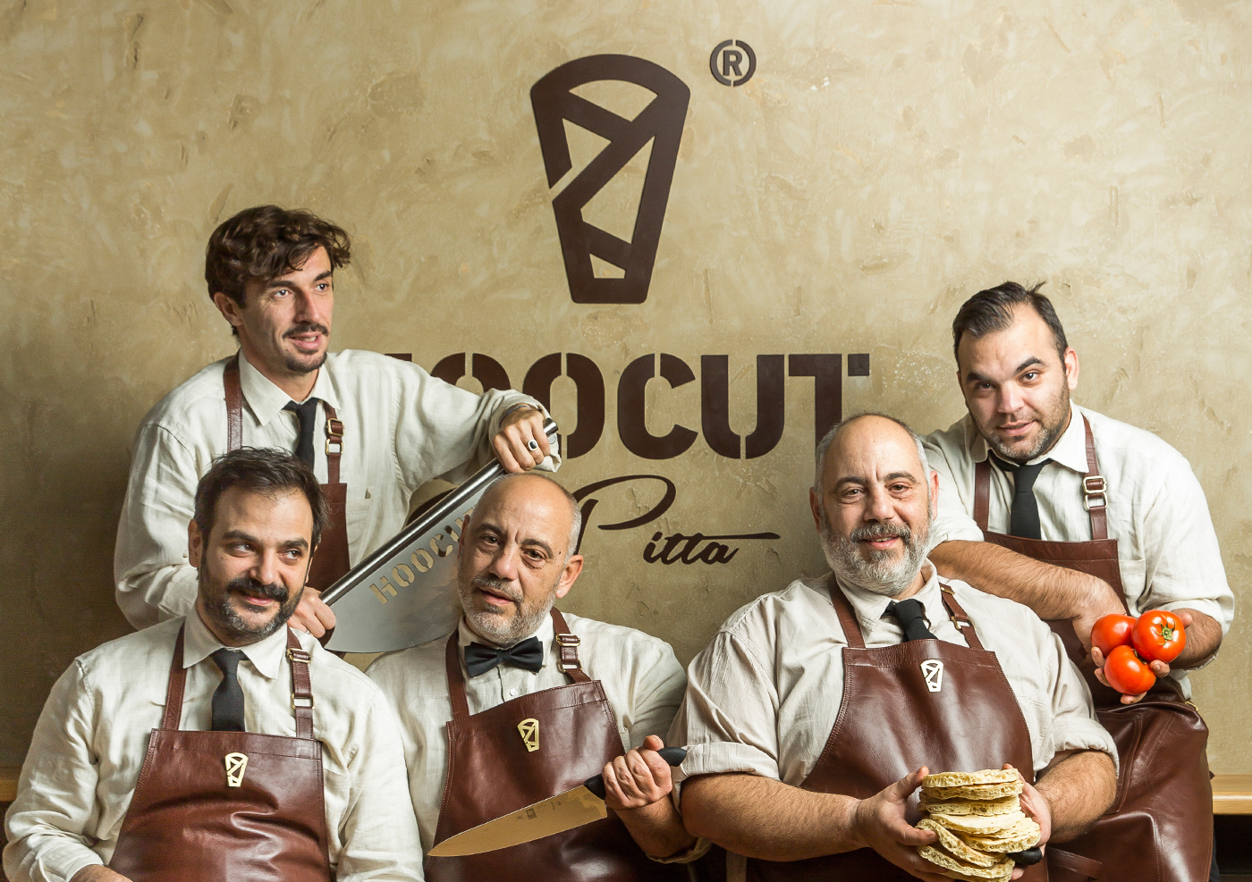


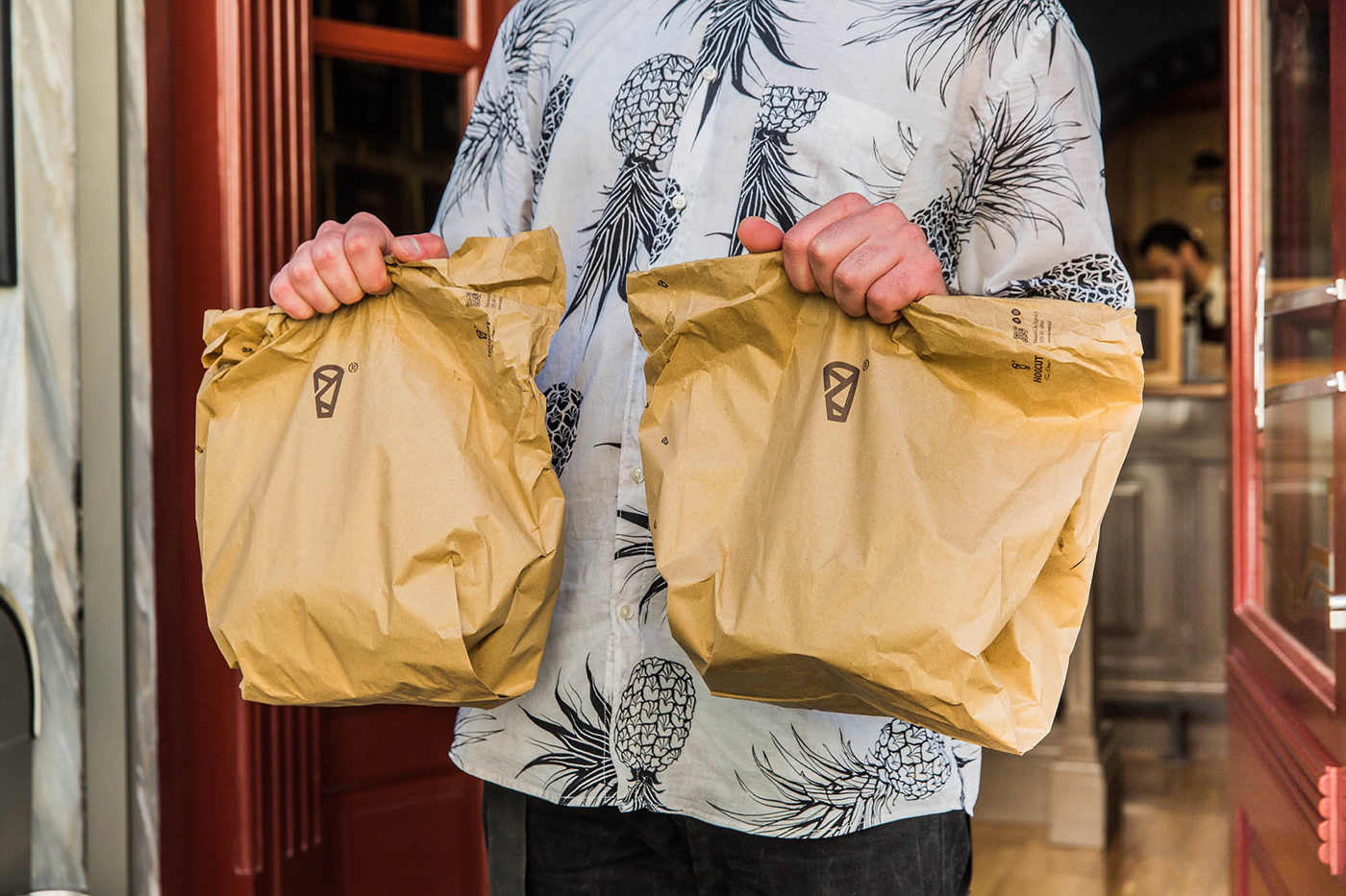

CLIENT Hoocut | True Pitta
CONCEPT & DESIGN Chris Trivizas
COPYWRITER Sissy Caravia
TYPEFACE Parachute® Typefoundry
PHOTOGRAPHY Dimitris Vlaikos
©2018


