

The idea of the app
The App is tracking time spent at the users most visited locations setting activities per visit, enabling him to get an overview of his daily activities, no matter if it´s private or business. By setting attributes to each entry the user can easily oversee his activities and create valuable statistics.
This combination of automatic time and activity tracking with the extend of detail is not available yet.
This app is based on the needs of young creative workers who tent to have an unbalanced life. It allows them to track the time spent at work, sport and other activities which are bound to a location. By setting up projects, it’s possible to assign entries to these and keep track on the hours per project, to make sure it stays under control.
The user can define up to 20 often visited locations to be tracked automatically, so there is no need to track the start- and end-point of his stay. When configuring projects properly, the app can even assign activities and projects automatically without any interaction of the user. In case the app is not able to combine enough info for the definitive assignment, it will ask the user to help out and provide additional info. This way the user can concentrate on working instead of thinking about the tracking.
Competitor apps
To get an impression on the current situation on the market, I’ve checked out 3 popular apps with a similar functionality and approach. For each app the functionality is described, features are laid out and a SWOT analysis is made to create a clear image.

Start creating
Paper Version
To create the structure of the app, I started by defining the content and functionality per screen and type of content. This structure orientates on the structure of current apps, as some of them seem to have an usable structure to get startet with.
Having set a rough structure for the data of the app, it was time to start organizing it on screen. To get a first idea on how to arrange things I’ve drawn some ideas for the main screen, the overview of locations and a settings page for locations on paper.


Various ideas on organizing the content, which is mandatory per screen, using pen and paper
Digital version
As this paper sketches are providing a rough idea but no real view on the design and details, I created digital versions of this screens in Adobe XD as the start for an interactive prototype. To keep the design according to the iOS Human Interface Guidelines and create a design which has familiarity to the operating system for easy adoption of new users I’ve used a lot of elements from the official iOS UI-Kit.


The screens of the sketches created in Adobe XD. Interactive Prototype

Extend the design
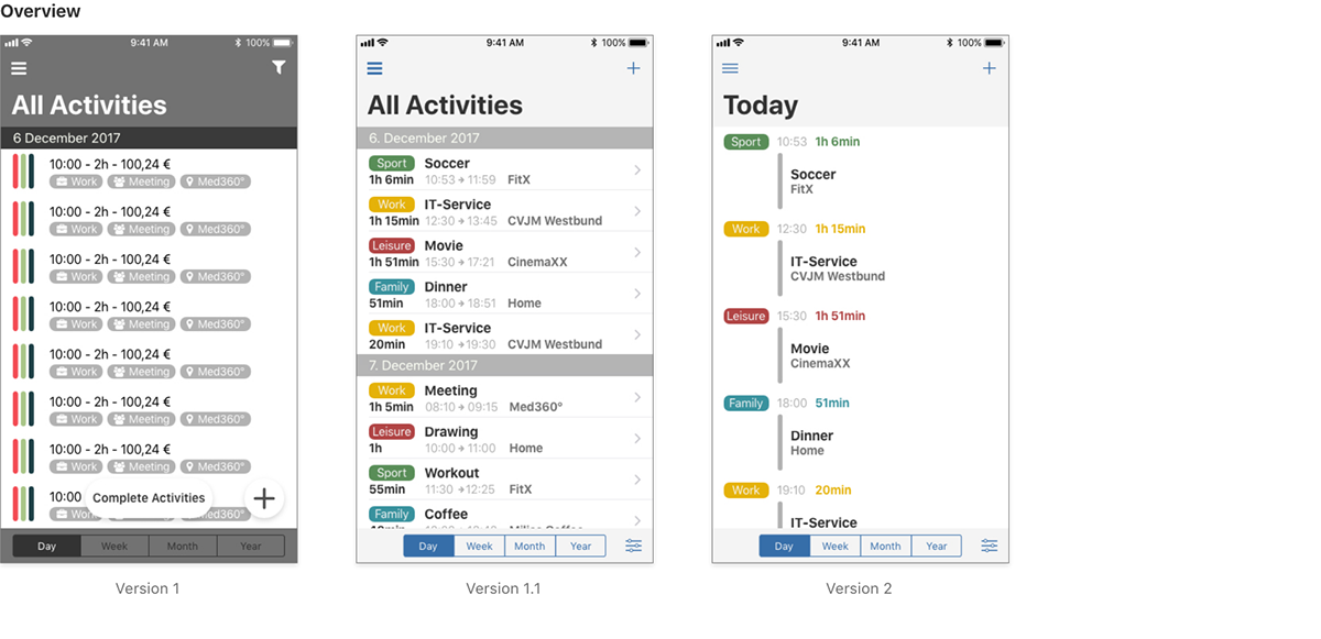
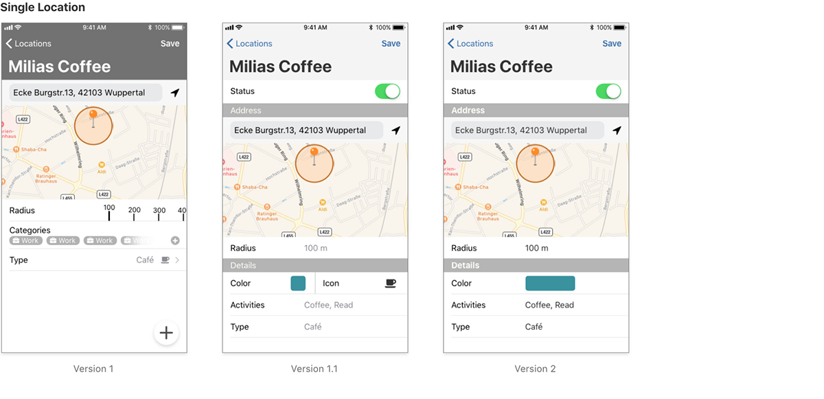
As it is often good to take a step back and look from a different perspective on the current situation or object, I did that on the first version of layout and design. By looking at all screens and rethinking the purpose per displayed element it turned out, that a lot of the elements are not useful in the created manner.
So I created version 1.1 and version 2 of the UI.
Feedback
It is good to take a second look on the design by your own, but it is even better to show it to others. Because the design and interactivity were not created to an extend which allows a real user test, I decided to show it to colleagues and other freelancers and talk about the design, how elements are arranged and their purpose.
This turned out to be very helpful to reveal obvious flaws, such as the inconsistent styling and arrangement of elements through the screens. This basic feedback set the base for the third prototype which has an extended functionality and screens. This version was the first to be used for user testing.

Adjust - Test - Evaluate - Repeat
To design an interface, taking a professional approach into account, it is necessary to keep things running and don't stick too long to minor adjustments or problems, as it increases costs and slows down the process. To avoid getting into a situation where I struggle with peripheral issues I’ve made two things:
1. Create a list of the major adjustments which should be done
2. Create a test scenario with a theoretical background for credibility
From this point of development the process starts to gain speed, as it changes into an ongoing rehearsal process of adjusting the design, testing, evaluate the outcomes and start over again. Obviously the testing is also optimized.
Testing
The tests had a clear structure and were done in a calm environment so the testers were able to concentrate on the test and their impressions. The tests were done with an iPhone, showing the interactive prototype and a piece of paper with the tasks, guided by me. Each test consisted of 3 parts:
- Beforehand: a personal introduction to the app - including a description and concrete examples fitting the persons use case, and to the method of testing.
- The main part: the test - by handing over the device with the running prototype and the paper with the tasks to fulfill.
- Afterwards: concrete inquiries on occurring problems.
During the test, I only observed the user and provided info on questions of understanding to enable the user to finish the test. Afterwards I discussed the solutions and struggles with the user to understand his thoughts better. For in-depth analysis and documentation, the screen of the iPhone and the discussion was recorded.
Design after first test


Current design
The tests revealed a major flaw in the data structure of the app, which led to confusion and misunderstanding of the testers/users, so I decided to rethink it and adjust the overall design. The old structure held a lot of information in the activities and locations, which was not as intuitive and useful as expected.
Analyzing this issue it turned out to be more handy to focus all info on the entries instead of the activities and store as much info as possible info directly in the entry instead of keeping it in a combination of activities and categories.
The content is now split into two groups - private and work - to have a clear structure in the content of the entries while the handling and the automatics are the same. So the content of the entries in the group private can differ from the one for work, keeping the general structure.
The current design covers only the tracking of activities concerning work, as it is the main objective for the app.
Overview


Menu


Interactive prototype of the current version
-

Next Steps
To round up the concept and make it ready for development the following steps should be done:
- Evaluate the outcomes of the lasted user test adjust the prototype if reasonable
- Implement more scenarios as for instance the automatic entry and test them at least in two rounds
- Write a complete Functional Design Document for development

Learned objectives
Not having a plan of the full structure and functionality per screen caused problems as this lag had to be filled during the design and testing process. Nevertheless thats not optimal it turned out to be useful as problems in the model directly showed up and could be fixed.
By doing the design using Adobe XD encouraged me a lot to go on as it is possible to really test out the ideas even though Adobe XD lagging some features. But the easy process made it easier to create new approaches and start with new ideas.
Setting up a test environment showed me that it is very important to organize things well and to be prepared as the testers are new to an objective and have different approaches. The tests really pointed out the lags in design, which weren't visible to without.
Thanks to everyone involved in working on this project by guidance, testing and thinking.


