


REBRAND: RADIO HAURAKI
Radio Hauraki, one of New Zealand's oldest commercial radio stations, was long positioned as a hard core, irreverent, rock music radio brand. Established illegally in 1966 in the waters of the Hauraki Gulf, the "pirate" station wished to break the state monopoly on radio frequencies.
In 2017 the Hauraki brand has evolved: It has grown up and got a haircut too. It has a new playlist, a new look and new hosts. But it’s still going against the grain and proud to be different. It hasn’t lost that rebellious spirit that it was founded on, and for many listeners it’s a daily connection to their youth. When tackling this project it was important that the branding conveyed it's "new era" whilst maintaining the irreverent maverick personality listeners had grown to love. The aim of this project was to refocus and revitalise the brand, attracting new listeners that may not previously have engaged with Radio Hauraki in the key demographic of 24-44 males.
Art Direction/Design/Retouching: Ashleigh Van Graan
Photography: Ted Baghurst
Styling: Louise Rae
Motion Graphics: Fraser Tebutt
Copywriting: Glenn Dwight
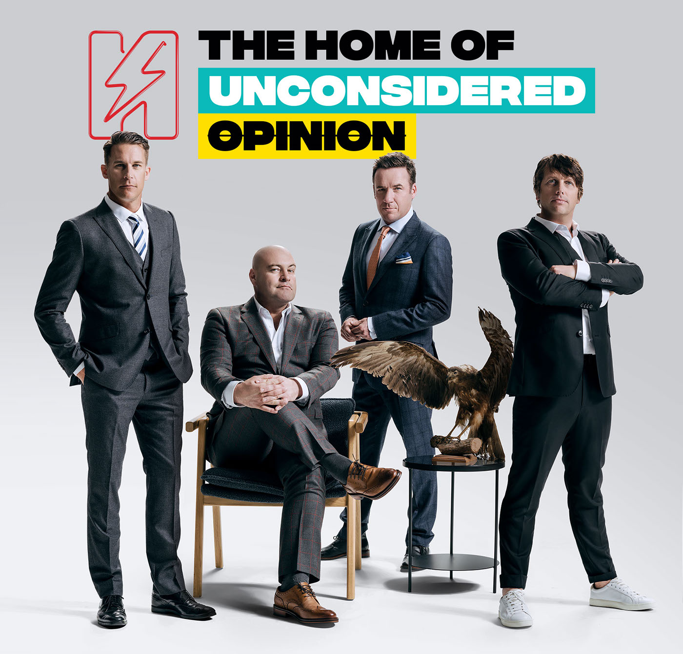

Confronting copy is juxtaposed with classically styled imagery to deliver a campaign that reflects the brand attitude and values. Copy can be easily adjusted so it is bespoke to a region/area or topical depending on current affairs. The tone of the copy is witty and smart, without losing the humorous undertones Hauraki has become known for.
The colour palette chosen for the brand is a development of it's predecessor, taking it into a more modern and alternative space in comparison to the classical rock style it had been for many years. It gives Hauraki a diverse range of colour combinations that can be used in either a subtle or attention grabbing way, dependant on message or medium.
The feeling of the design is very irreverent and strategically random.This is to make the viewer question it just that little bit, and have the feeling of it not being quite right e.g. the campaign line "uneasy listening" features upside down on most executions, and isn't quite contained by it's boxes, just like Radio Hauraki.


THANK YOU FOR VIEWING!


