

Physics, chemistry, and biology are common, core high school science courses in the US, and are often perceived as subjects that are unapproachable to all but the “smartest” and most motivated of students. These textbook covers aim to refute this perception by reminding users of the fundamental elements of each subject every time they use the books.
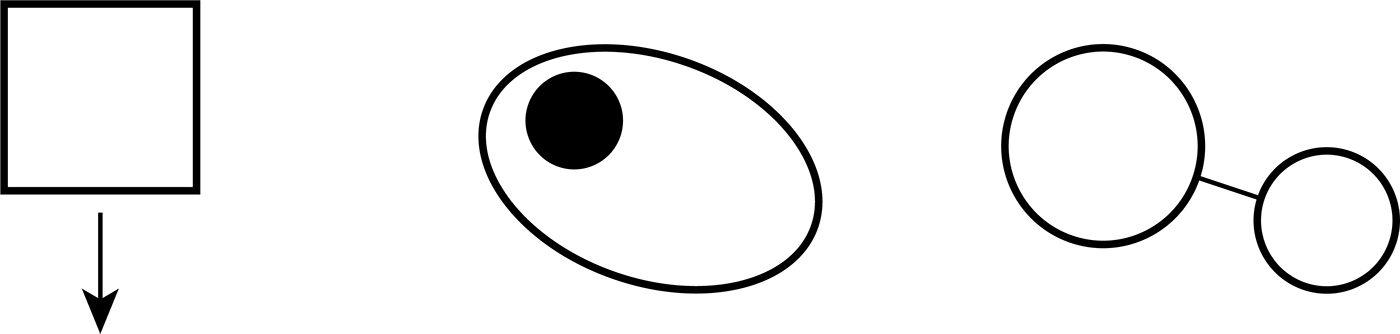
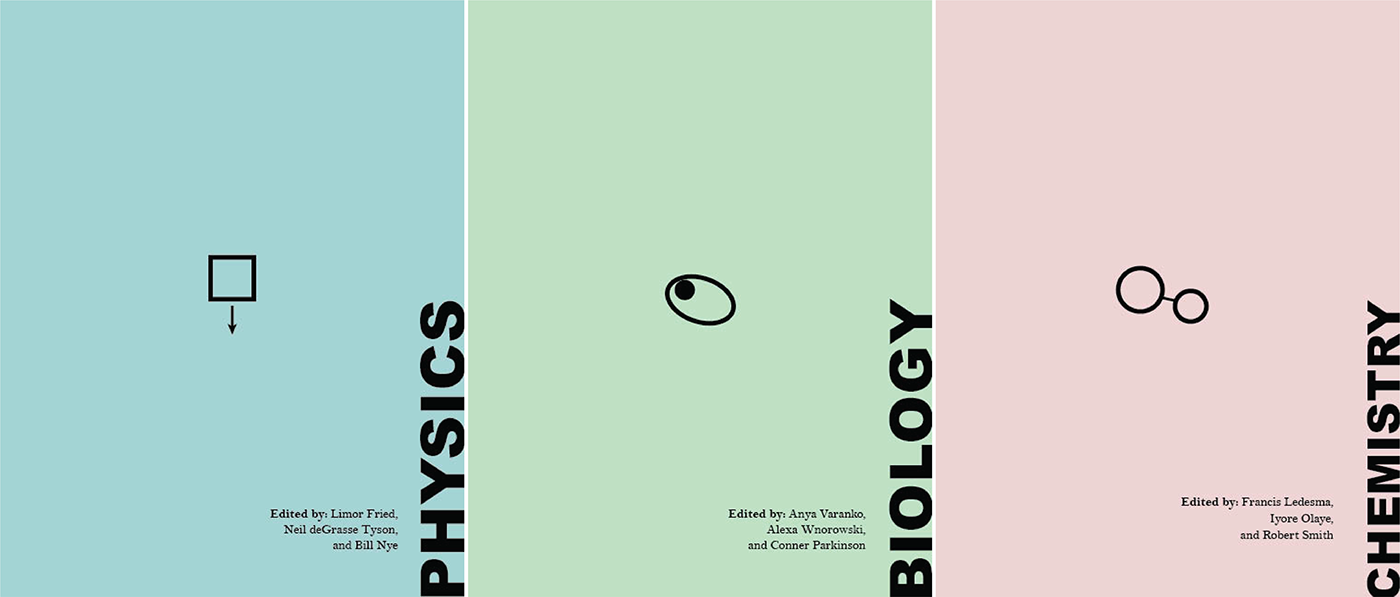
I distilled each subject down to what I feel is a fundamental element for each: a cell (eukaryotic -- with a nucleus) for biology, two atoms connected by a bond (diatomic, single bond) for chemistry, and a [rigid] object moving in a [specific] direction (downward, as an additional reference to gravity) for physics. Of course, each can be broken down further, or different fundamental elements could be chosen. I made specific decisions about how fundamental each of my building blocks needed to be; for example, choosing a rounded cell with a nucleus but no organelles because I interpret cells as the basic building blocks of all living things, instead of a strand of DNA since some single-celled organisms have RNA instead of DNA (and RNA, DNA, and proteins together are the three essential molecules necessary for all life, etc.).
Originally, I thought it would be nice if each cover was simply black text on a white background, but that did not look nearly as nice in print as it did on my laptop screen. I decided to use a washed-out split-complimentary color scheme (red, green, and blue-green) and arbitrarily assign the color to each book cover. I chose Arial Black as the bold, sans-serif title typeface because I did not want the title to feel ostentatious or unrelatable, which I thought serifs or a funky typeface might cause. For the body text, however, I wanted the typeface to feel dignified and deserving of respect, yet friendly and approachable (like my favourite science teachers!), and Bell MT fit that description to me.
Finally, I laid out the cover so that the eye would be drawn to the fundamental icon in the center, and only after would the viewer notice the title and authors.
In high school and college, many of my math and physics textbooks displayed images of roller coasters or bridges on the covers. It was as though each textbook was trying to tell me, “At the end of this, you will be able to build a roller coaster!” As if the roller coaster was an aspirational reminder.
I worked very hard to succeed with math and physics – I enjoyed it and wanted to be good at it, but it did not come naturally to me. One of the things that helped me the most was grounding myself in the fundamentals of each topic before starting homework or tests. For this final Mark Making assignment, I knew that I wanted to do a set of math or science textbooks that would empower students to feel like these subjects were within their reach. These textbook covers each display a fundamental element of the book’s subject, hopefully grounding students in the fundamentals each time they reference the book, rather than showing them a subjective aspiration.


