
Gisin Landscape and Design Rebranding
Gisin Landscape and Design is a local business that was looking to update their original logo. It was outdated, inconsistent, and needed some new life breathed into it. They required a neat and tidy, new logo to reflect the exceptional work they do.

As you can see above, this business had a variety of versions of their logo. They were looking for something consistent and more modern to refresh their look.
Below is the complete original logo. It was a very wide format, low quality and difficult to use in many applications.

At first, the Gisins were unsure of what direction they wanted to go with a new logo. I gave them a variety of ideas just to get started and see what direction we needed to head in. After viewing the first draft, they decided they wanted to stay with their original theme of mountains and trees that they have used for decades, but they also liked the idea of changing the letter 'i' into something else.

Draft 1
By draft two, I felt like the logo was getting way too busy, which was a problem with the original logo. We didn't want to fall into that trap again, so I tried to stress the importance of simplicity, especially since I am a more minimalist designer by nature. This is where compromise between the designer and the customer is essential. It's crucial for the customer to receive a design that they are happy with (otherwise I'd be out of a job), but it is still my responsibility to make sure that they receive a functional and readable logo in the end. In a small survey, we discovered it was almost impossible for people who were unfamiliar with the company name to distinguish the first 'i' when it was a tree of any shape, so that absolutely had to go. Not all designs are successes, and that is what drafts are for!

Draft 2
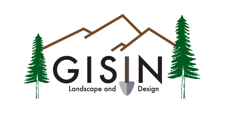
In the end, we retained a shovel for the second 'i' to display the fact that the business works on changing and maintaining landscapes. We kept geometric mountains to tie in with the shovel. The customers preferred the organic trees to the geometric ones, and I felt that this worked because it added some contrast to the logo and gave it a more nature-y feel without becoming messy.
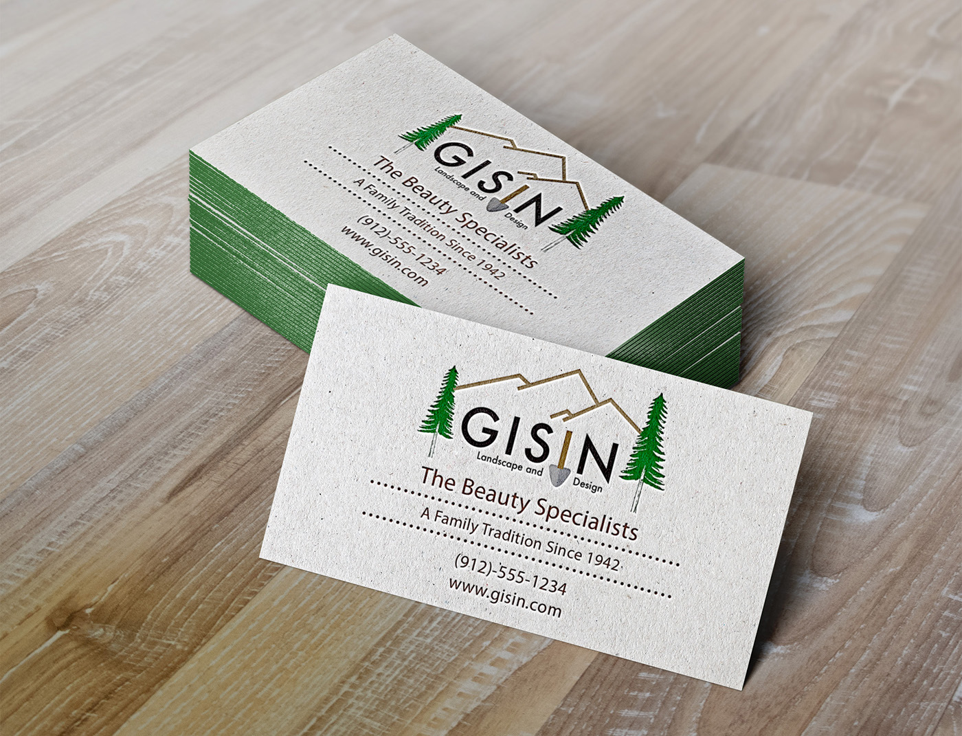
Business Card Sample

New logo decal on one of their many company trucks. Our print business also applied full coverage back window decals and tailgate decals. We are currently in the process of updating their building signage and vinyl wrapping the larger truck pictured in the first image. I will add more images in the spring when all of our branding projects are done.


