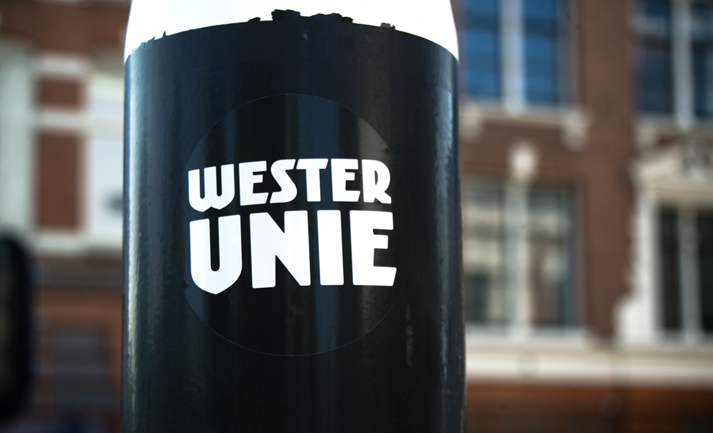
Since there is little typographic expression of the 'Amsterdam School' of architecture, we have always felt there was a need for fonts that expressed this particular aesthetic. 'Kurversbrug' is a revival of the Amsterdam's bridge letters. The original alphabet was probably designed by Anton Kurvers around 1930. Ramiro Espinoza solved many inconsistencies in the original model, completely redefined several letters, added punctuation marks, designed new weights and turned a simple alphabet into a family suitable for posters and standing flyers.