CaliforU — Rebranding
CaliforU is a west coast accessory brand with the purpose of bringing California style to its customers.
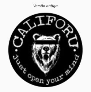
The proposal of rebranding is because it was realized that the brand did not have a palette of colors and symbols defined, just a polluted logo, with a lot of information, not to say about the product offered and amateur.
The proposal of rebranding is because it was realized that the brand did not have a palette of colors and symbols defined, just a polluted logo, with a lot of information, not to say about the product offered and amateur.
The idea is to get CaliforU to be visually inserted in the market, creating greater identification with the target audience, maintaining the origins and at the same time fixing the mounting errors of the old logo.
The bear was kept as a central element, but with fewer traces. It is facing west and with a star above, referring to the California flag star. Thus, CaliforU gets two items to work on even the bracelets, the bear and the star.
The typography for the title “CaliforU” is a more laid-back font with a more urban / street texture but also blends in with the beach environment. The other typography already brings more seriousness, with a finer stroke than the first so that there is a balance of sensations. So we have a relaxed, stylish font and a more serious second to build authority and trust. In addition, the function of this second font is that it is easy to read on any surface that is applied in any size.


