
KPCB Design Challenge — IndieGoGo App Redesign


Problems with the original design (Jan 2018)
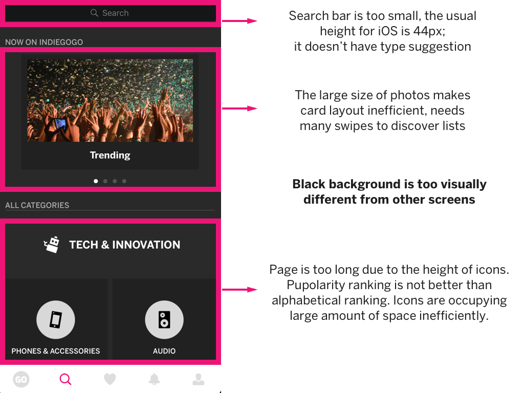
Home Screen


Campaign Overview


Search
Saved

Design Process
Competition Analysis
IndieGoGo's biggest competitor is Kickstarter. Kickstarter's iOS app has a cleaner visual aesthetic, easy navigation, and great information architecture. Another difference is that Kickstarter places more focus on text. Thus, it uses a subtle color scheme to make reading comfortable and scanning easy. It also uses blocks or cards heavily.
Home Screen


Users can browse the curated list by expanding the list on top. Image heights are shortened so that users can scan content easily. The caption now have white background and new layout for readability.
Campaign Overview


The progress bar now has consistent layout with the home screen. The progress texts are all pink (instead of greying out some of them) because the user wants to know the details of the campaign, so the texts are of equal importance, in contrast to the scanning on the home screen. "Read Story" now has an arrow to indicate the affordability of a button. The bottom "contribute" bar is hidden when the user scroll to the perks section so as not to confuse the user. Instead of a right-aligned "get this perk" button, the button is now center-aligned with the text "claim" which better corresponds to the rest of the writing. The perk blocks now have more details, a lighter arrow icon, and improved layout for scanning.
Search


Search screen now has a text-based, alphabetically ranked list. The typography and colors are consistent with other screens.
Saved


Saved screen now uses cards with images for better scanning. Important information such as funding progress and days left are emphasized using pink.