
MilliporeSigma Quick Purchase UX Improvements
I spearheaded a UX improvement project for the emdmillipore.com Quick Purchase page. This page was meant to address the needs of MilliporeSigma's most prolific customers, but it was not performing its job adequately according to analytics. The project progression is illustrated in the following three screenshots.
Im my analysis, the original page (shown in the first screenshot below) had several problems. The primary issue was that the page was conflating two different Quick Purchase methods, making the page confusing to users. This confusion extended to the instructional text, which was too long. The form area was repetitive to a fault; the "Product Number" and "Quantity" labels did not need to appear next to every field, and the "Add X Rows" feature was needlessly busy. Finally, the interface was unnecessarily constricted into a narrow column, adding to its cluttered appearance.
To solve these issues I organized the Quick Purchase interface into a tabbed layout, with "Manual Entry" (the more popular method) displayed by default, and "Bulk Upload" available by clicking the second tab. The final layouts are shown below in screenshots two and three.
Splitting the two Quick Purchase methods into separate interfaces allowed me to split the instructional text into two shorter, more easily digestible pieces.
I expanded the interface to fill the available space, and removed the repetitive field labels. I reimagined the "Add X Rows" function with a dropdown field for quantity. The dropdown options adjust dynamically in order to never offer an option beyond the 50 row limit.
I designed an improved error indicator to show the user exactly where they had entered an incorrect value, and for the "Bulk Upload" interface I added an option for the user to download a sample spreadsheet file.
After the project was completed, analytics showed significantly improved Quick Purchase usage numbers.
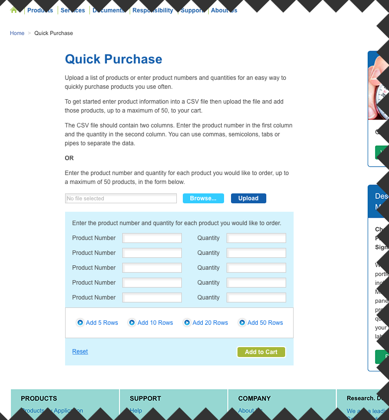
the original Quick Purchase interface was cluttered and confusing
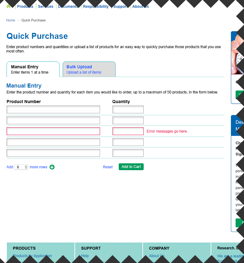
the improved Quick Purchase page "Manual Entry" view
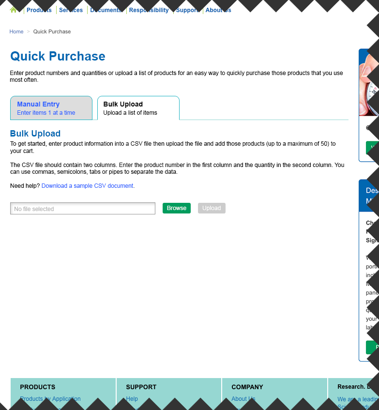
the improved Quick Purchase page "Bulk Upload" view

