
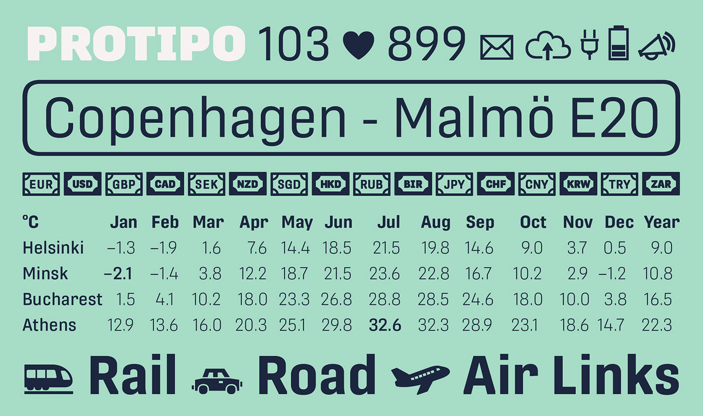
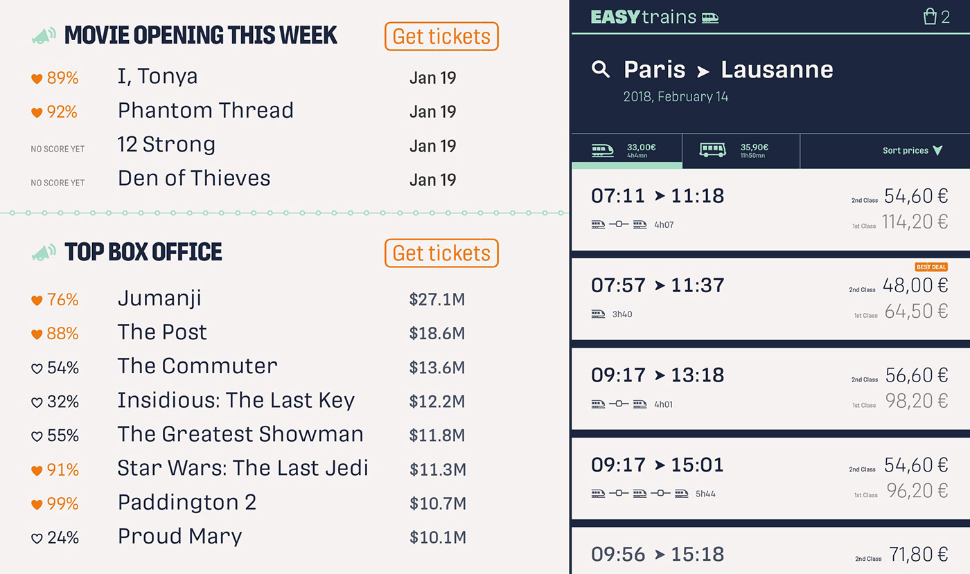
Protipo family is ideal in all information design situations: apps, infographics, UI, wayfinding, transport, posters, display, and even internet memes. Make smarter, impactful designs with Protipo’s low contrast, four widths, impressive two-weight icon set, and the advanced variable (VAR) font format (coming soon).


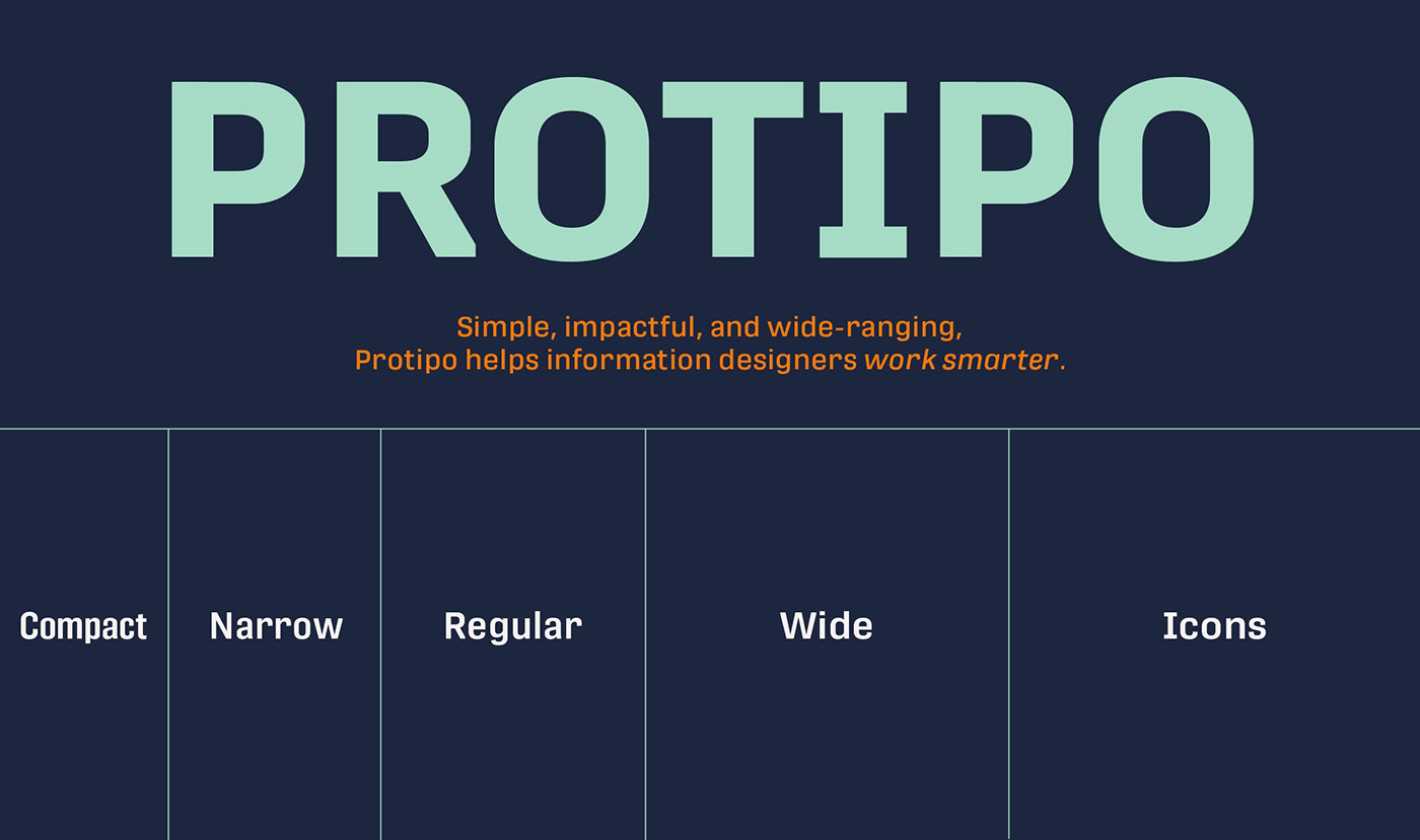
Veronika Burian and José Scaglione’s Protipo type family is an information designer’s toolbox: a low-contrast sans of three text widths with a separate headline family, accompanied by an impressive two-weight icon set, and working with the advanced variable (VAR) font format (coming soon). From annual reports and wayfinding to front page infographics and poster use, designers consistently turn to the simplicity and starkness of grotesque sans fonts to get their point across. Protipo is made for such environments.
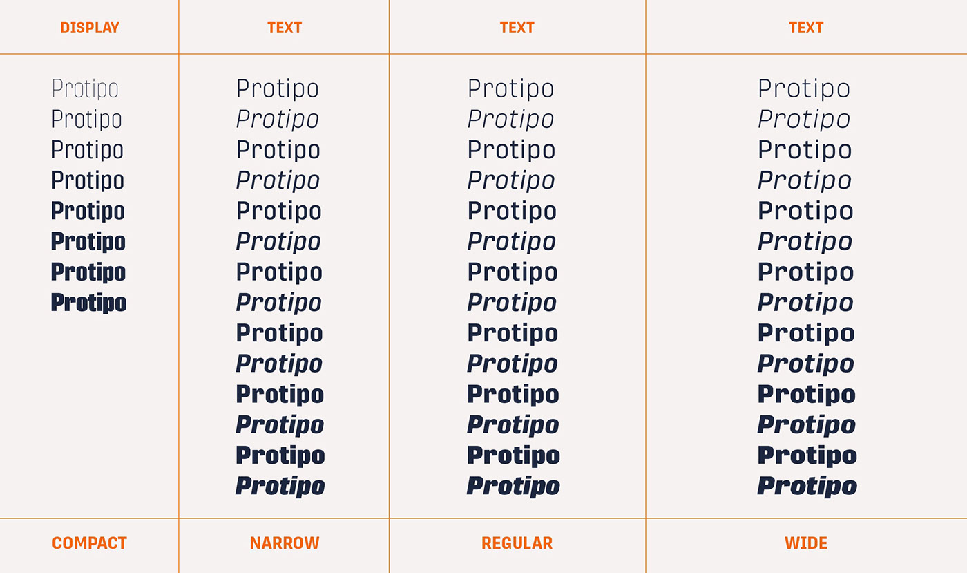
When designing information you may start with the headline, which in the case of this family is called Protipo Compact and comes in eight weights. From Hairline to Black, set it large, overlap it, or let it run off the page. Protipo Compact was made to hit hard and attract attention with a different character set and different proportions than the three text fonts. It sets the stage for what’s to come.
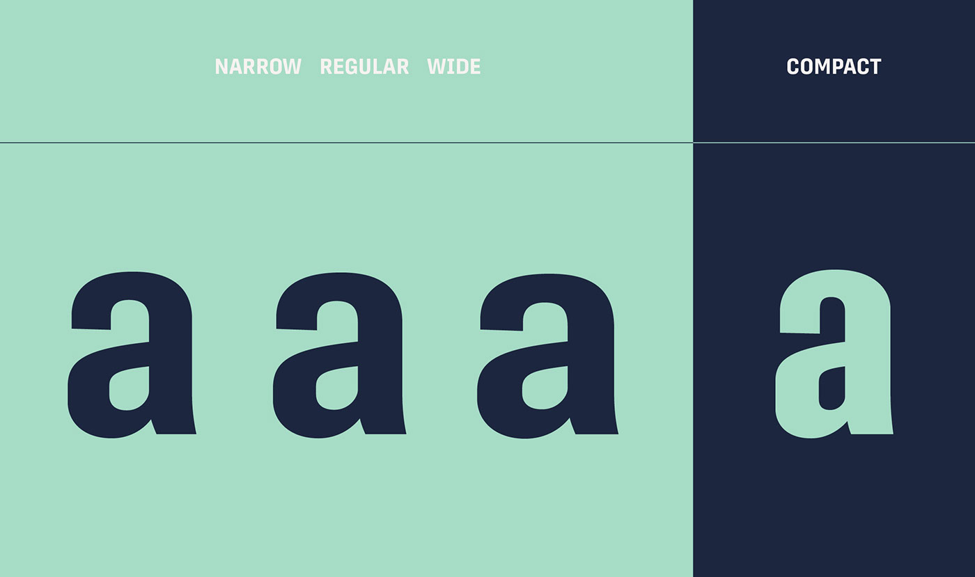
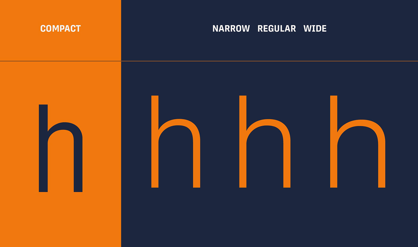
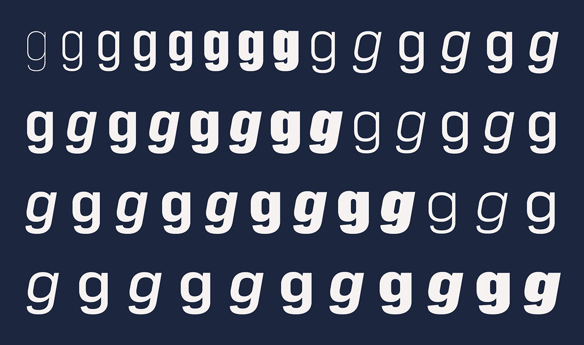
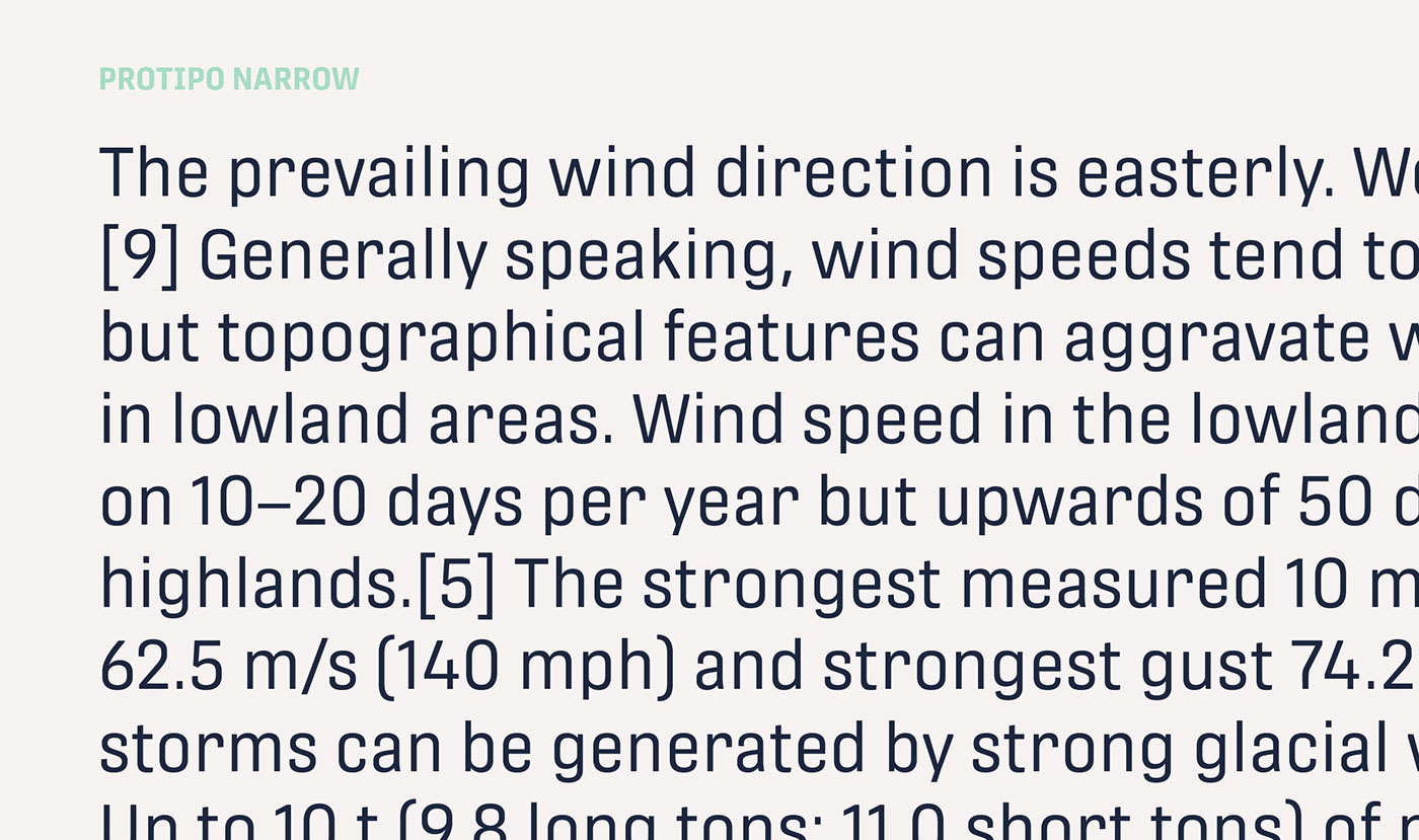
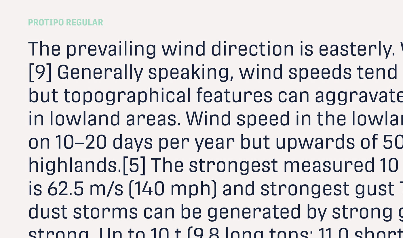
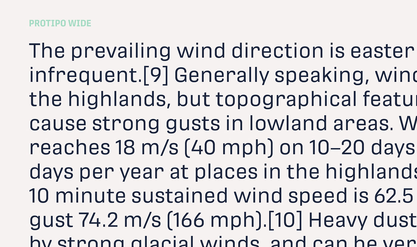
Great information designers are aces at melding form and function, so we’ve stacked the Protipo family with Narrow, Regular, and Wide versions as a way of organising your information and directing the reader. Each width has seven distinct weights (light to bold) and italics, while maintaining the round-rect shapes of its DNA. Subtle details amplify its place in the typographic universe, like an ‘a’ and ‘e’ that go from solid to supple when italicising, an ‘f’ that gains an italic descender, two versions of the lowercase ‘r’ and ‘l’, and clipped corners on diagonals to keep the tight fit inherent to this kind of design work.
Protipo is ideal in all informative situations: apps, infographics, UI, wayfinding, transport, posters, display, and even internet memes. Add to all this the icon sets and upcoming variable font capability, and you’re assured a level of creativity, productivity, and impact on a much greater scale.
When designing information you may start with the headline, which in the case of this family is called Protipo Compact and comes in eight weights. From Hairline to Black, set it large, overlap it, or let it run off the page. Protipo Compact was made to hit hard and attract attention with a different character set and different proportions than the three text fonts. It sets the stage for what’s to come.
Great information designers are aces at melding form and function, so we’ve stacked the Protipo family with Narrow, Regular, and Wide versions as a way of organising your information and directing the reader. Each width has seven distinct weights (light to bold) and italics, while maintaining the round-rect shapes of its DNA. Subtle details amplify its place in the typographic universe, like an ‘a’ and ‘e’ that go from solid to supple when italicising, an ‘f’ that gains an italic descender, two versions of the lowercase ‘r’ and ‘l’, and clipped corners on diagonals to keep the tight fit inherent to this kind of design work.
Protipo is ideal in all informative situations: apps, infographics, UI, wayfinding, transport, posters, display, and even internet memes. Add to all this the icon sets and upcoming variable font capability, and you’re assured a level of creativity, productivity, and impact on a much greater scale.


FULL CREDITS
Lead designers and concept
Engineering
Quality assurance
Graphic design
Roxane Gataud
Minisite design
Cesar Sesio
José Scaglione
Roxane Gataud
Minisite programming
Kenneth Ormandy
Minisite design
Cesar Sesio
José Scaglione
Roxane Gataud
Minisite programming
Kenneth Ormandy
Copywriting
Beta testers
Alvaro Valiño
http://alvarovalino.com/
Sandina Miller
https://millertypography.com/
Vizzuality
http://www.vizzuality.com/
Special thanks to Gerry Leonidas for coming up with the typeface name and his valuable feedback.
Alvaro Valiño
http://alvarovalino.com/
Sandina Miller
https://millertypography.com/
Vizzuality
http://www.vizzuality.com/
Special thanks to Gerry Leonidas for coming up with the typeface name and his valuable feedback.

