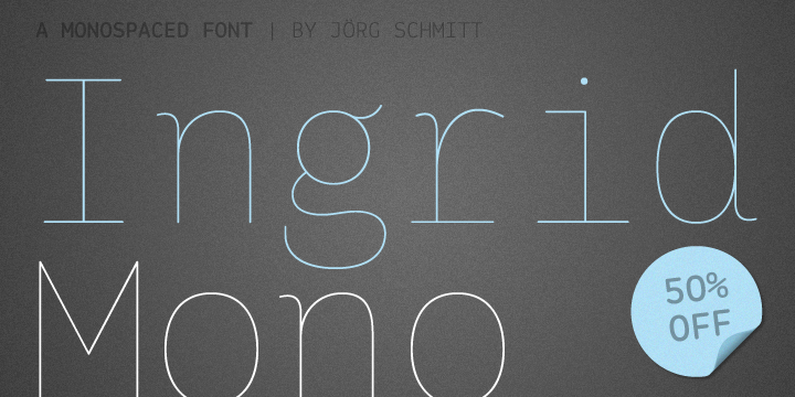
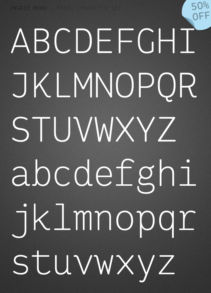

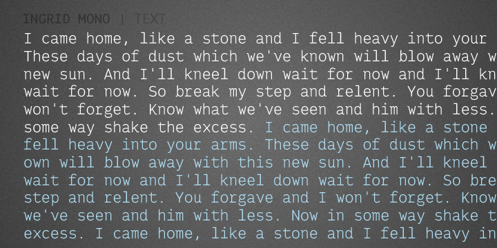
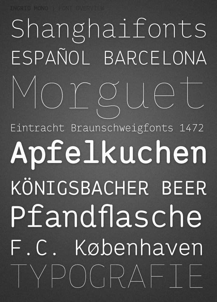

The birth of the monospaced types dates back to the past. There was a need for the creation of typesets for typewriters. The difficulty was to align the different glyphs in the same width. This led to particular problems with letters like “M” and “l”; the former seemed to be squeezed into the same width of all letters and the second one appeared way too stretched. Despite – or perhaps because of – the impression of the typewriter it is still popular with Graphic Designers. The Ingrid Mono font family with a high range of glyphs and symbols has that special appearance.
Jörg Schmitt named his font after Ingrid because of his mothers very german name. But not only because of this he chose to name it after her. It also decribes perfectly in english what the main character of this font is… it is “in grid”.

