


Do More with Less
"Impact Mobile App - UX/UI Redesign"
The Challenge
We were provided a great opportunity to hone our visual design and UX process by redesigning a mobile app for Impact Research & Measurement to make it look modern with enhanced usability.
Analysis - The area needs improvement
The app is based on the needs of:
People who are busy and do not have enough time to monitor every news of their Company, Brand and Competitors.
People who are busy and do not have enough time to monitor every news of their Company, Brand and Competitors.
- Needs quick actions for their chosen news articles
- Perform a custom search to monitor past news and articles.
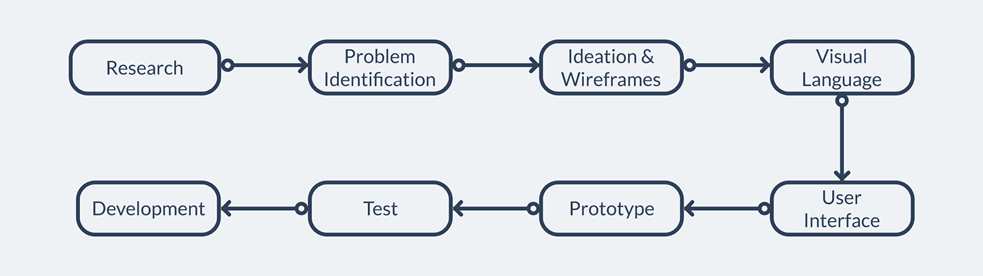
Our Process
We spent a good time with Impact Team who created an old version of the app and discussed what works and what’s not for their clients. They gave us interesting feedback taken from their clients and explained their vision for future changes.
One thing to notice is that this project was focusing on UX/UI which didn’t include User Research, Comparable Reviews, User Journey Maps, Information Architecture, User Journey, Card Sorting etc.
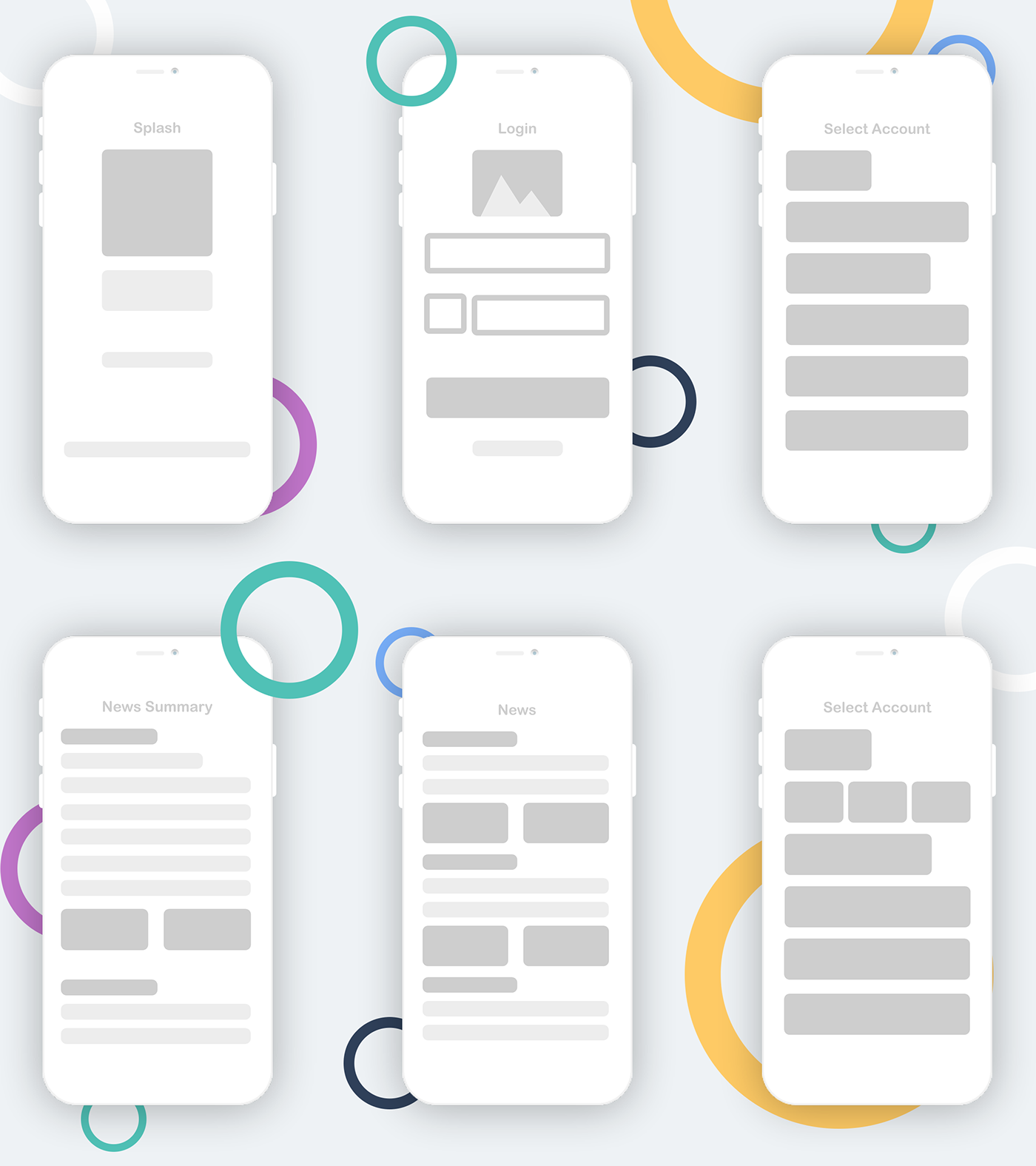
Wireframes
After we had a clear understating of what are Impact and User goals, we listed key interactions and created few low-fidelity Wireframes.
Brand Visual Language and Style Guide
Languages are made up of different types of words that can be assembled together to create a message. Visual language is like any other language. The words of the visual language can be grouped into color, space, shape and movement.
We created Visual guidelines based on Impact Brand Language and mixed with our new Visual Language to create a more clean and better usable design.

Impact Mobile App Icon Redesign
The Original icon of Impact App had a very old style for example Blurred background, Gradients and common arrow which doesn’t go well with new App redesign. The icon looked almost unnoticeable when compared to new apps in mobile app drawer. So definitely a change was needed most.
We made a new icon based on Research where we tried to show Analytics and Impact using Graphs and overall given it a Fresh modern Feel.
.
Splash Screen
While keeping the main context in design which is analytics and Impact, we designed a more modern Splash screen which also works as a loader for initial database loading.

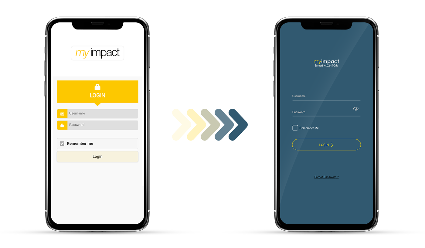
Login Screen
With a new modern approach to design while adding few usability options like Unmask Password option is given for user to see what he has entered for error correction.
On old design Forgot Password was not an option until you type a wrong password but often times Users do forget their passwords and to overcome that hassle we added forgot password link in new Login Screen.

Account Selection Screen
When the user selects an account with our new design they get clear feedback as given color highlight and arrow syndication, where user is at present and what options are available for them.

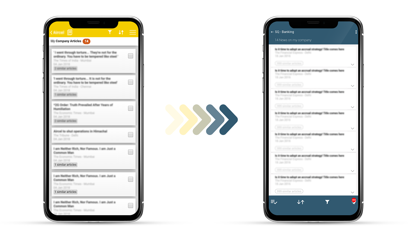
Articles Feed
New article feed is combination of few changes like filter, sorting and notification icons are shifted to bottom with clear and modern look on feeds people are use to. User top screens shows what’s important and that’s News feed here.
We have removed checkbox for selection while using a gesture based approach where user can select any article by long press on their phone screens.
Main Summary Full View
We added a new Interaction for quick news summary, user can read few lines of any article without jumping to full article view.
It saves time and gives user ability to find if something is important they can jump upon and read in single screen.

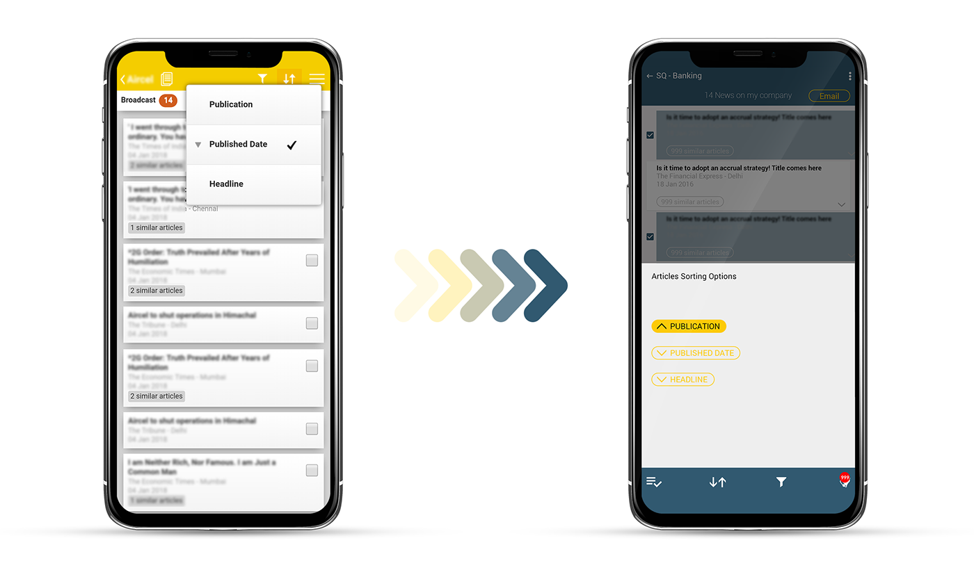
Filters
Filters are added in lower screen to utilize User reach on phone screen while maintaining a Modern approach to UI.
Selection
For article selection we added gesture based selection while giving user a clear feedback using color and checkbox highlight. Once user selection is done there is syntax based action popup on top of navigation area.

UI & Prototype
After we finished with Low-fi and Mid-fi Wireframes we started the interactive Prototype with high-fidelity interfaces.
This project took around 2 months and Impact team is very happy with whole UX/UI Redesign process.
If you want to discuss UX/UI design or redesign for your App or website – Get in Touch with us | Experience Prototype | Download PDF version


