


Attributes and Moodboards
Everything starts from a verbal description of key brand's values and features. It's important to make sure we are on the same page with the client and understand the 'soul' of his business correctly.
To find the right metaphor and visual rhythm for a future identity, we explore hundreds of references. Then we carefully group and filter our findings to create self-explaining moodboards.

In Sketches We Trust
Sketching is one of the key stages in our branding process. This is a visual exploration and the basis for dialog between our design team and a client. During this stage, we just explore what wows and what works to discover which shape expresses a brand's mood in the best way.
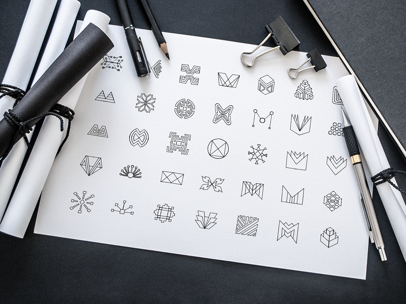
Low Fidelity

Directions
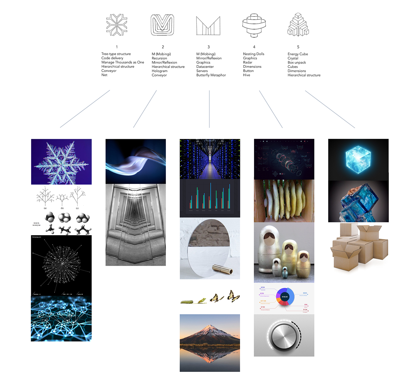

Exploration

Color
Once we identified the right shape for the Mobingi logo sign, we started exploring color combinations. To preserve the adeptness from the previous logo and highlight some "tech-coldness," we chose a few blue tones. Transparency is applied to accent the 3d dynamic effect.

Wordmark
The sharp and modern logo sign we've designed for Mobingi requires sharp wordmark.
Mobingi needed a SansSerif wordmark, however, it took time to find the right font weight, balanced spacing, and unique branded elements such as the "M" shape and the dot on the "I".


Testing
Good visual identity should give the brand a marketing advantage. The trick is to find the middle ground between a unique look to stand out from in-niche competitors, and the expected visual language in the industry to be defined correctly from the first glance.


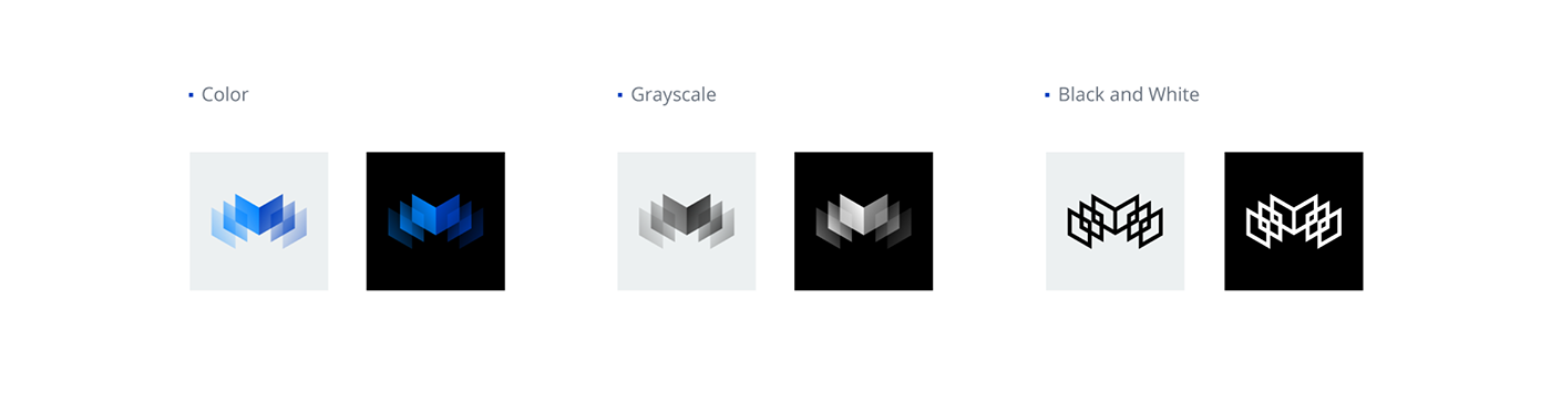
Final Results and Style Guide
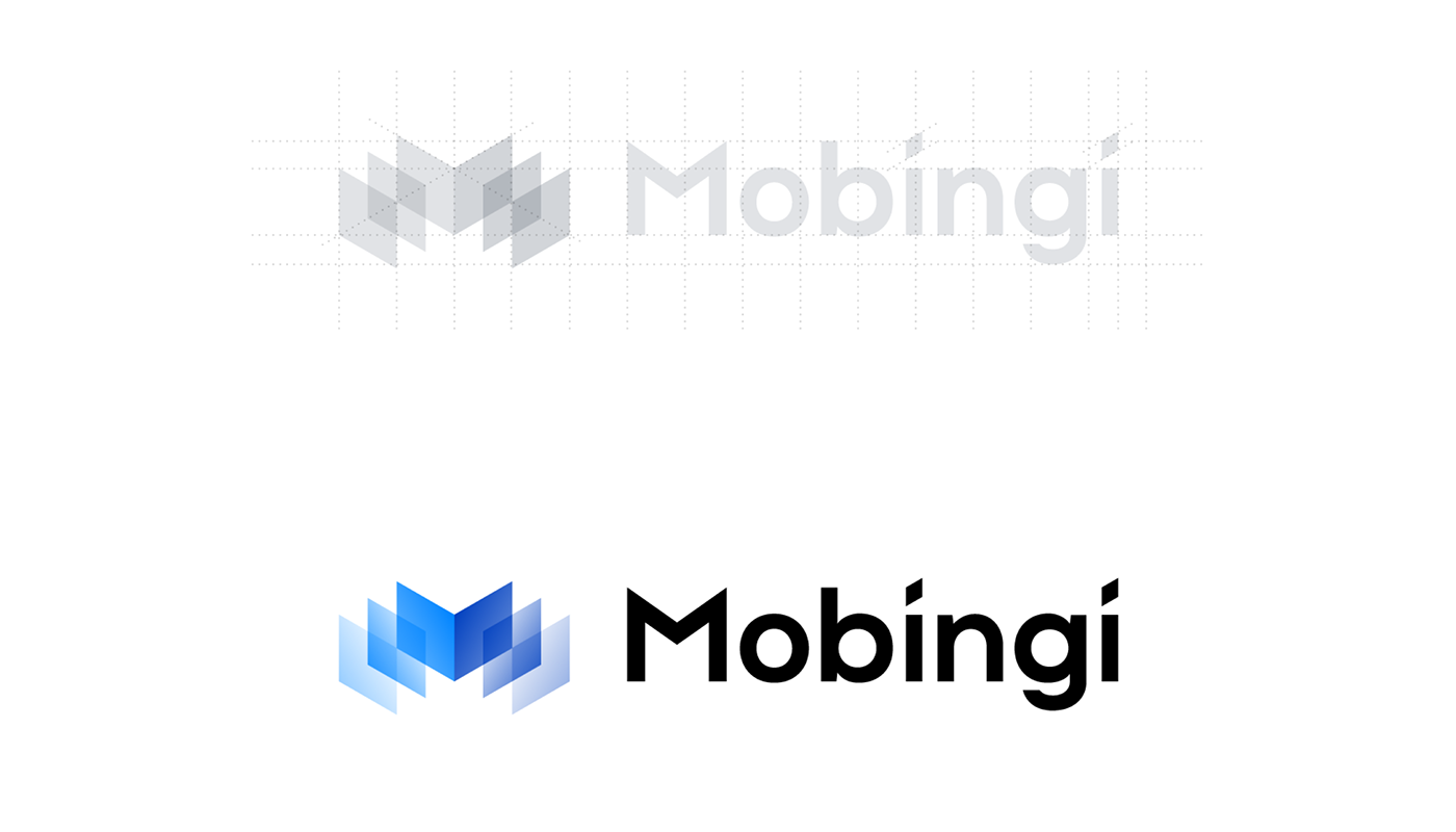
The Mobingi logo sign has an isometric construction, so to make sure that all elements of the brand system work correctly and can be combined, tiled and animated, we used an isometric grid across the brand guide materials.
Logo Construction


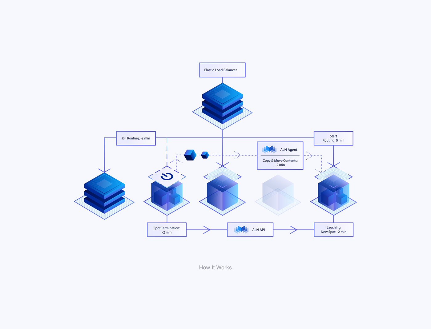
Brand Illustrations
When it comes to brand illustrations, we always start from defining visual style restrictions, because this can influence the choice of metaphors of future illustrations. In the Mobingi project, we had an isometric grid, sharp geometric shapes, and a limited color palette that helped to define the right style quite fast.


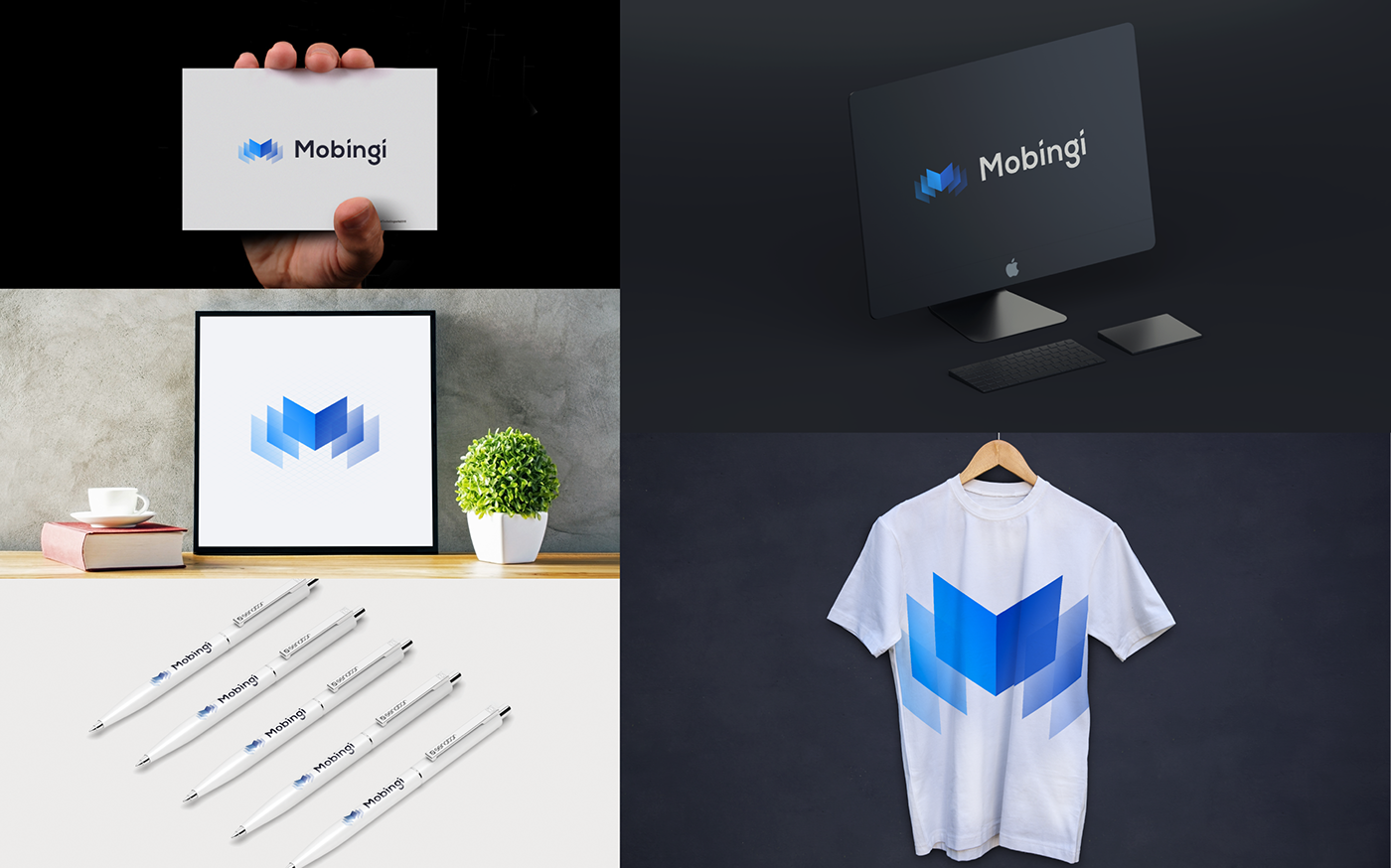
Live
At the end of the day, the key challenge happens when a new identity goes alive. There are lots of different places where the logo will be used, so the challenge is to provide the correct assets for a wide variety of materials and contexts. And the ultimate reward is seeing a client proud to use his new logo.


Outcome
The redesign increased brand recognition by 66% among
potential customers and industry experts
more on

Thanks for Watching!