


My portfolio this time is the ‘watermelon juice branding’.
The company name is cocomero, the Italian word for watermelon.
The company name is cocomero, the Italian word for watermelon.
Since the branding is specialized on the watermelon juice instead of general fruit juice, the design
needed to emphasize the watermelon feeling.
So, from logo and color design to actual product, I designed the overall concept focusing on the watermelon.
For overall feeling of logo, I referred to shape of watermelon and made this logo with inspiration
from wavy movement of juice.


For product, I made body label of beverage bottle, cover sticker,
and name card. I filled the beverage bottle with actual watermelon juice sold in market.
I also made label and sticker after accurate size measurement.
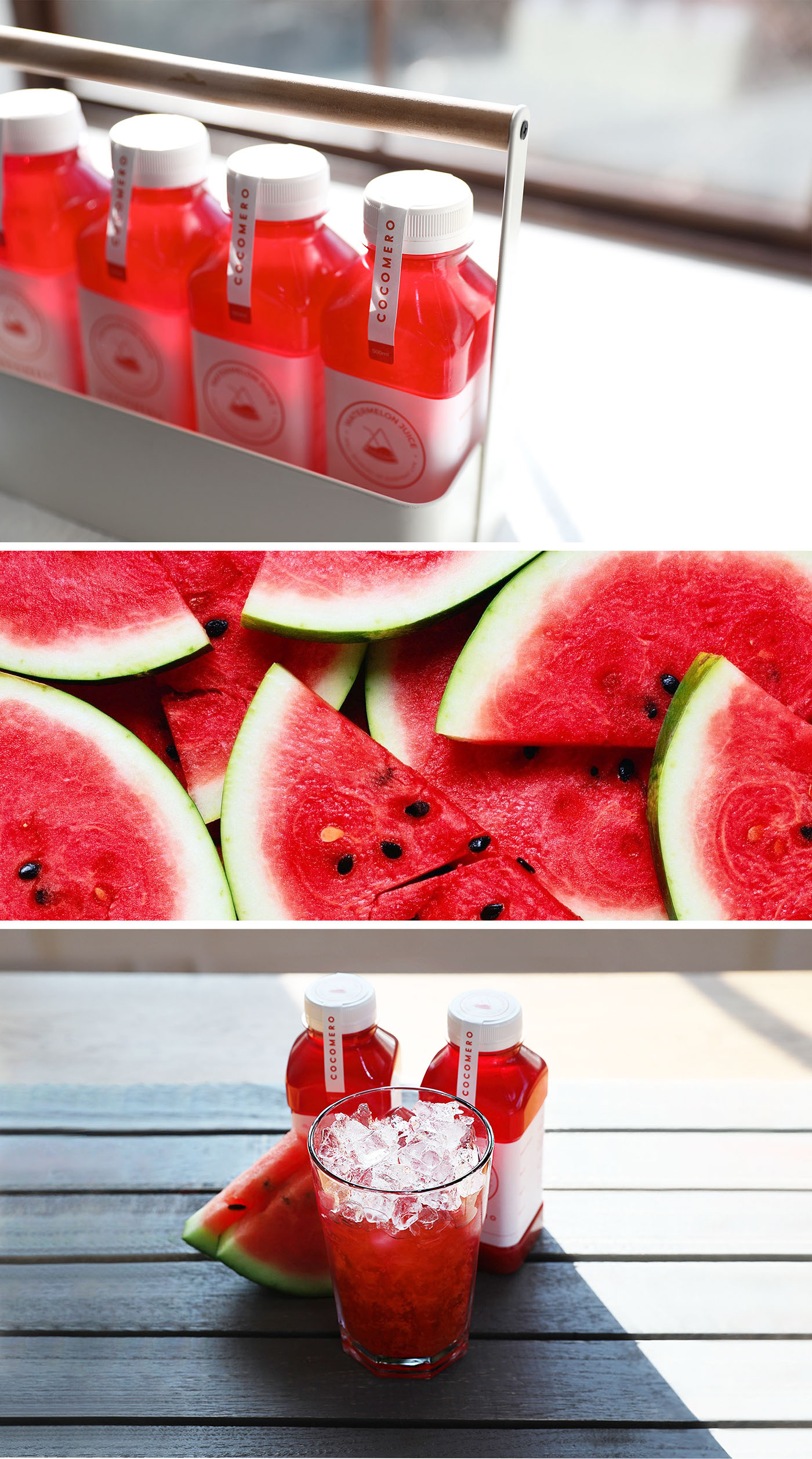
I rented actual studio to take picture of the product.
For materials used in shooting except the beverage bottle, I chose the materials with modern design.
For materials used in shooting except the beverage bottle, I chose the materials with modern design.
As the picture was taken in winter, I had hard time finding the watermelon.
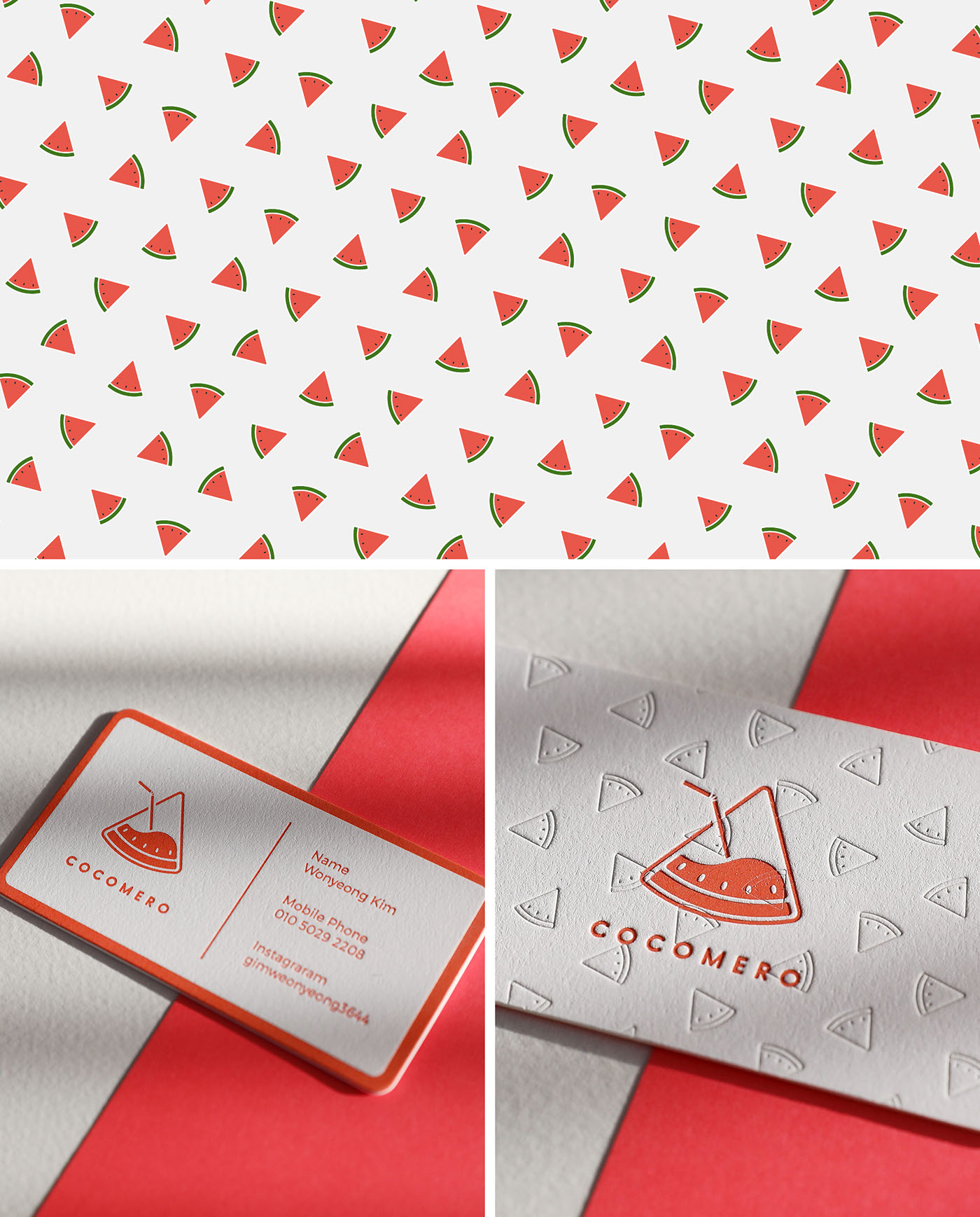
In overall designing, I personally wanted to make the branding that
customers can easily identify. Therefore, the actual product and name card
design focused on the identifiable branding.
However, my design ability is not limited to my subjective design.
I am confident in making the best output with various forms for different demands.
I am confident in making the best output with various forms for different demands.


