

A selection of digital flyers and collages created and arranged using a combination of Photoshop, Illustrator and analogue techniques.

HOTFOOT Flyer. Text and colour duplicates were done in Photoshop, the central logo itself was a hand drawn study using a black sharpie, scanned and edited further in Illustrator before being arranged and duplicated in Photoshop.
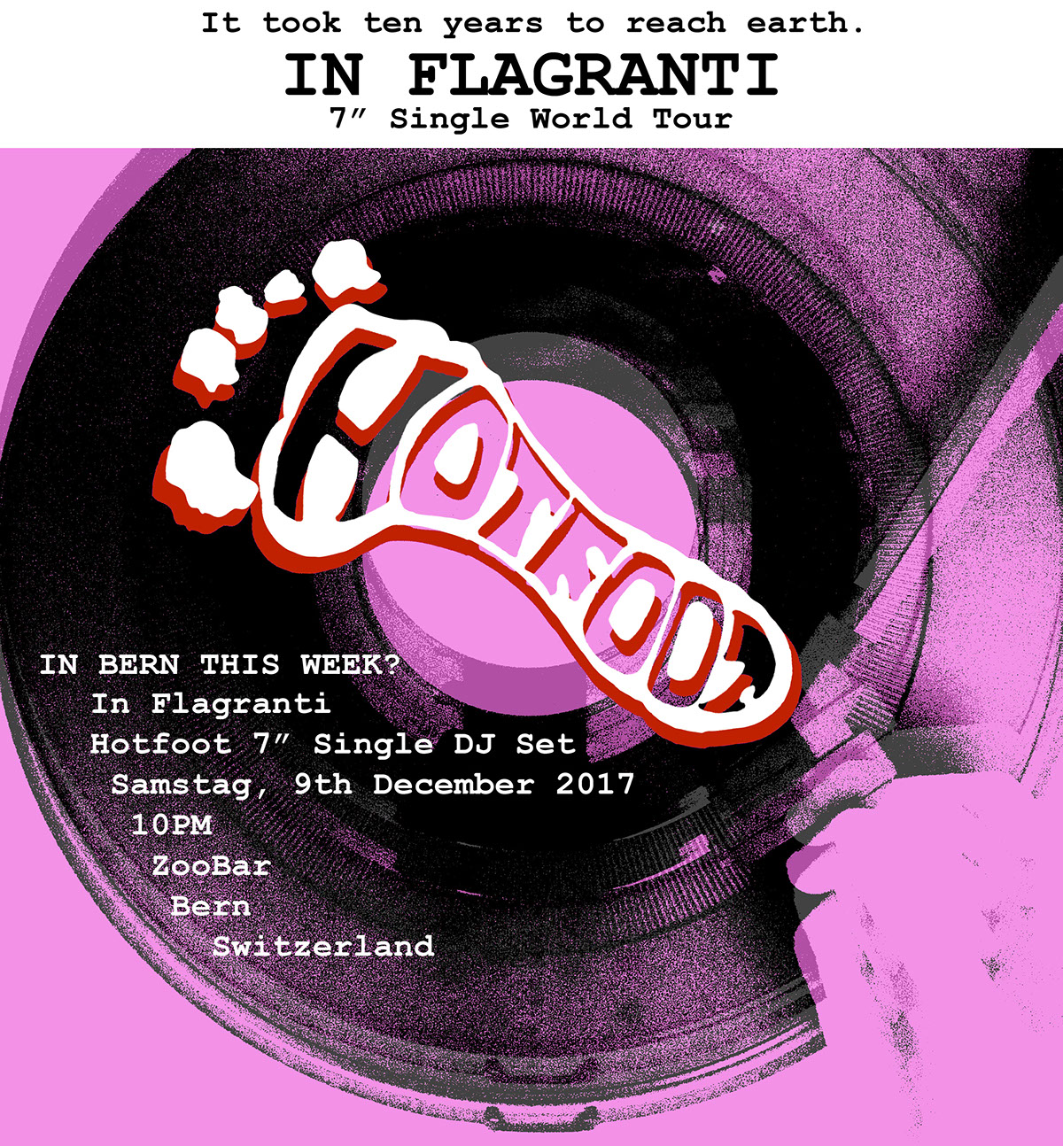
HOTFOOT Flyer. Digital collage arranged in Photoshop. The main photograph was an image I took of myself holding the turntable arm, this photo was also duplicated and overlapped with each other along with some different contrasts of the main colour. A couple of the duplicated layers were slightly shifted above each other to give a negative/ faded appearence, the opacity was also changed to give it the faded quality. Logo, type and text were done in Photoshop.

Flyer for Irish rock band; Fontaines D.C. (1) A combination between using digital and analogue techniques, the composition had been arranged and put together digitally in Illustrator. The image was originally composed of one single small collage combining printed out features of the band and it's members together in a single composition and scanned back in digitally.
Taking the combined image into Illustrator, I started to arrange it in a geometric order thereby making it appear more like a visual abstract composition starting off in the center of the layout and gradually expanding the size. So far liking this arrangement I save the original image as a PNG and imported it again in a new composition and traced it in which gave the image the black and white appearance. The final feature that was added was a textured effect created by newsprint paper I wanted to add a textured feature that would give the final look of the flyer a 'worn and 'rough' consistency.

Flyer for Irish rock band; Fontaines D.C. (2) A follow up from the previous layout.
This layout was the original to the outcome above this one, when compiling the collage together the black and white central image was the original where I took one image of the lead singer and added in the other members to fill the composition.
When it was originally printed out the image came out with a subtle blue tinge, but I was intrigued to look at how both the black and white and the tinged variations could be combined and whether if they would work as a single combined image. When imported into Illustrator, I applied the same arrangement of both images by expanding and enlarging the scale. The band's name at the top of the composition was produced from cutting out the name as individual letters from cardboard and printing them onto newsprint paper with acrylic paint, they were then taken into illustrator, traced, saved as transparent files and arranged onto the final image.
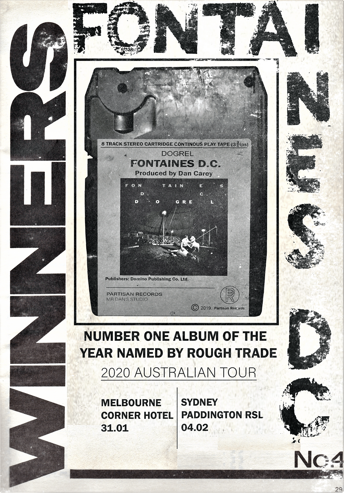
Flyer for Irish rock band; Fontaines D.C. (3) This composition was across between a promotional direction and a flyer for tour dates.
The layout itself had been reused and taken from a music magazine in which originally depicted the music charts of the week.
The layout admittedly was not designed by me but was I curious to observe how or if an already existing layout could still work in a relevant context as an announcement strategy to fans of a particular band and album.
I was interested to not completely disregard or reuse the whole of the layout but I wanted to leave and add extra features that could still match and work appropriately enough with the layout of the original content, in this case I wanted to leave the word; winners along the left hand side of the composition as an implication that the album being promoted for the tour was named album number one of the year. Promoting the album I was interested in using music concepts from the past, I decided to use an 8 track tape and paste the album cover on the top.
When the page was first imported into illustrator, in order to remove the original content I took a small blank section of the page and pasted it all around where I wanted to cover and work over the top of, the roughness of the covered areas didn't appear as neat, but once the text and image had been added this tended to make roughness of the layout less easier to see the difference.


