


Paper Paragon is my boutique design studio that creates sophisticated and chic wedding invitations for couples looking for something non-traditional and artsy.
You might want to grab some popcorn, this won't be short :)
A quick background on how I got into wedding invitation design: I got married several years ago and together with my husband we designed every aspect of our wedding together (my husband is also a designer). This sparked my interest in launching a custom invitation design studio; I wanted to make stationery that preludes the unique ambiance and theme of a couple’s upcoming wedding!
I tailored the studio's brand to appeal to couples looking for artistic and tasteful invitations. The brand needed to be sophisticated and chic without just being another generic wedding vendor — it needed to stand apart. The overall vibe of Paper Paragon is geometric, chic, and sophisticated.
Branding
Naming, logo, and typography
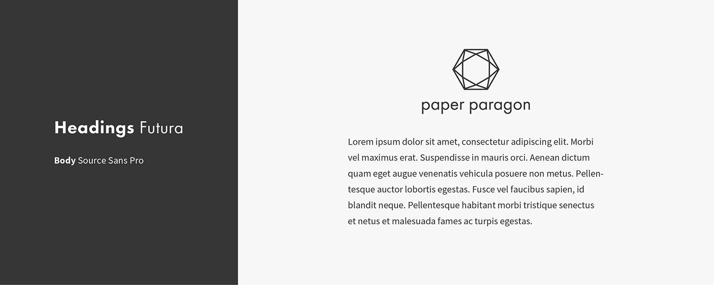
The name Paper Paragon was actually based off a name idea that a friend of mine came up with. She initially said Paragon Papers but I thought that Paper Paragon rolled off the tongue better (and didn't sound so much like some kind of leaked government documents lol). I knew I wanted the brand to sound like a trendy boutique and have a strong geometric presence. As soon as I heard “Paper Paragon”, I knew that that name personified what I wanted the brand to express and an image popped into my head for the logo. I could see the icon in my head and I set about creating it. For the icon, I wanted it to mentally evoke a 3D space through implied perspective alone.
To give myself a better understanding as to how this shape looked and how it could be accurately drawn, I sculpted the shape I imagined with toothpicks and skewers into a low-poly dome. After studying the physical model I moved into Illustrator to refine the shape.

When I constructed the shape in Illustrator, I used straight lines and zero-contrast strokes to give a jewel-like quality to the shape. I started with a hexagon then connected each inside corner across to its relative corner.
Oh no! The symbol that popped out was a Star of David inside a hexagon! That wasn’t going to work, so I took a step back to figure out what needed to change.

From studying the shapes of my sculpture, I noticed that the shape I wanted to achieve was essentially a hexagon within a hexagon that was rotated 90° with straight lines connecting the vertices between the two. I played around with varying the size of the inner hexagon and landed on the one that looked the most balanced. The increased size of the inner hexagon also gave dimension to the shape.

The final touch to the logomark was to rotate it 90° to make the bottom facet parallel with the line implied by the wordmark's uninterrupted x-height. After testing many different typefaces with the symbol, I landed on that timeless classic Futura Book. It simply paired perfectly with the symbol by echoing its strong geometry and stroke width.

With the logo and headings typeface chosen, I moved on to the body typface. I wanted to keep this brand completely sans-serif to contrast against the ubiquitous scripts and serifs in the wedding industry but since Futura's short x-height is so impractical in smaller sizes I needed another font for body copy. I landed on Source Sans because it's everything Futura isn't, it's practical, understated, and stylistically invisible. It does a great job in its supporting role to Futura; it isn’t begging for all the attention.
Colors
Instead of choosing colors as if they were their own product I intentionally chose each color to serve a purpose in the website and brand materials. All three saturated brand colors come in both bright and muted versions to maximize versatility in how they can be applied. The muted versions work great for backgrounds while the bright ones work well for things like CTAs and hover states. The grays were each optimized for their respective intended uses for text, backgrounds, and accouterments like borders and rules.
Paper Paragon isn’t a bright, colorful brand, but instead builds an air of romance and effortless sophistication with rich, deep tones. The logo itself is never rendered in color but rather in either pure white or near-black to emphasize crispness and give a boutique vibe.

With the key assets and vibe of the brand in the bag, I set about the website, stationery, business cards, social materials etc.
Business cards
I'm so proud of these! I created five different variations, each with their own theme/photo; when I give my card to a client I fan out all five for them to choose from and learn their subconscious style by which theme they take: girly, edgy, modern, earthy, or vintage.
Each variation uses rich photography with lots of depth, but a fairly consistent texture that the crisp white logo contrasts nicely against. Since I knew I would be showing all of them together, the perfect unity of the logos' placement would contrast powerfully against the completely different images.


Print collateral
As Paper Paragon is a primarily digital business my brand print collateral, while fun to make, isn't a huge part of the brand. The pieces I've shown here are a collection of wedding fair promotions and my stationery. When I mail promos or follow up thank you notes to clients I like to use teal envelopes to add a functional splash of color and to add an element of the unexpected to their day when they grab the mail.


Website
I kept things simple and straight forward, letting the work speak for itself with styled shoots of the products. The first question I addressed is “What is this business and what do they make/sell?” The crisp white logo and tagline “Custom invitations for your elegant wedding” clearly answers this right off the bat in the hero.

My ideal client is looking for wedding invitations that are custom, elegant, and artsy. Intrigued by the hero section, they scroll down and immediately are shown my geometric, modern, and unique collections of invitations. They like the previews and click on the photos to explore the entirety of each collection.

Ok, so they are liking what they see so far. Now “who makes these?” is next in their mind. Keep scrolling and the “about” section promptly follows this. I provide a short friendly blurb that describes the typical style of my invitations, my personality, and a photo of me.

The next thought I answer is, “I love these invites and Jennifer seems like a nice person to work with, now how much do these cost?” Like the previous sections, I provide this answer after they read through “about” and scroll down. I’m upfront and honest with my prices. This is important because no bride likes having to hunt to figure out how much everything is going to cost. It takes out the guesswork so the couple can quickly learn if Paper Paragon is going to work for their budget. The structural beauty of the layout of the pricing guide sticks with the boutique minimal vibe through clean typography and simple lines.

Now they've either fled in a sticker shock induced panic or are ready to reach out and grab hot chocolate and a free consultation. The contact form is clean, muted, and focussed.

Check out the site yourself: paperparagon.com

And the blog: paperparagon.com/blog

I’ve been writing about helpful tips and trends for brides as well as news about Paper Paragon. I designed the blog using Webflow’s CMS. With this it was simple to create new articles and have them automatically styled and synced chronologically without having to do it manually for every post. At the bottom of each article is the same CTA as the main page to point users towards scheduling a consultation.
In addition to the blog I've consistently engaged the wedding community and brides on Instagram and Facebook with behind the scenes looks at the business and styled shoots for the invitations and for promotions and used email marketing to build brand awareness.


Signature Invitation Collections
Each invitation collection is inspired by a different style of wedding. Though the themes vary, they all look like products of the same boutique. Throughout my signature collections, I’ve featured sophisticated color palettes and textures with clean typography and experimental geometric paper shapes, making my invitations very non-traditional. Each collection includes a save-the-date card, invitation, RSVP, and thank you card.
When designing my signature invitations, I do more than just create stationery that looks cool and artsy; I envision the style of the wedding it's intended for and contemplate on what's contributing to the spirit of the wedding. Where is the event? At a mountain chapel, a rooftop restaurant, a refurbished hipster warehouse? What time of year is the wedding? What kind of décor is used? Even down to what the bride’s dress and bouquet look like. I put all this into Pinterest mood boards.
The Geometric Florals Collection
This collection is all about sharp geometry, bold edgy color, and clean minimal typography. It evokes the spirit of things like two-piece dresses, bouquets of berry-toned flowers, and black and white décor with gold accents. My favorite piece (probably of all the invitations I’ve done) is the diamond-shaped RSVP card. What I love about it is that even though it’s not a square like the rest of the set, it still meshes because in essence it’s just a square with its corner cut off.
Inspiration for Geometric Florals


Invitation photography by Tandem Tree
The Modern Intrigue Collection
Designed for dark luxurious weddings in candle-lit refurbished warehouses, this collection is very non-traditional with its black and white palette and unique shapes. The pieces feature a one-of-a-kind hand-painted (then digitized) background texture and are lightly sprinkled with physically sprayed gold flecks. The RSVP card is particularly different because it folds into a triangle that stands up. This way, the card can sit on someone’s desk or counter and be a visible reminder to mail their RSVP.
Inspiration for Modern Intrigue


Invitation photography by Tandem Tree
The Winter Flowers Collection
The wedding for this collection is vintage-inspired and set in a snowy mountain town. I was inspired by forests with a fresh blanket of snow, lace, fur shawls, and flowers protected from the chill. The color palette is very muted and uses a sophisticated serif to achieve a winter vintage vibe. Again, I’m using pure basic shapes for the cards like squares and circles rather than the usual rectangles. The RSVP's circular shape adds to the soft aesthetic and comes with its own custom handmade square envelope.
Inspiration for Winter Flowers


Invitation photography by Tandem Tree
The Flat Organic Collection
This collection breathes the spirit of a clean and modern wedding in the summertime. Organic forms in sage and navy nestle together on a field of white and suggest an easygoing outdoors wedding. I illustrated the floral flourishes and orientated them in different ways on each piece to keep each one fresh and original while relating to the rest of the pieces in the collection. To keep with the casual elegant feel, I used simple typography with a handwritten feel.
Inspiration for Flat Organic


Invitation photography by Tandem Tree
Styled Shoot Collections
In addition to designing original signature collections, I was also invited by wedding planners to collaborate on styled shoots with my custom invitations. These are basically photoshoots for pretend weddings that are super trendy and creative. Styled shoots involve everything from: models to cake, hair/makeup to invitations, gowns to décor, and even the wedding venues themselves. A professional wedding photographer shoots everything then distributes the photos to all the involved vendors to use in blogs, magazines, and social to promote their services.
When wedding planners reach out to me we go over their overall design vision for the shoot to get a starting point. From here I exercise free-reign over the design to create invitations that fit the theme while still being able to represent my unique brand.
The Modern Greenery Shoot
This style shoot was for a modern luxurious wedding overlooking the St. Paul skyline. The overarching theme was the airiness of extravagant tropical greenery on white. In my design, I embraced this literally by strategically placing monstera leaves against a white background. To make it luxurious and modern I paired a script font for the headers with a sans-serif geometric font for the info. To keep this collection in line with my brand the cards were all pure, simple shapes. For this shoot I also created a custom triangular pocket that houses the invitation and RSVP together that would give a unique first-impression when the guest received it in the mail.


Photography by Sophisticated Grace Photography
The Holiday Party Shoot
On another occasion I was asked to create the invitation suite for a “Kate Spade-inspired” Christmas party. The styled shoot was focused on bright colors, black and white, stripes, and metalic gold accents. It also needed to look energetic and classic. As with my other invitations, I used various geometric shapes for the cards like circles and squares. For the invitation itself, I designed a new folding card. It has two triangular flaps that fold into a square — because why not??


Photography by Electric Lime Photography
Trade Show Design
To get more eyes on my business, I was a vendor at one of the top wedding shows in Downtown Minneapolis. Throughout the day, hundreds of couples would walk by my booth and I would need to quickly capture and retain their attention. I needed to stay true to my brand without spending a fortune on booth décor. To do this I put myself in their shoes and created an experience I believed they would follow. I needed to immediately create visual interest in my booth while clearly communicating what my business sold. With piqued interest, I could ask them about their wedding and talk up my custom invitations. Next, I would direct them to fill out a short form to collect their name/email so I could get in touch with them after the show.
I kept my booth minimal and tasteful. The theme of my booth was copper, white, and black. I knew that my invitations and the copper pipe would pop against the black curtains dividing the booths and give the space a boutique feel.
I designed and built: a custom copper pipe rack for the invitations to hang from, suspended copper invitation displays, two copper and whitewashed wood tables (for promo cards and email address entry), and a three-piece handlettered transparent acrylic and copper sign. I hung all of my sample invitations on cute little copper clips from the hanging displays and pipe rack with alternating lengths of invisible line. This not only added a vertical dimension to the space but also added eye-catching movement when the stationery swayed in the breeze of people walking by.
I matched the design of my show exclusive promo cards to the booth design with a stark black and white palette and a bold layout.


What I've learned from dreaming, building, and running Paper Paragon
This experience has helped me flex my muscles on scaling a brand out into many diverse mediums, from a website and social media content to stationery and a physical space. Everything is different but it all shares the same soul. I honed in my skills in thinking big picture; I'm thinking about capturing the ambience individual weddings and how I to capture their spirits in my invitations while at the same time staying true to my brand values. Throughout designing the website and even the trade show booth, I was frequently thinking of the user’s experience and how I wanted to guide them toward their goals and my own.
I picked up new skills along the way: calligraphy, hand lettering, web development theory, crafting a table, and package design! Many of my invitations had custom dielines that I used to further enhance the theme. I experimented creating custom folding cards and other non-traditional shapes. As I worked with these prototypes I saw that I not only had an interest in creating new and interesting cards, but also the skill and logic to understand how to create them. I discovered a love of package design.
After discovering this passion with Paper Paragon I decided to branch out and expand my portfolio by designing a totally custom box of single-origin chocolates. Check out that project's case study ATLAS Chocolates!
Also please hire me if you run an agency in Denver or Boulder :) 🎆


