
Mr. Franz Wienerroiter came to us, because he needed a logo for his new found company. The company is about drones and making photos and videos with them on request. So we started to think...
the beginning.

The top one ist the bird eyes view the bottom one the front view. My teacher, Mr. Weissauer, had the idea to handle the logo like this. When you need just a small symbol you can use the bird eyes view. If you need the name you can use the front view.
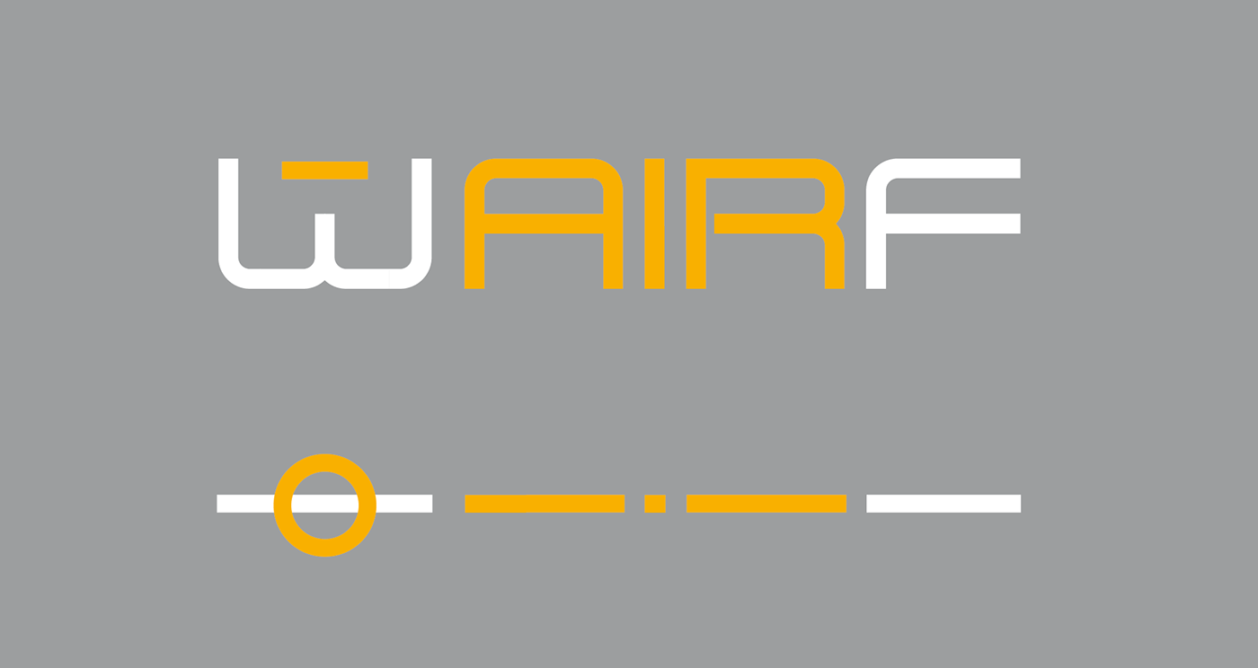
The initials of Franz Wienerroiter are WF. We wanted the air theme in it so just put air between W and F.
The 4 circles in the upper one are symbolising a drone.
the production.


We wanted to do a better drone, because we were not happy with the idea in the first picture. So I scribbled around a bit and the result was the one that is used int the following picture.

This picture is about the font, although you can also see the final drone design.
the end.
After finalizing the logo I noticed that it looks way better when the colors are switched. So I just sticked to that.

