LA FLèche
[EN]
Brand guidelines - 2018
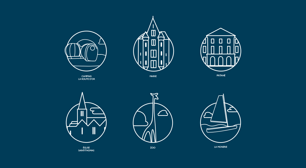
La Flèche is a city in western France. The city is rapidly developing due to the zoo, the opening of large company offices, and the increasing population. The name, La Flèche (“The Arrow” in English), strongly represents the growth of the city.
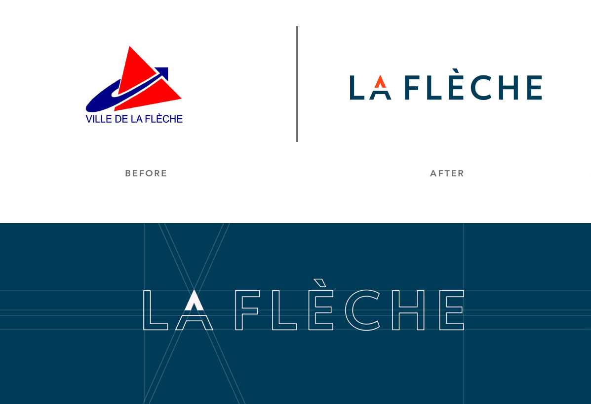
However, the city’s outdated logo no longer represents this theme and thus it needed a rebranding that would be immediately recognizable from far and wide.
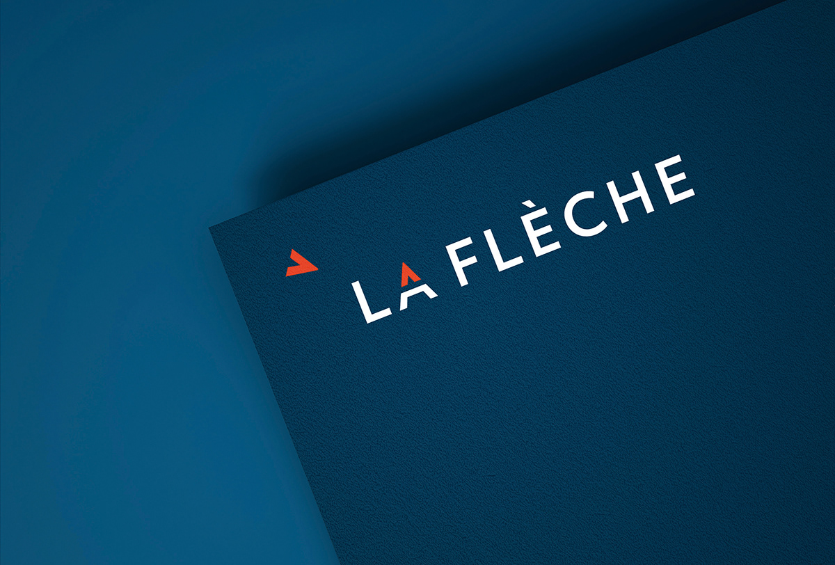
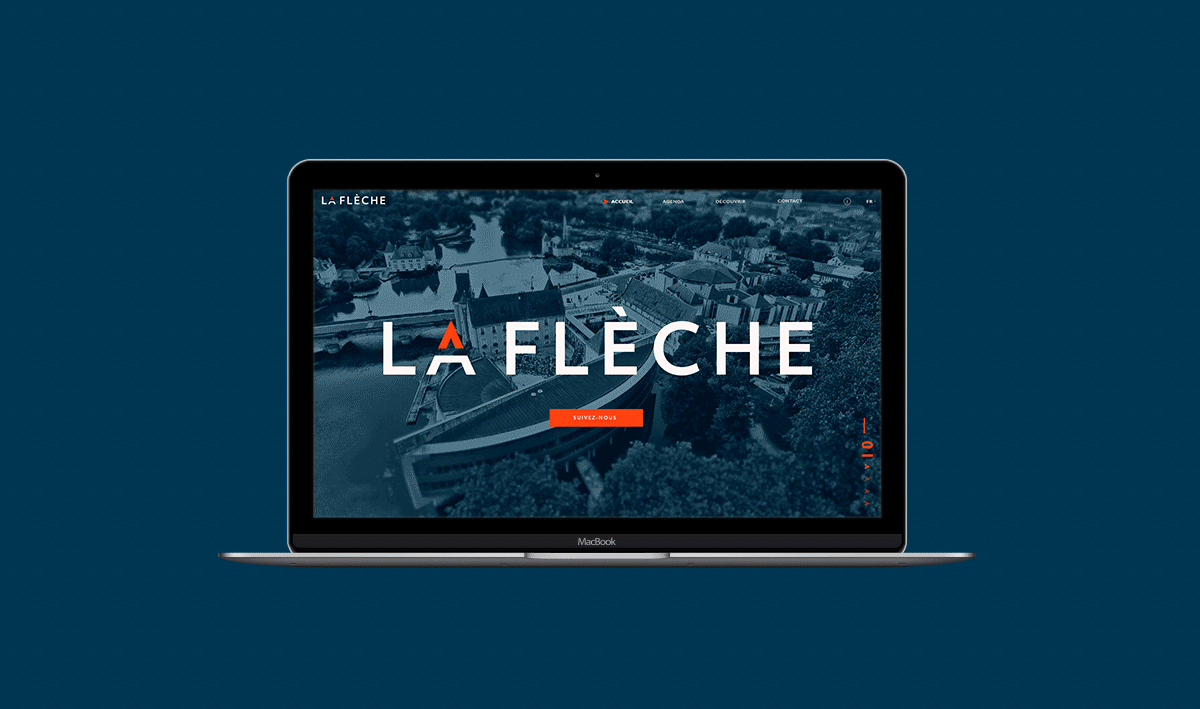
By choosing to integrate an arrow into the word La Flèche, it is transformed into a symbol that creatively displays recognizable features in legible text. As a result, the improved logo showcases quite simply, that La Flèche is a city of growth and opportunity.
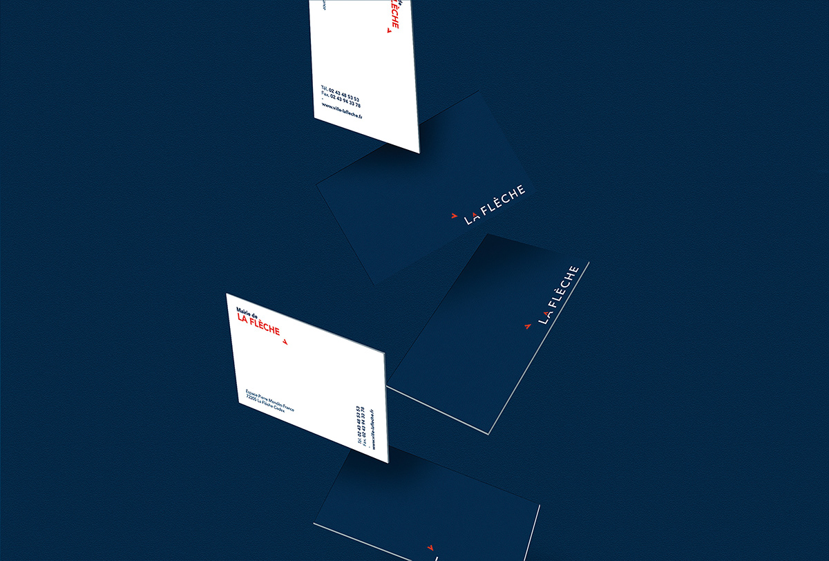
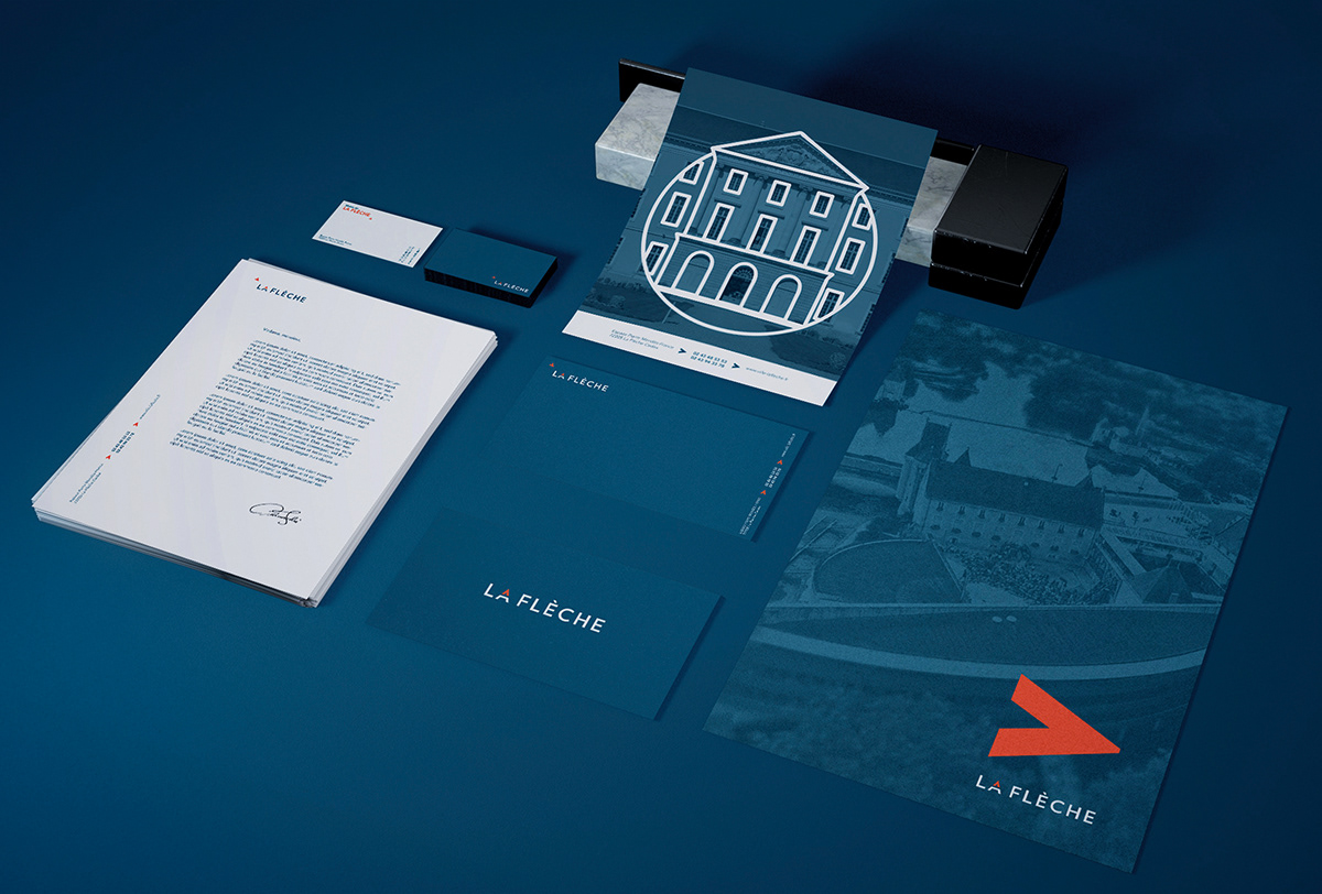
By using an uppercase A in “LA”, the letter naturally forms and an upwards-pointed arrow to represent the city’s rising prosperity. Additionally, the isolated upper-part of the A can easily be used for stationary or other city documents. Even on its own, it continues to represent the city’s upward drive.
[FR]
Charte Graphique - 2018
La Flèche est une ville située dans l’ouest de la France. Cette ville est en pleine expansion grâce au zoo, aux nouvelles entreprises s’y installant et à la population qui ne cesse d’augmenter.
Le nom ‘La Flèche’ la représente bien, une ville qui ne cesse de monter. Cependant le logo actuel n’est plus représentatif de la ville, l’objectif a donc été de rajeunir l’image de marque et de maintenir une identification claire de la ville par le glissement en douceur du logo actuel vers une version réactualisée immédiatement reconnaissable sur tout le territoire.
En choisissant d'intégrer une Flèche au sein du mot "LA FLECHE" (arrow in french), le mot devient un signe. Il joue entre le lisible et le visible, dans une alternance optique saisissante. En résulte un logotype dont la simplicité semble une évidence : La Flèche est une ville en pleine croissance !
La forme du «A» évoque directement une flèche montante vocalisant une ville qui ne cesse d’augmenter. Le haut du «A» permet de créer des motifs déclinables sur l’ensemble de la papeterie et des supports de communication de la ville. Cet élément montre toujours le mouvement et la croissance de la ville.