Let’s continue to discuss iOS Human Interface Guidelines(HIG). In the first section, I introduced the Overview of HIG. In this part, I was still going to summarize the same outline by “App Architecture” of HIG based on my design experience.
As accessible as it is personal
The world’s most personal device was designed for every person. So a person who’s blind can take group selfies. A person who’s deaf can call Mom from overseas. And a person who can’t move from the neck down can send text messages to friends.
“Accessibility” in HIG means understandability and easy to reach. A perfect App is able to provide an equally engaging experience for all users, including disabled people. Following tenets below which I call a User-friendly concept enable you to reach the goal:
・ Let VoiceOver, a screen reader, audibly describe what is onscreen. It provides alternative text labels to people with visual impairments.
・ Provide users reactions to accessibility preferences, such as an option to reduce motion is enabled.
・ In videos content, providing closed titles or explanations allow the deaf to perceive audible content. Audio descriptions enable the visually impaired to access easier.
* For more information, see iOS Accessibility.
Loading
To prevent people from confusion, frustration, and leaving your app.
・Make it clear when loading is occurring. The “clear” means that providing specific notices to users, like an activity spinner or an explicit progress display. So users are able to judge how long they will be waiting — following User Control.


・Do not make people wait for content to load. Show the screen immediately. It is okay to use placeholder text, graphics, or animations to identify where content is not available yet.

placeholder
・ Mask loading time by providing videos or interesting graphics to educate or to entertain people.
・ Customize loading screens that fit your apps.
Modality
To prevent people from doing other things until they complete or dismiss a view.

modal views provide modal experiences
・Carefully creating a modal context only when your apps are critical to getting users’ attention since people prefer to interact with apps in nonlinear ways.
・Using Alerts easily interrupt Users Experience. So carefully using alerts for delivering essential information.
・Make sure your users know the outcome when they dismiss modal views on your apps.
・Keep modal tasks simple, short, and narrowly focused.
・Display a title.
・With the possible exception of an alert, nothing should appear over a popover.
・ Coordinate modal view appearance with your app. e.g. use the same appearance like a navigation bar in your app.
Navigation
To implement navigation in a way that supports the structure and purpose of your app without calling attention to itself.
・Logical, predictable, and easy to follow.
・Using a minimum number of taps, swipes, and screens.
・Using standard navigation components.
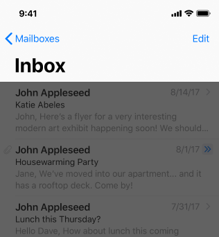
・Using a Navigation Bar with titles and back buttons.
・Using a Tab Bar enables people to easily switch.

Apple offer 3 kinds of styles for developers:
Hierarchical Navigation

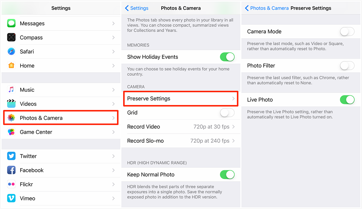
e.g. iPhone Settings in iOS 10.3
・ Be created by a Navigation Bar.
・ One choice per screen.
・ Have to retrace or start over from the beginning for going to other destinations.
Flat Navigation


・Be created by a Tab Bar.
・Switch between multiple content categories.
Content-Driven or Experience-Driven Navigation


・ Free style movement.
・ Combined Hierarchical and Flat Navigation.