Blck. Charcoal Cosmetics
Visual Identity and Packaging
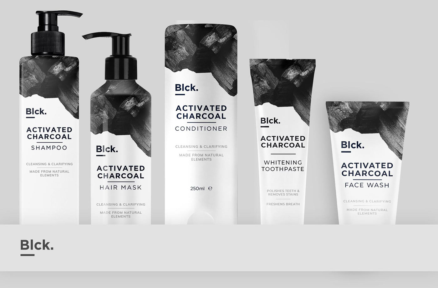
Blck. is an aspiring company that aims to create full line of cosmetics products which are based on charcoal and its natural cleansing effects. Their relatively young company aimed to breathe in fresh approach to cosmetic industry in Turkey. The line features shampoo, face wash, body wash, soap, toothpaste and bath tablets. Their request was to create a suitable branding identity that will feature simplistic but rich design that resembled professional medical companies.
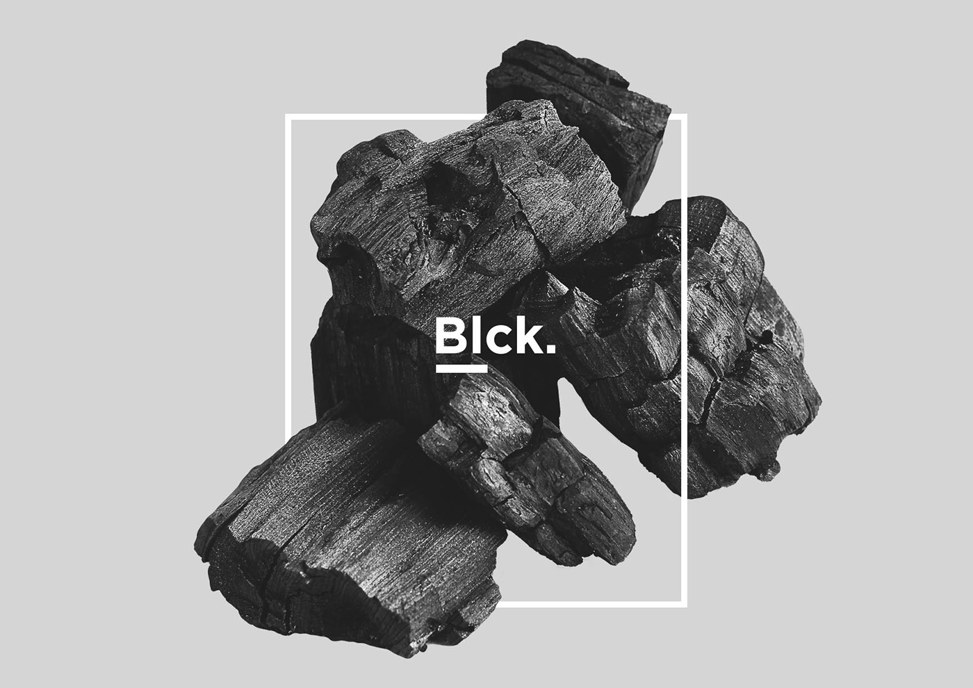
The logo is purposefully made to be extremely simple to avoid visual noise on packaging. The simplicity is reinforced with the company's name - Blck; as it is simple and short. It allowed the logo to be flexible with colours and application. Mainly, it represents simplicity of their product and professionalism.
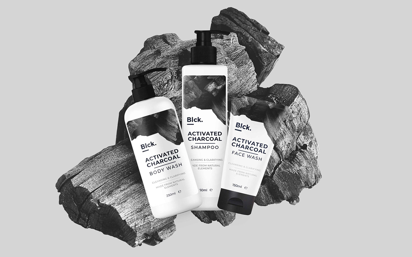
As for branding, it seemed intuitive to employ simple visual techniques that directly represented brand's main product, which is charcoal. It's sharp and monotonous texture help to create smooth, elegant and appealing image. This way packaging shows exactly what a customer will get - a professional charcoal product.
In the end it there was two banding proposals that was extremely hard to choose from. Dark and Light themes.
_
Dark theme:


Light theme: