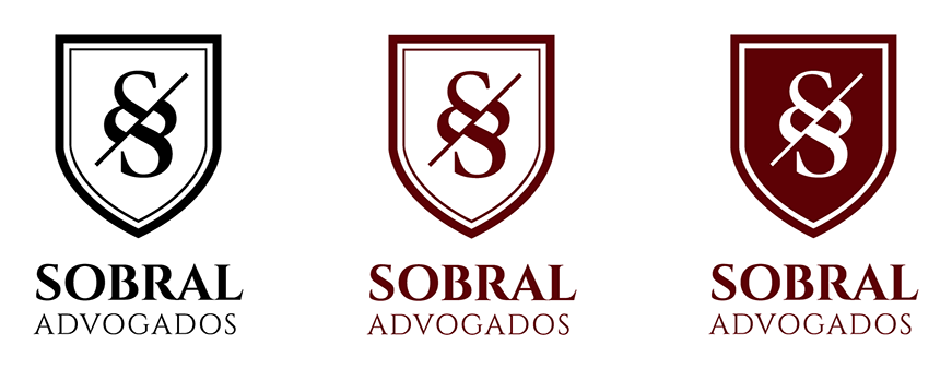
O logo do escritório de advocacia Sobral Advogados foi criado para inspirar elegância, estabilidade e confiança. O desenho é apresentado na forma de um brasão, símbolo historicamente austero e formal, contendo uma letra 'S' estilizada de forma a remeter ao símbolo de parágrafos em textos legais, o que cria um vínculo entre o nome do escritório e sua área de atuação. A paleta é também formada por tons sóbrios, o que contribui para a seriedade da identidade visual.
The logo for law firm Sobral Advogados was created in order to establish elegance, stability and trust. The figure presents itself in the shape of a crest, an historically austere and formal symbol, containing a letter 'S' stylized in order to resemble the paragraph character applied in legal writing, which creates a link between the firm's name and its area of expertise. The palette itself consists of sober shades, adding to the identity's severity.