


Klaus reached out to me. He was brought into Attraction Gym to head the German branch of the Dutch company.
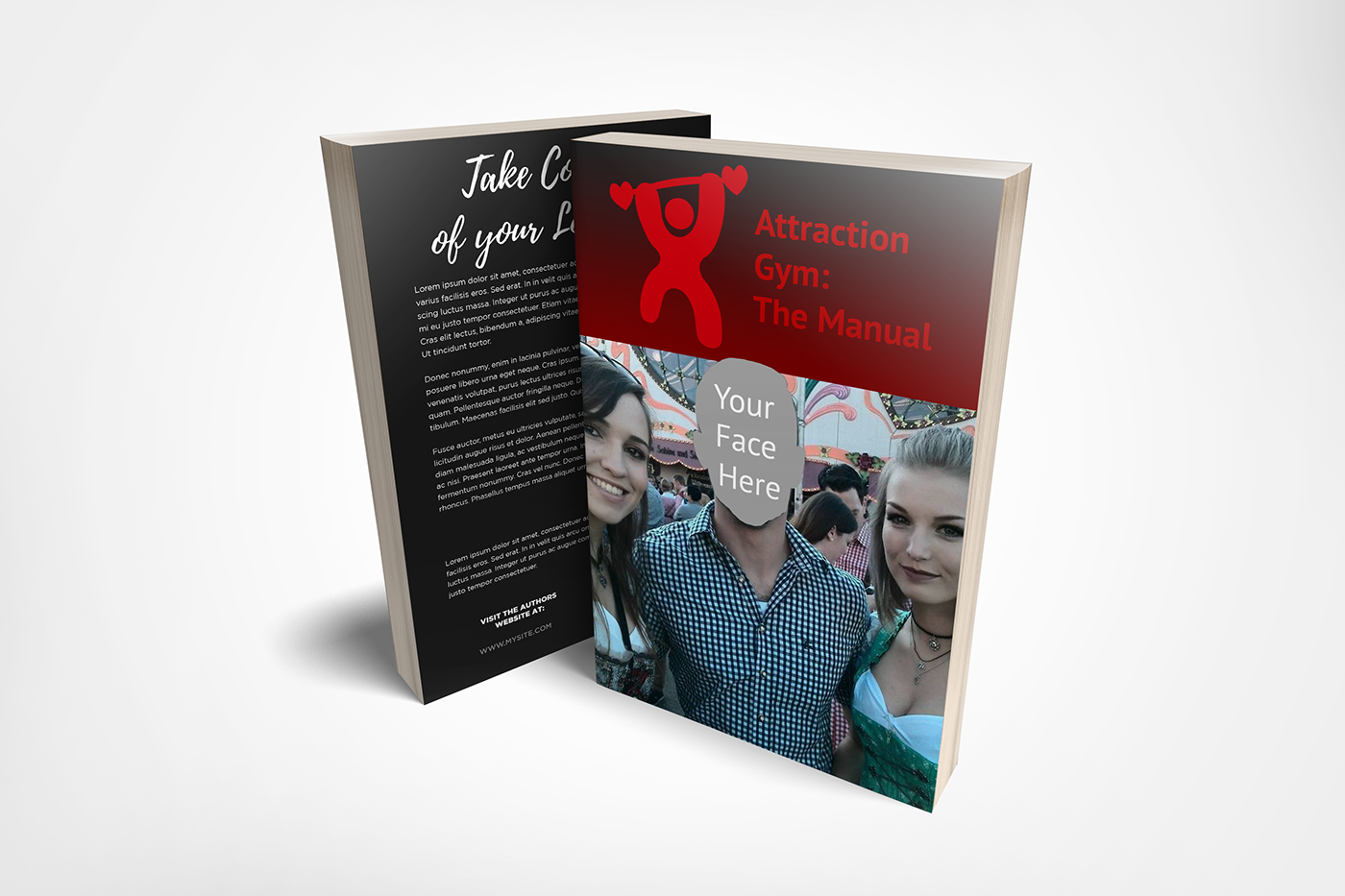
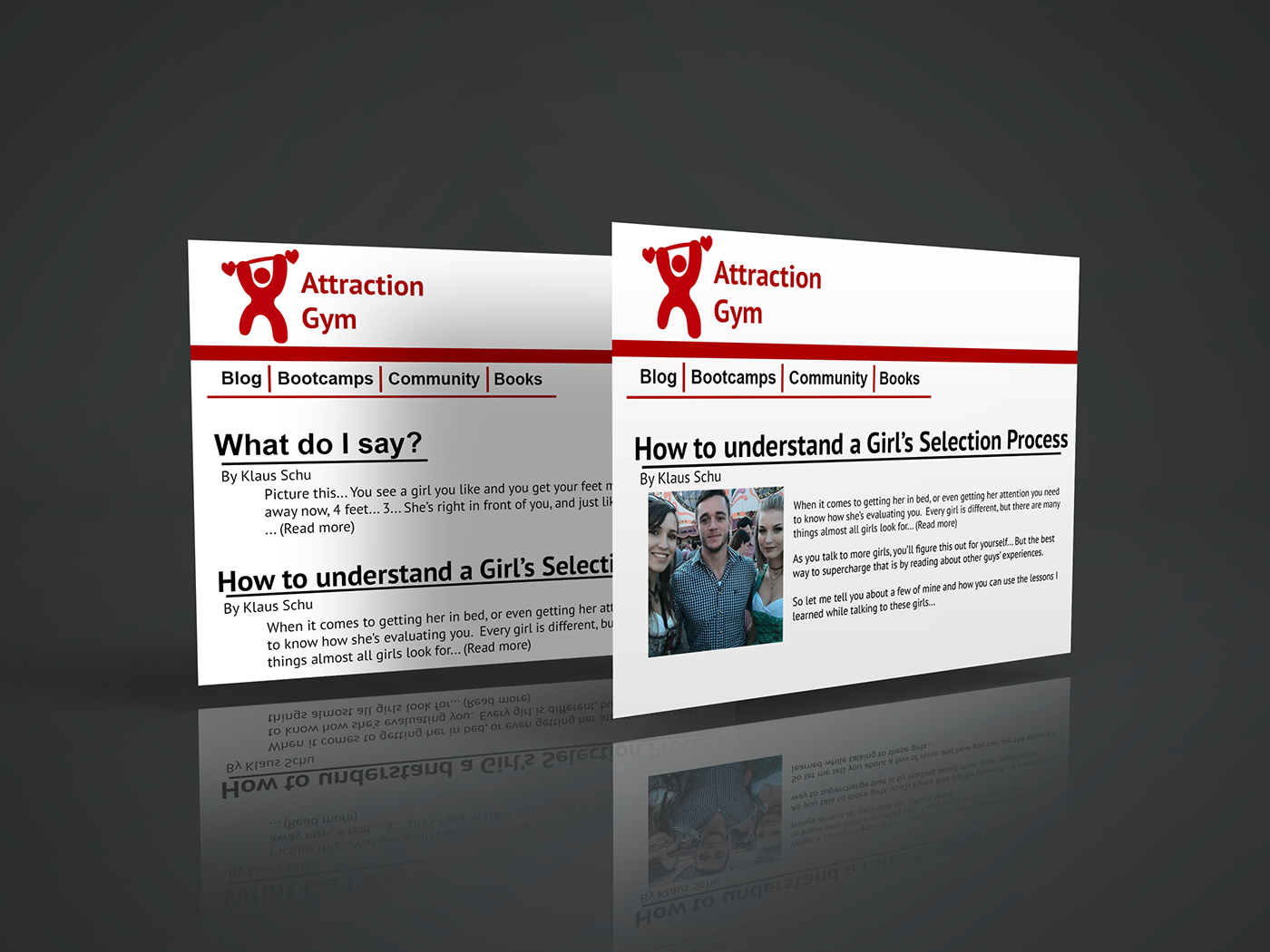
He wanted to improve the logo from the cloudy version to his own, web-ready version.
We went through a few different color schemes and shapes, and decided on a clean, simple red.
The shape went through several revisions. A subtle perspective shift was applied to the shape to suggest a side lift, and the direction of the barbells was switched to create a sense of forward direction and achievement.
Red was chosen to represent attraction and passion.
Klaus was very pleased and shared this testimonial with me:
Here's the original logo, with bigger versions of the mockups and final logo afterwards:


