


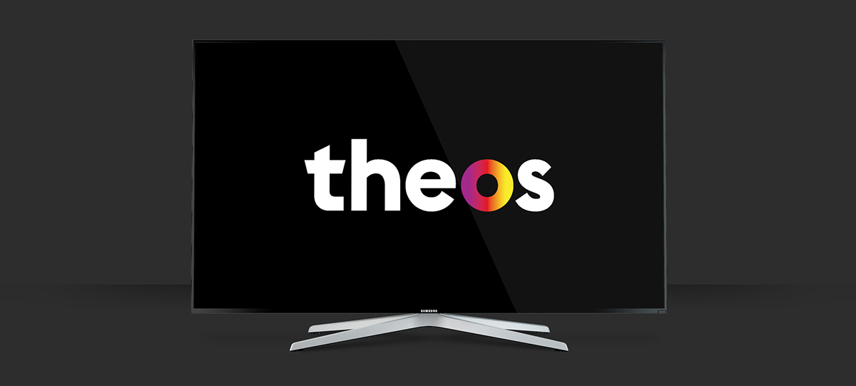
Theos is a TV channel targeted to young audiences with the goal of preaching the Catholic faith and gather new followers for this religion and its traditions.

BRAND DEVELOPMENT
Being one of the precepts of Catholicism the preaching of the faith and since it's a traditional major religion with a decreasing number of followers, Theos focuses its efforts on targeting Millennials and GenZers, maybe the most valuable and hard-to-reach audiences right now. These audiences would be approached through a fun look and a fresh language while respecting the traditions of the religion.
The starting point would be the feel of openness and modernity provided by the current Pope. Theos would also take advantage of new media and internet technologies and that’s why one of the main elements of its communication is the hashtag, encouraging the viewers to “share the faith”.

NAMING & COLOURS
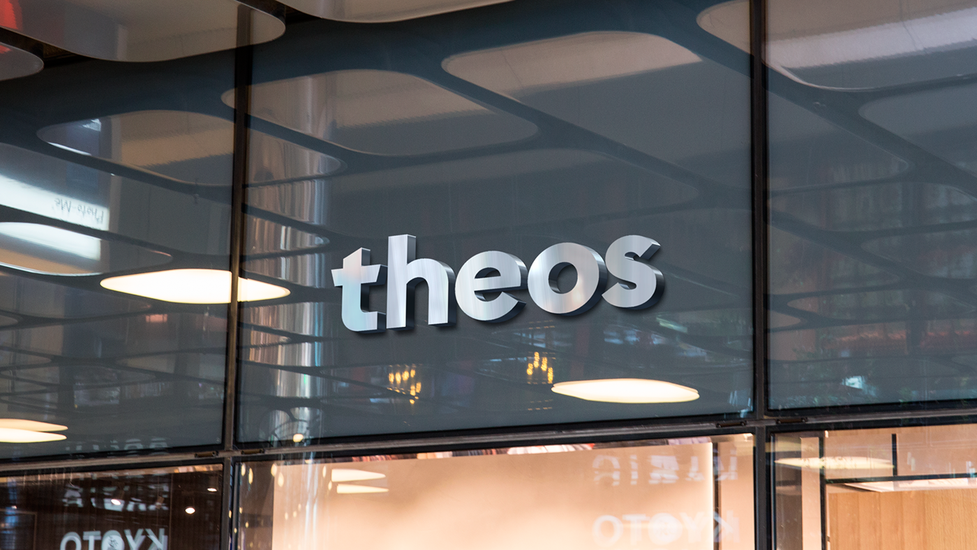
Coming from Ancient Greek word θεός, Theos means literally “God” and it fulfills the purposes followed by the channel. It’s international, different, timeless, religion-related and respectful with the catholic tradition.
As for the colours, following the state-of-the-art ombré trend, Theos chooses a faded composition of purple, red and yellow, all of them associated to the liturgy of catholic church. Inside the logo, the colours would be arranged according to their fixed position regarding the full width.

SYMBOL & BUG
The symbol is the letter O. Once isolated from the logo it would work as the on-air bug and the distinctive sign for all off-air communications.

GRID & ELEMENTS
The distance B operates both as a safety margin for text contents and as the radius of the onscreen logo/bug.

ON-AIR
Broadcasting continuity pieces are all defined by its two communication elements: the symbol of the channel and the use of the hashtag. On the self-promotion pieces and programming trailers, the symbol appears from the edges of the screen until it reaches the position defined by its placement on the full-size logo, while the hashtag announces the date and time of the program.
On the programming adjustment pieces, the content that will be broadcasted next is announced on the left bottom corner, with the hashtag #next along with the name of the program and its title.
After a commercial break, the name of the content that is being broadcasted is reminded by a text on the upper right corner of the screen, with the hashtag #nowwatching along with the name of the program and its title. When it disappears, the channel bug returns to the bottom right corner.
OFF-AIR
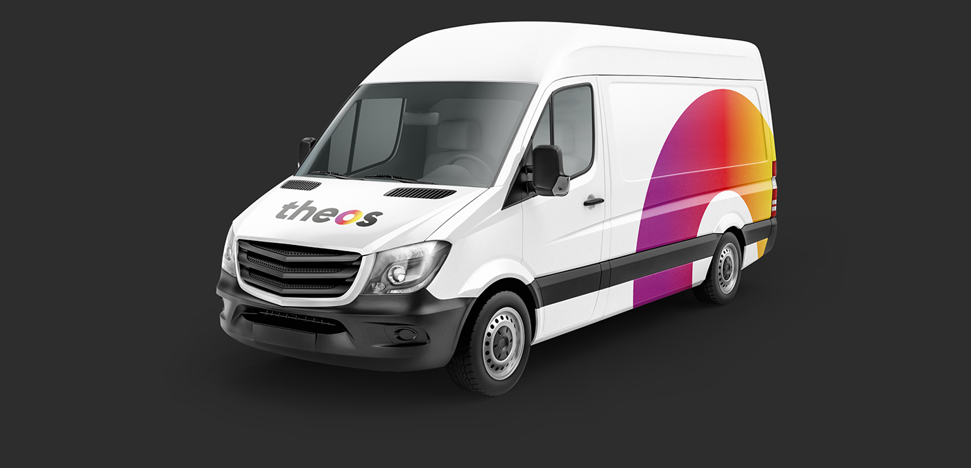
Theos' outdoor advertising pieces follow the off-air communications guidelines of the channel, that establish the usage of the ombré layer and the hashtags as the main elements that best catch the attention and express the values of the brand.

Mobile units are also branded with both the full-size logo on the front and the symbol of the channel on the sides.
Written communications, such as press releases, statements and any other announcements on paper start with the symbol and a hashtag that defines the content of the communication. Since the logo and the symbol may coexist on this kind of communications, a monochromatic variant of the logo is used in order to avoid any redundancies.

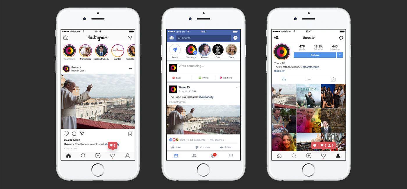
Social networks are the main element of off-air communications. Social media allows the brand identity to be developed more deeply as the channel embraces all inputs generated by the interaction of the audiences, taking advantage of the latest trends such as stories.
Theos is the result of a workshop with Clase BCN. The briefing commissioned us to create the branding for a fictional TV channel based on spirituality and/or religion.


