
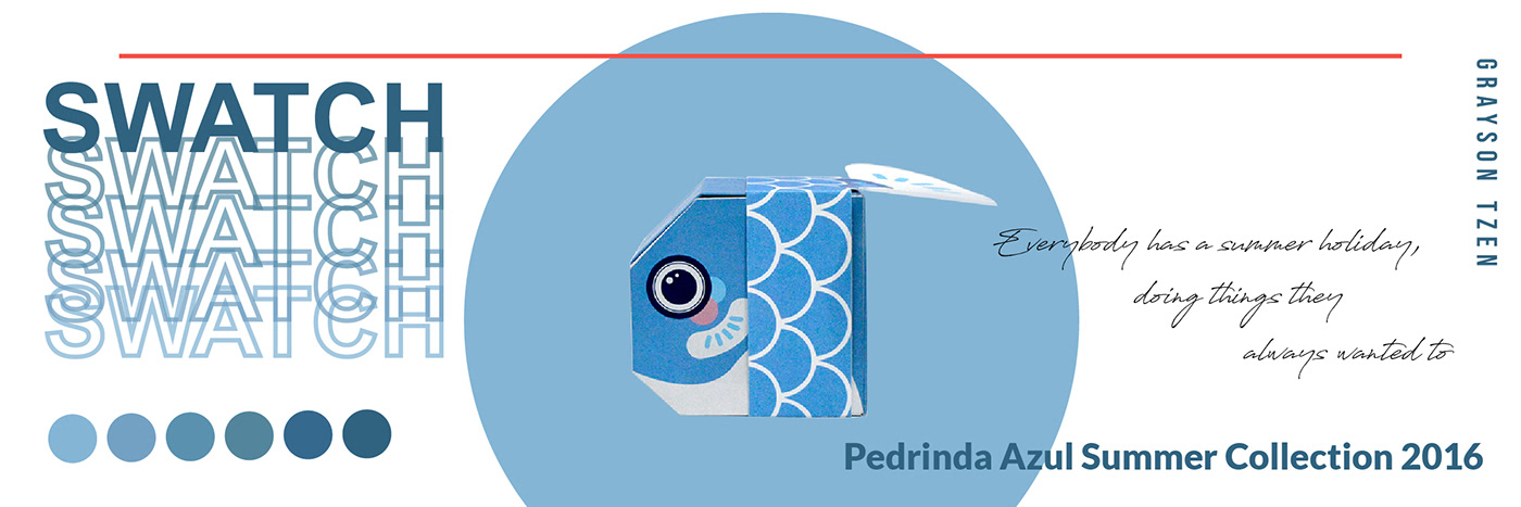
This Is my packaging design for the Swatch 2016 summer collection - Pedrinha Azul.

For this assignment, the lecturer asked us to pick a brand to create a packaging design for a selected product where our class collectively decided on Swatch. I was very interested in this product as it contained interesting elements; the Swatch summer collection in 2016 reminded me of the beach and sea.
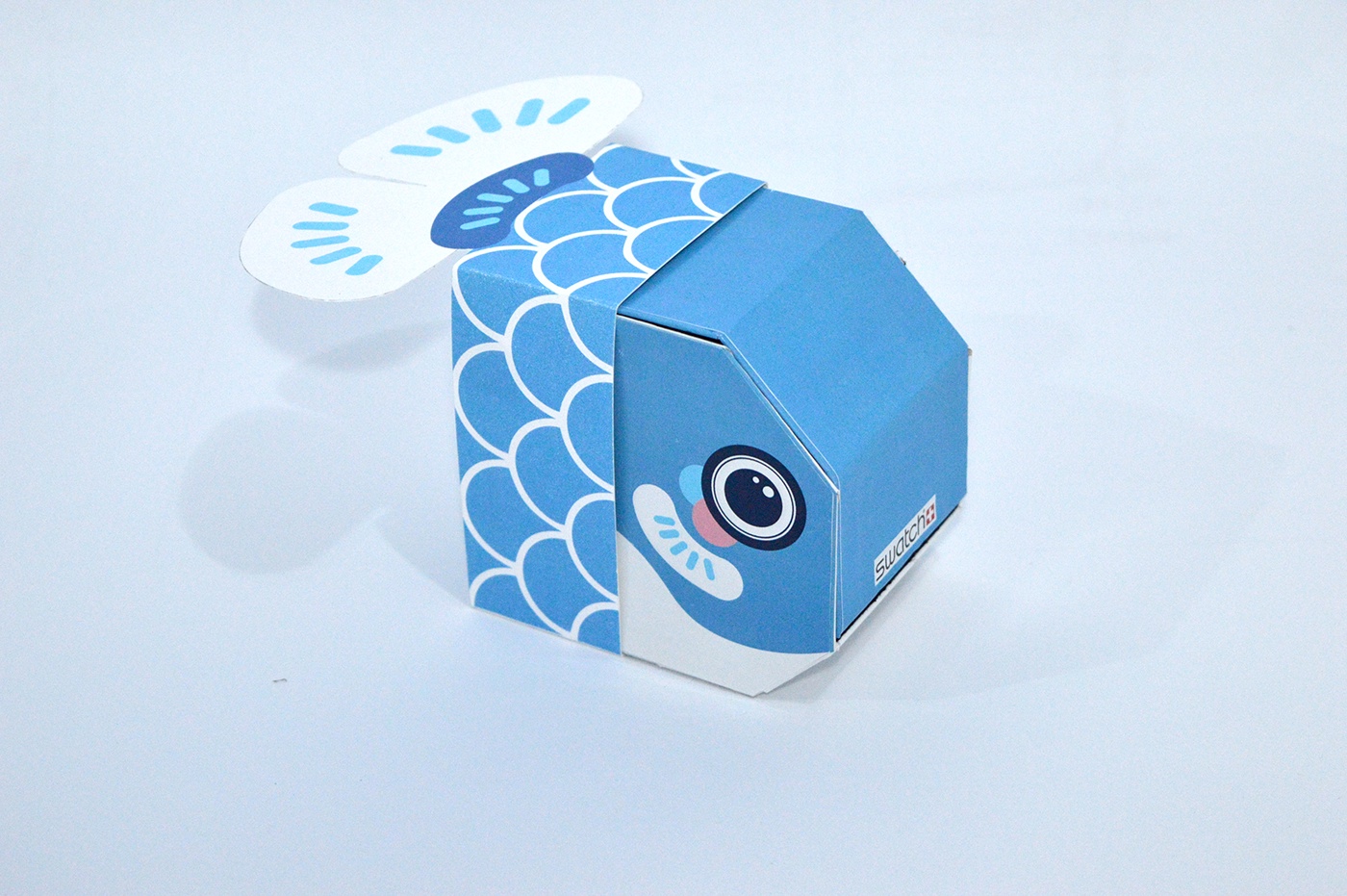
My initial ideas involved elements like seashell, glass bottle, sand, none of which matched the product. I finally decided to use the fish element to ingratiate female audiences; the fish scale pattern on the watchband. My lecturer was surprised at my art direction to represent the summer sea.
I faced some issues during the mockup stage where I seeked assistance and inspiration from my friends to revise the mockups.
I finally came up with 2 packaging designs based on the same idea which utilised different colours and outlook. I followed up with a small survey asking the audiences about their preference in design. The responses favoured the light blue one as it was more attractive.
The key thing I learnt from doing this assignment was decision making. The whole process from idea generation, packaging outlook, mockup and materials used all influenced the end results. To top it off I was required to take a product photo of the packaging which I did in my own fashion.

Student Work
Swatch Beach Swing : Pedrinha Azul 's Packaging Design


