
FC Barcelona / redesign
Desktop
Just a fun project to redesign the homepage of professional football club FC Barcelona. The design they have at the moment is bit boring for me and as fan of FC Barcelona I wanted to make a design that looks cleaner and more to todays design look. I added a color scheme with black/white/grey and the blaugrana that FC Barcelona have in their logo/jersey.
See the original website

Home
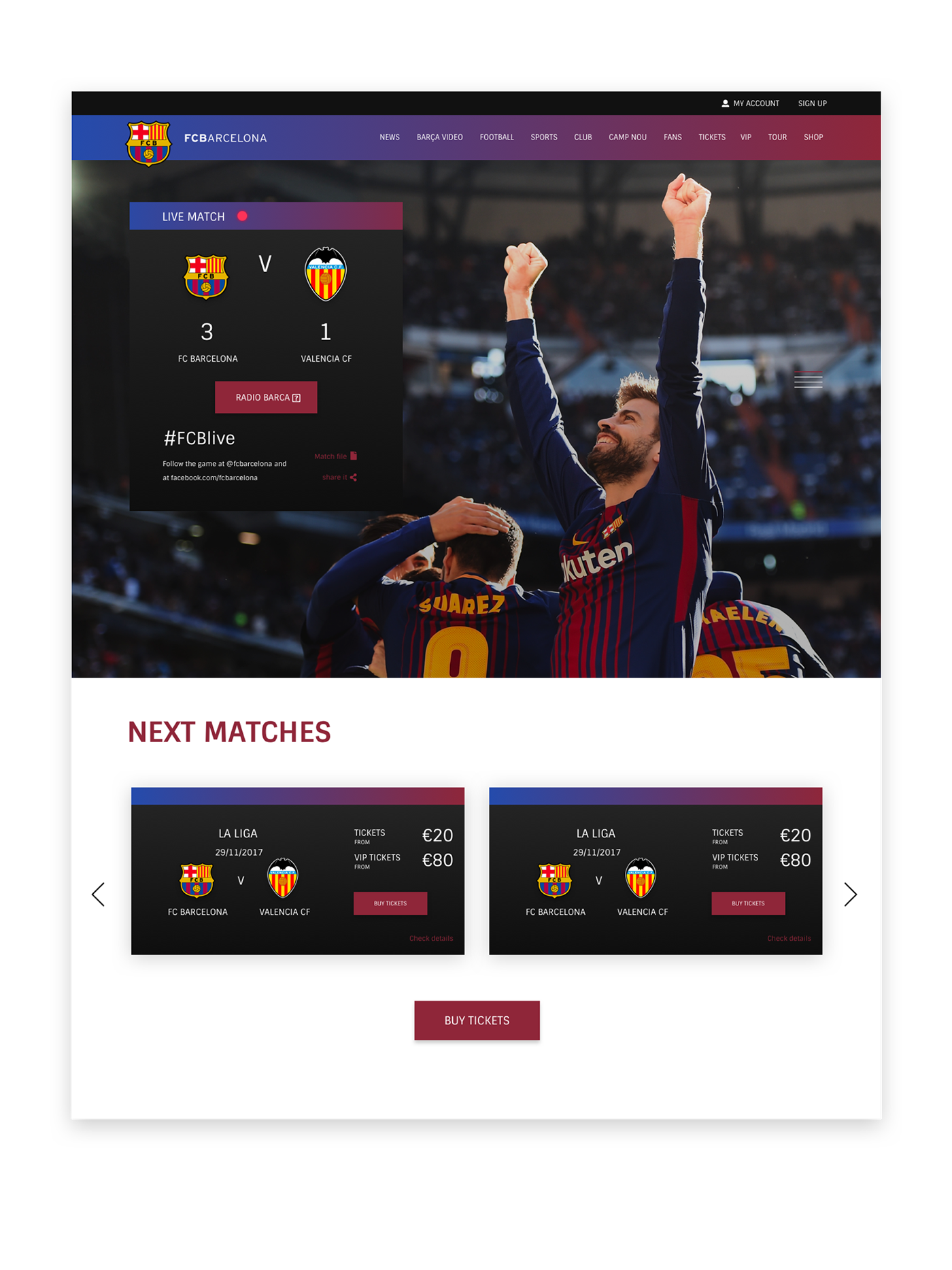
This is a quick look at the hero section and the section to see upcoming matches and to buy tickets.
News
I kept the news section clean and easy to look through. Just a simple thumbnail, date, info, heading & read more button/link. I also added the option to view all of the news items, by clicking on the red button (MORE NEWS).

FCB Store
I organized and cleaned out the store option in the FCB site, It is now more clear and simple to go through. With some strong photography used in the background why you should get the FCB Jersey 😉.

Photos & videos
Just as the news item, I kept the Photos & Videos section very simple. Thumbnail with a heading and also a icon to show if it is a video or not. There is also a option (just like news) to see more photos & videos. Say cheese 📸

The Players
Clean slider that shows 4 random players. The players are numbered on there kit number, by using the arrows you can see the other players of FCB 1st team. Using the button below you can go to the full players list and other squad lists.

FCB Socials
2 columns showing the Instagram and Twitter feed, you can expand to 3 columns by adding Facebook as well. It also shows when the Instagram or Twitter post has been posted (21 hours ago).
2 columns showing the Instagram and Twitter feed, you can expand to 3 columns by adding Facebook as well. It also shows when the Instagram or Twitter post has been posted (21 hours ago).

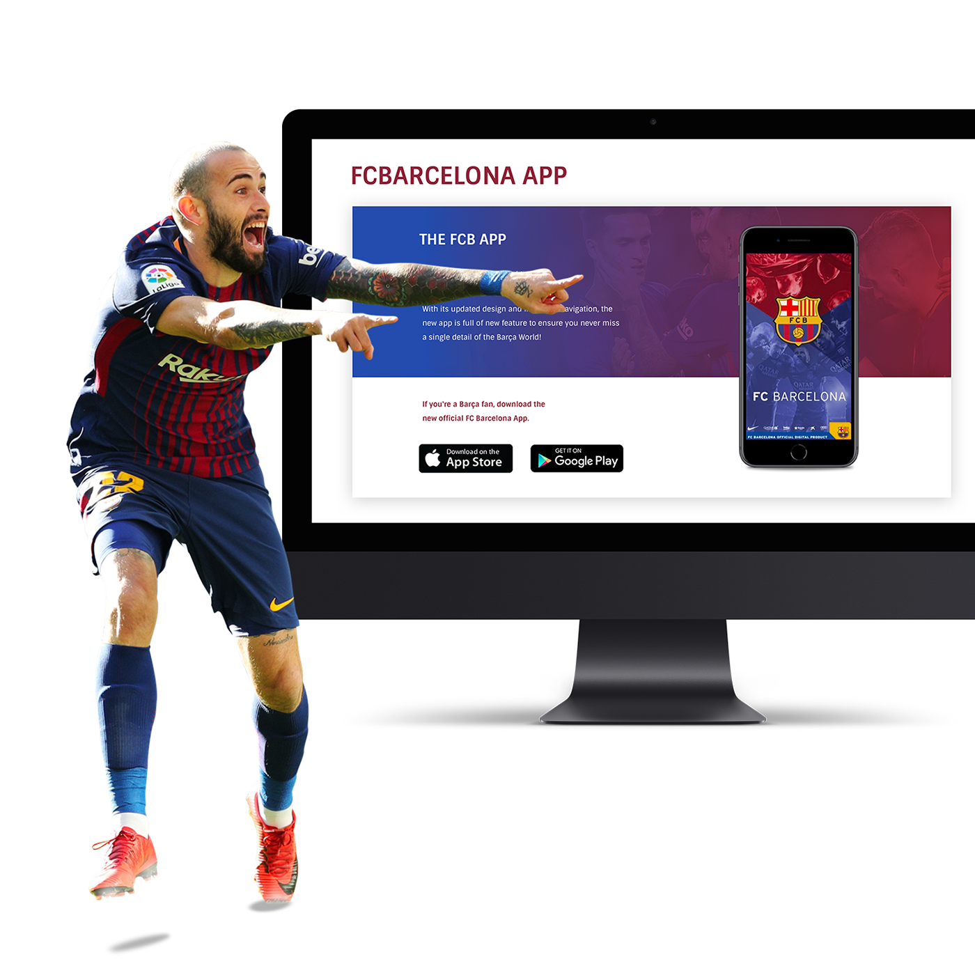
FCB App
On the main website this section looks very boring and not interesting to download. I used a nice clean mockup of the Iphone 8 and added the app screen in there, looks better and more eye catching in my opinion. I added the text and to make it stand out more I used the blaugrana gradient in the background with some nice photography. I faded the photo out behind the text so it will be easier to read.

Footer/Newsletter
The same what I did for the FCB app I kinda did for the newsletter, in my opinion it looked boring and not eye catching on the main website. So I made it more simple and used a clean design with a nice looking blaugrana gradient in the background 🔵🔴 . I also made the footer/sponsor part way simpeler and cleaner look & feel, no gradients or background images as that would be to busy in my opinion (for this design). This black and white footer ends the site well, by using a big FC Barcelona logo you still have some color in the footer so it doesn't get to boring 😴.

Colors
I used 7 colors for this website, 2 grey ones, black/white and the blaugrana (single color & gradient).

Fonts
I used just 1 font type for this website. I used a simple, clean, easy to read font and in my opinion it looks great haha 😎👌


