During the internship at Galagan branding agency, I created a logo for Arabatska arrow.
It is a tourist resort in the Sea of Azov area, mainly for a summer family vacations.
It is a tourist resort in the Sea of Azov area, mainly for a summer family vacations.
The task: to create a logo.
The purpose: to expand the audience of visitors for year-round tourism.
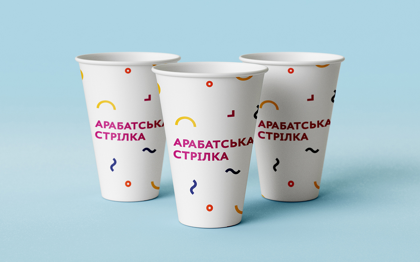
The logo has flat and minimalistic design.
It is made in geometric lines and shapes, which are elements and colors of the resort attractions: sea, sun, pink lakes, hot spring and water sports.
Also, these elements may be modified like constructor creating new illustrations and supplying a positive attitude of the resort.
It is made in geometric lines and shapes, which are elements and colors of the resort attractions: sea, sun, pink lakes, hot spring and water sports.
Also, these elements may be modified like constructor creating new illustrations and supplying a positive attitude of the resort.
Colors