01: L'usine Ads
L'usine, a beloved baked goods brand in Saudi Arabia, was our client. We created several one-off campaigns for their sliced bread brand. The ads communicated lightness, health, and energy.
Concept & Art Direction: Kenan Abdulghani
Jr. Art Director: Wesam Qamar
Visualizer: Rexi Quimos
Concept: Get FREE health with every pack.
The objective is to showcase the health aspect of the bread. As such, We found a creative use for the overused FREE icon to become something extremely valuable, that is, free health with each pack. The copy on the icon reads free in Arabic.


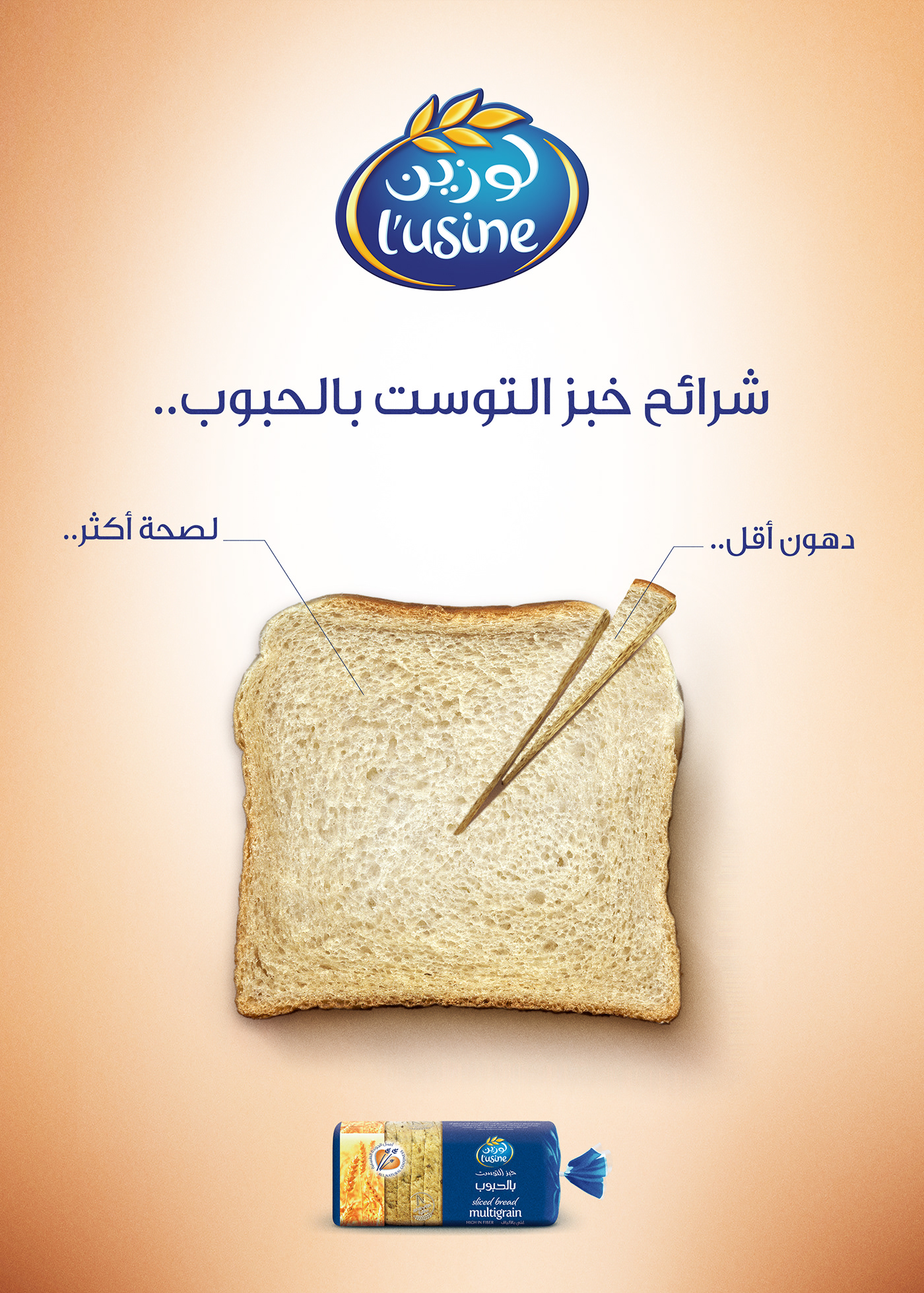
Concept: Infographic Bread
The brief was to showcase the minimum percentage of fat in L'usine bread. The copy over the bread reads: Less fat.. more health. Of course, "less fat" contributes to the small piece of the bread, while the main headline reads the name of the product.
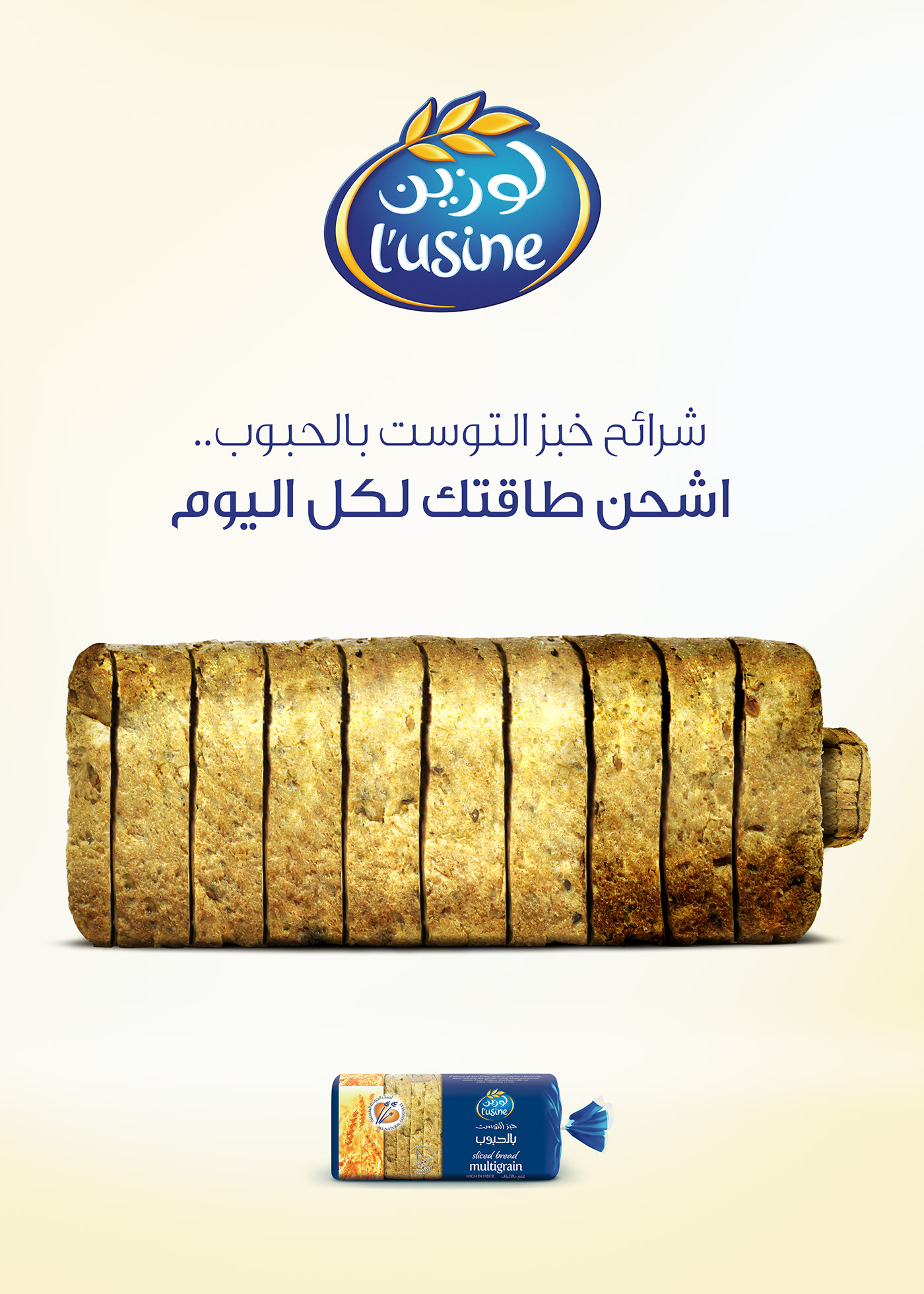
Concept: Charge
The client approached us with a new insight, through the large amount of grain, L'usine sliced bread can give the consumers energy. As such, the idea is a simple visual metaphor.
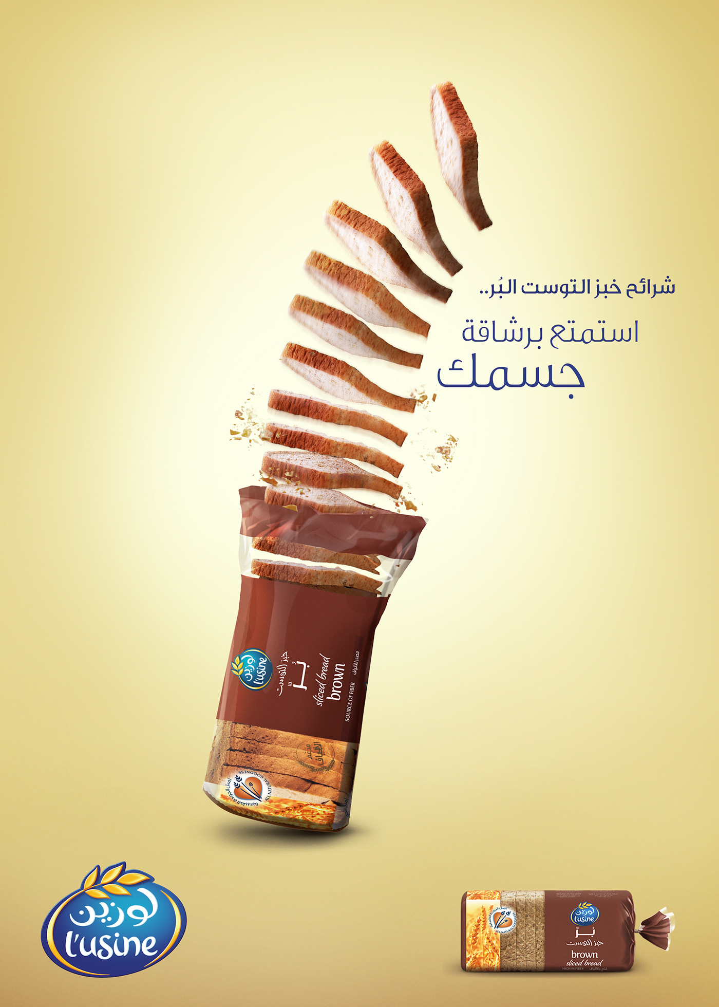
Concept: Nimble
The client challenged us to communicate "nimble" visually, which is one of the main characteristics of their brown bread.
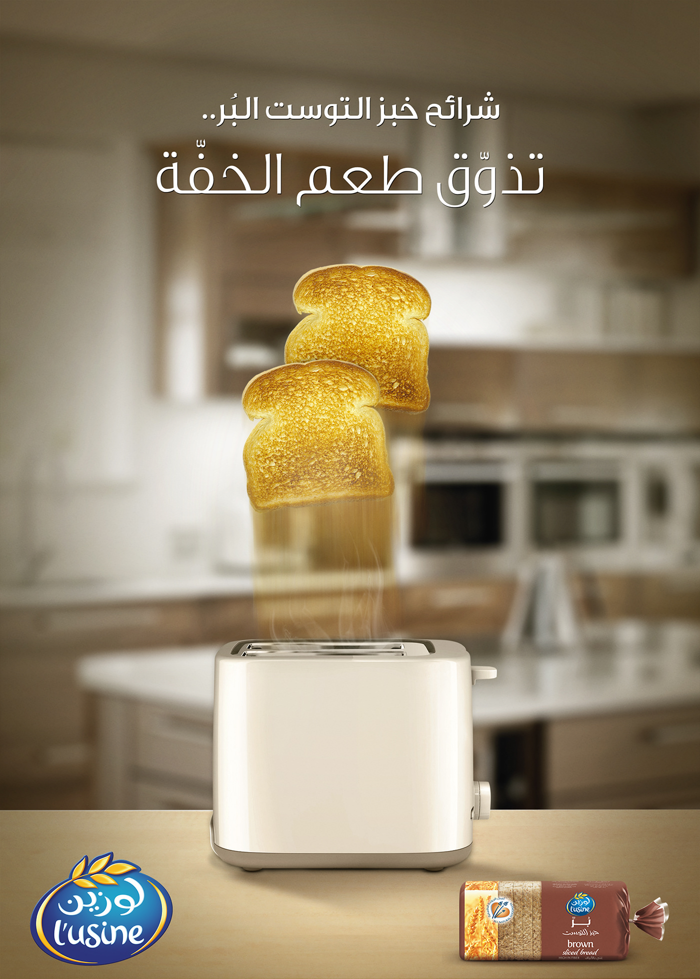
Concept: Bouncing Bread
The client challenged us to communicate "lightness" visually, which is another characteristics of their brown bread. Headline reads: taste lightness.
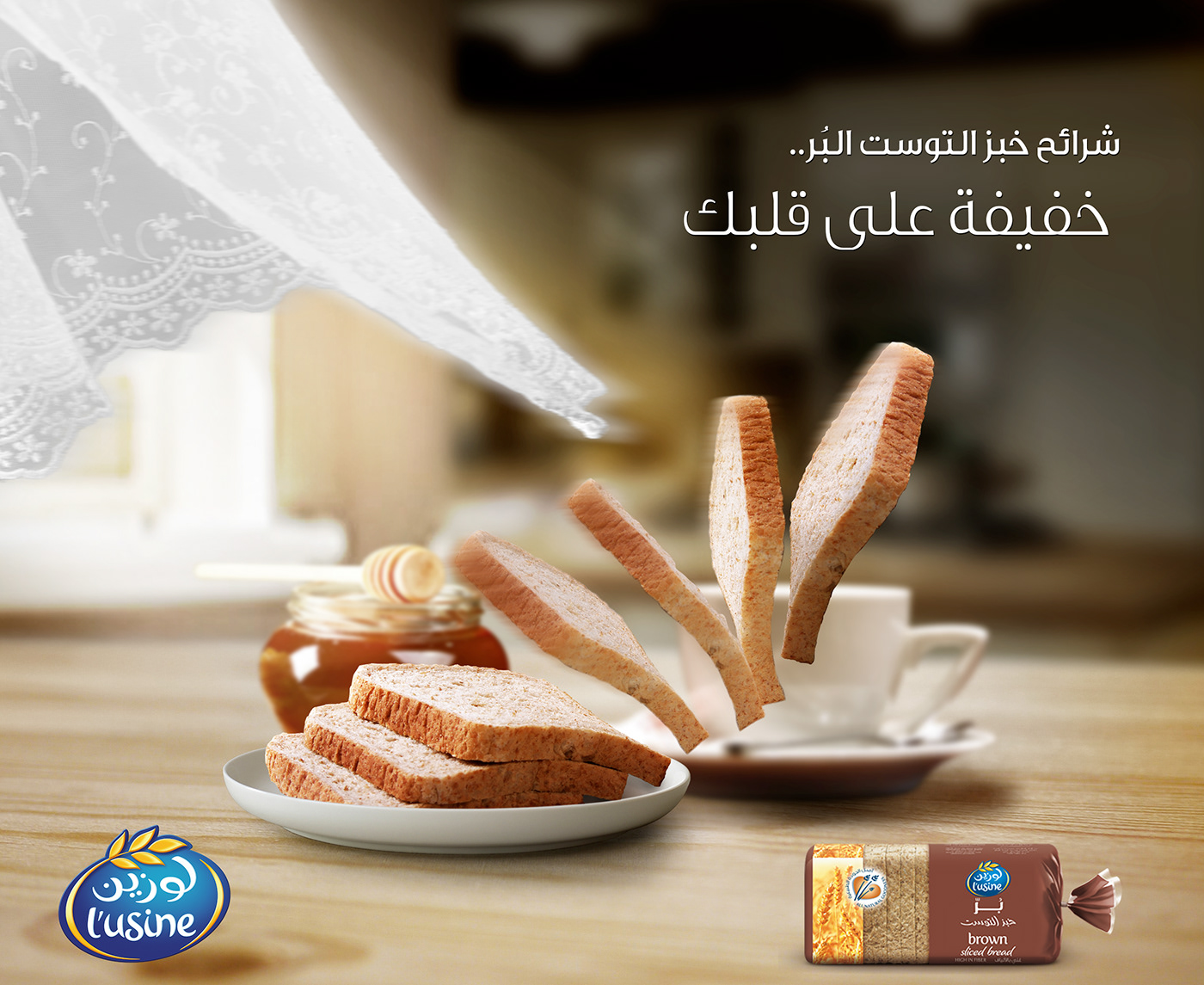
Concept: Air Whiff
Here the concept shows how light L'usine bread is; just a whiff of air is enough to show how light it is.
-------------------
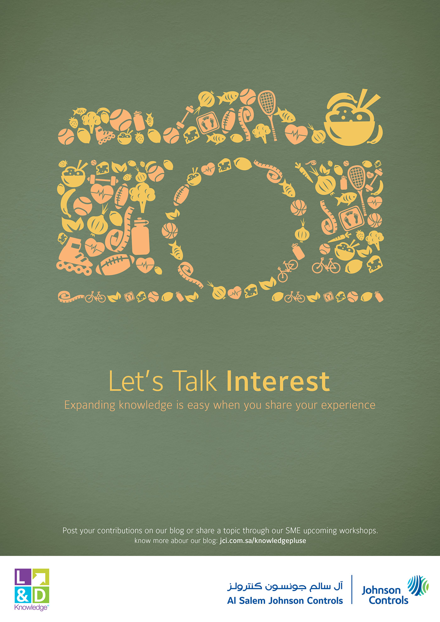
02: Johnson Controls Knowledge Sharing Campaign
Johnson Controls approached us to create a campaign to strengthen the loyalty and the belonging of its employees along with creating a like-home culture in the company. Along with the director of strategy, and after interviewing several employees, we realized that these employees have a a lot in common to talk about. The creative strategy sparked the concept of the campaign: Let's Talk.
The campaign was accompanied by a lot of creative applications, like music concerts for employees who have the same taste in music, technical workshops held by some of the employees, and even an after hours comedy club for employees who like to share a story with a punchline—to name a few.
The art direction was meant to be simple to focus on the offering of the campaign.
Concept & Art Direction: Kenan Abdulghani & Bashar Ashek


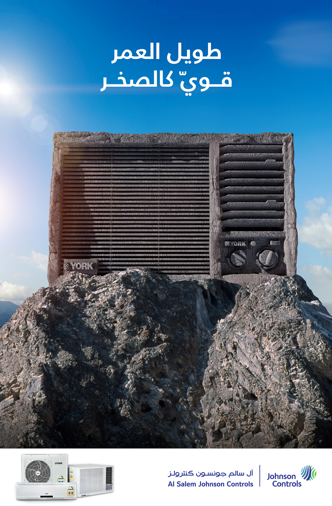
Johnson Controls: Solid As A Rock
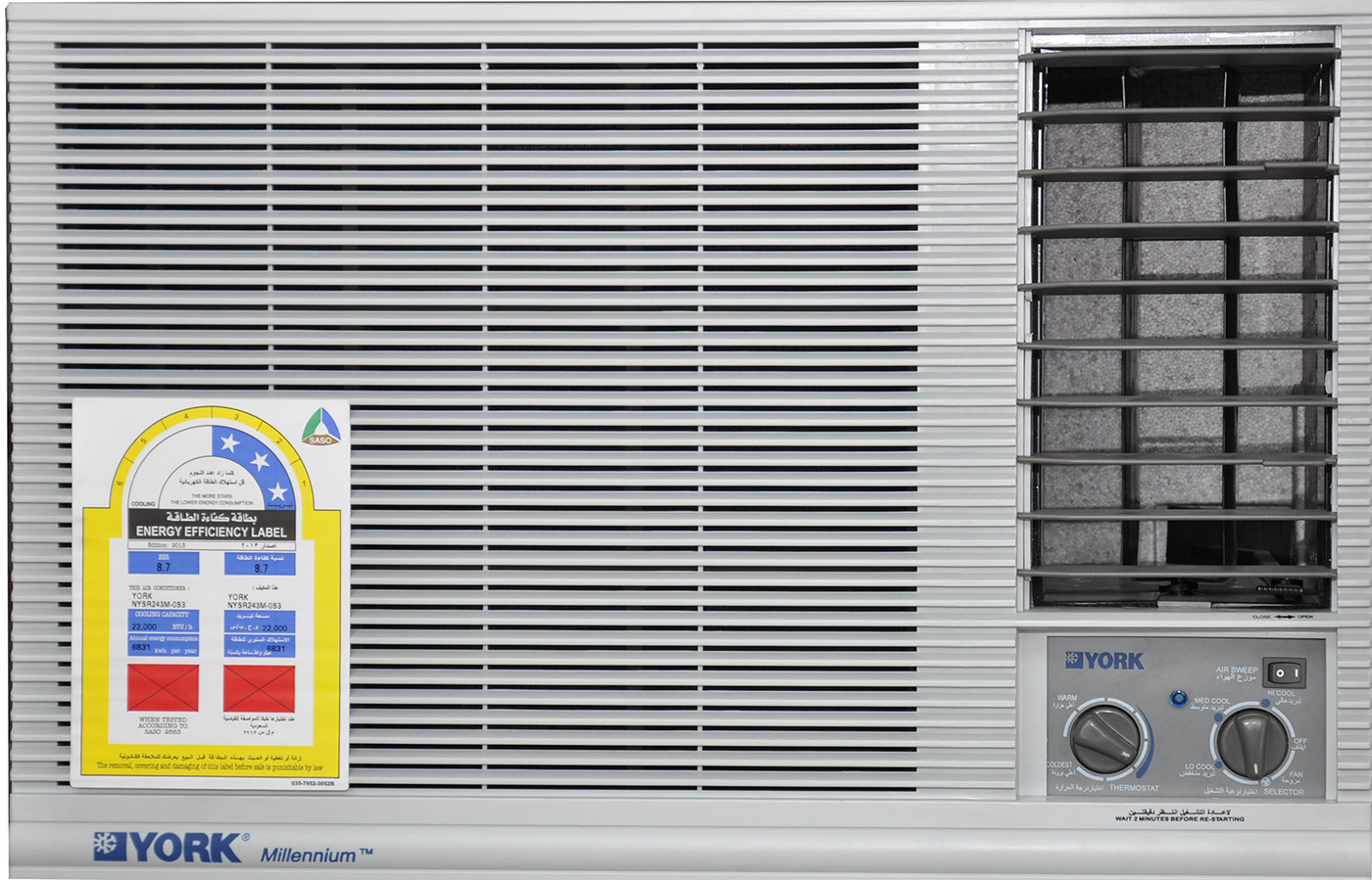
The client approached us with an idea in mind; the marketing team wanted to create a one-off ad campaign featuring their air conditioner (which was one its way from the assembly country, i.e., the actual product was not available) shaped as a rock. The task was tough, but the result was rewarding.
3D and Art Direction: Kenan Abdulghani
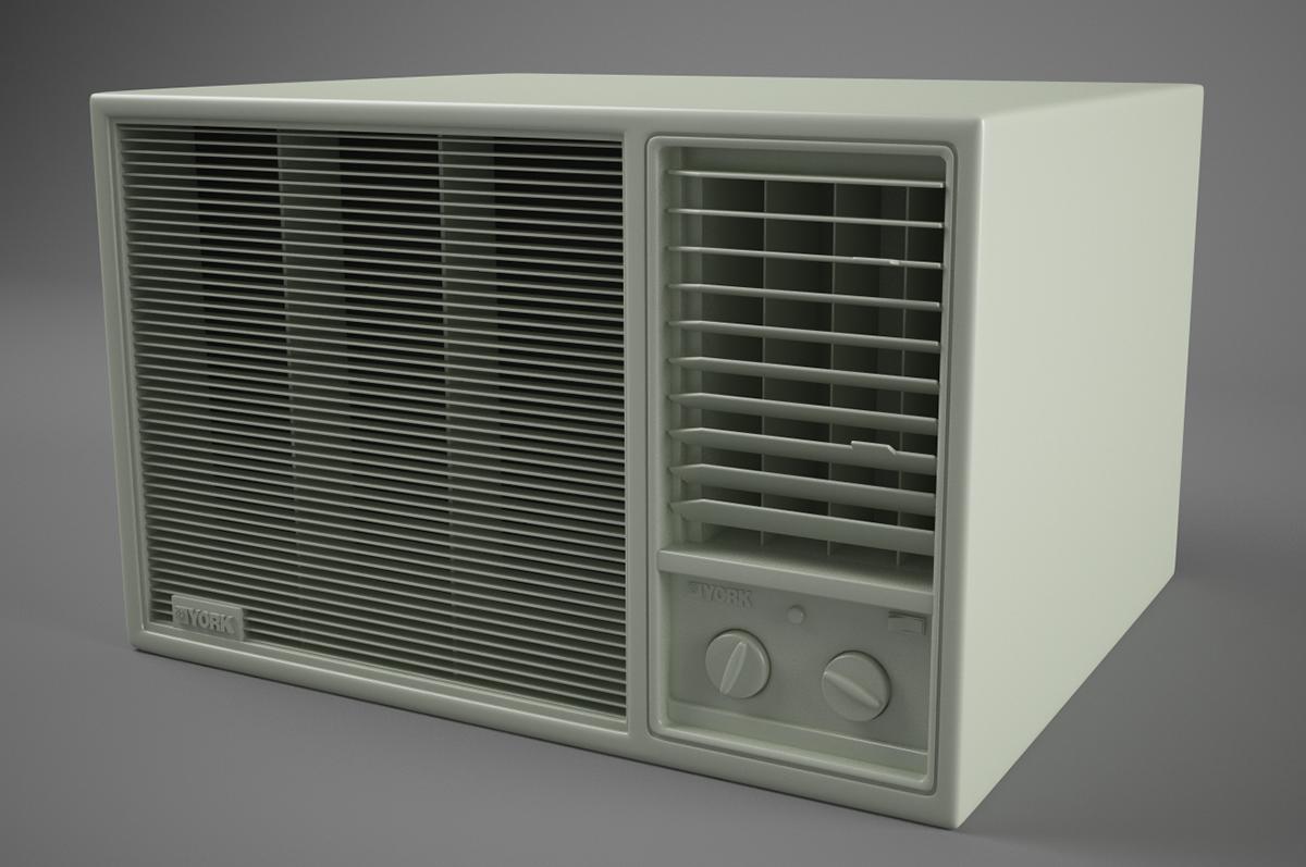
The only available AC picture at the time.
3D model
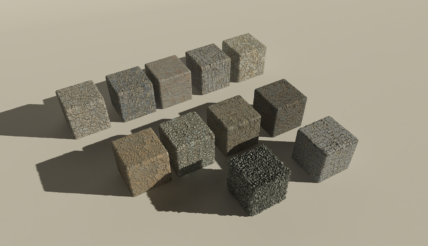
Textures study.
Final Ad.
-------------------
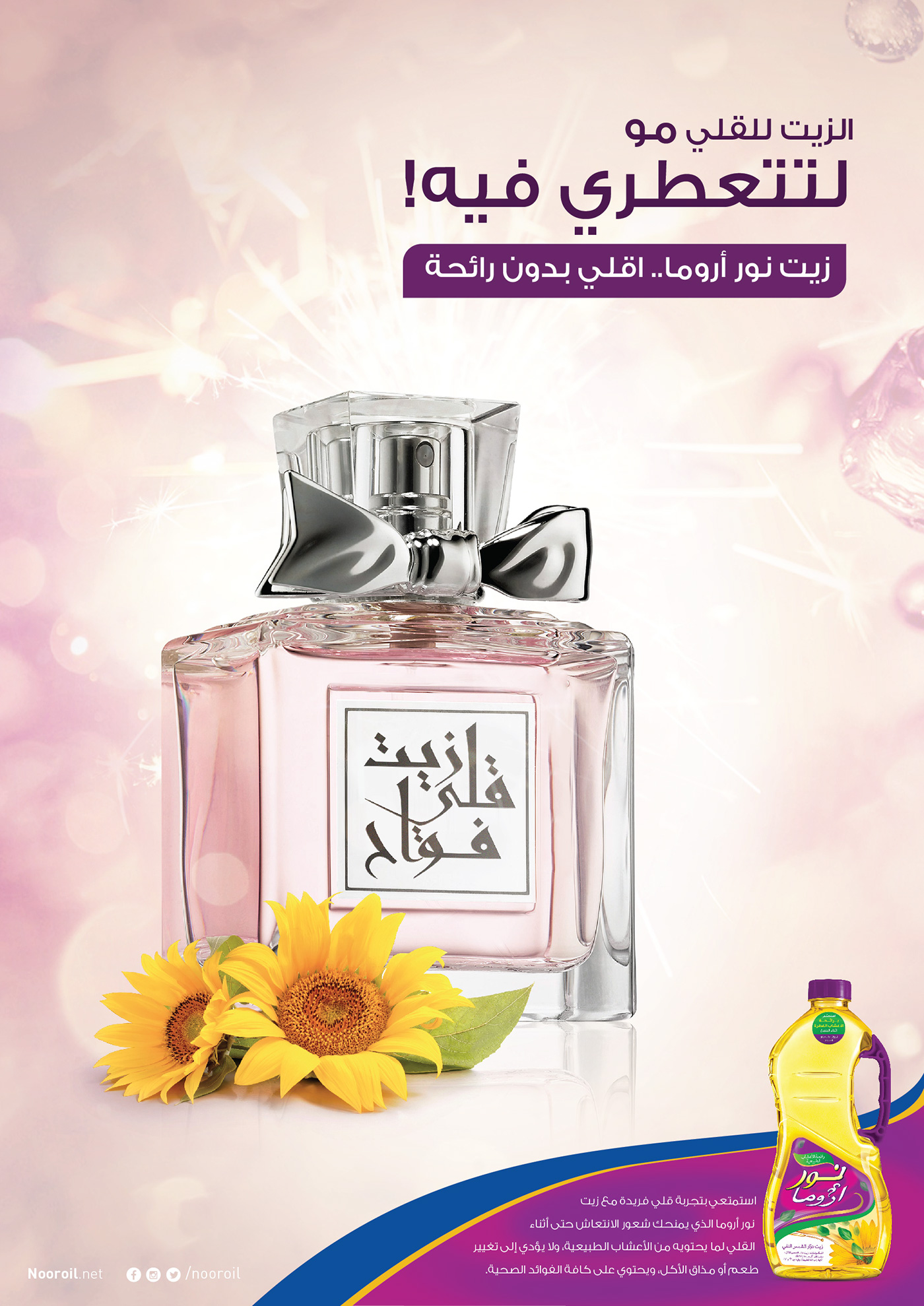
03: Noor Oils
To launch their new product, Goody approached us to create a print campaign for Noor frying oils. Our creative strategy focused on defining a USP in order to penetrate a cluttered market and gain market share. Through research, we found out that what annoys people when it comes to frying oils is the smell that sticks to the clothes after using the oils. Several insights drew our attention to the analogy of frying oils becoming like a perfume. As such, we conceptualized the humorous and intentionally-promotional-looking (at the end of the day this is FMCG) campaign idea: frying oil is for frying, not a perfume, and offered Noor Oils as the odorless alternative frying oil.
The execution shows competitors' frying oils shaped as perfume bottles.
Concept & Art Direction: Kenan Abdulghani, Mahmoud Tableby & Wessam Gamar