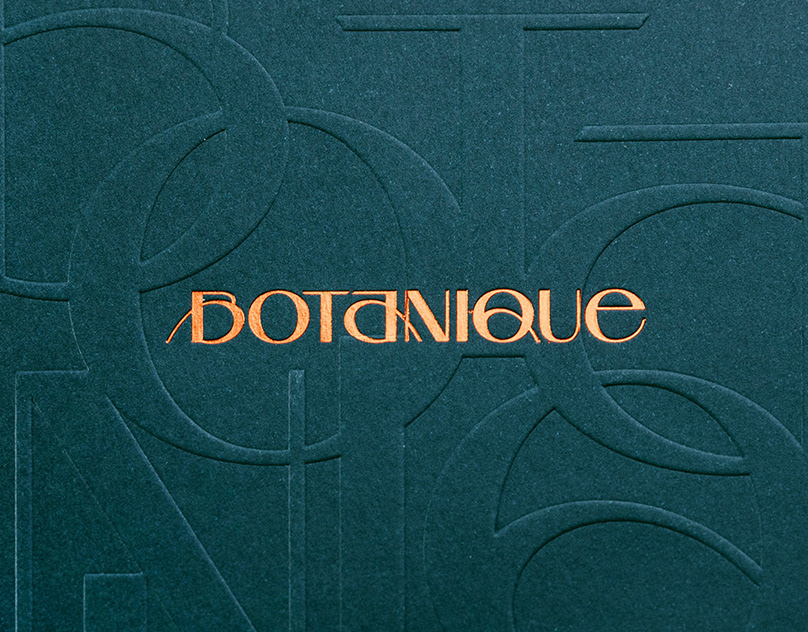
I opted for a traditional serif typeface for the main logotype. It looks beautiful and sleek, And it most definitely looks in-place alongside other similar brands.


The sheer simplicity and unobtrusiveness of the stationary compliments the beautiful products offered by Freebourne.


